The 7 Elements of Art
7 Elements of Art: Space
Watch this lesson for free on our YouTube channel
Free Lesson on the 7 Elements of Art by artist Lillian Gray.
This is a video and blog series teaching the 7 Elements of Art in an easy-to-understand way. The series consists of 7 lessons presented by artist Lillian Gray.
Space is one of the 7 elements of art along with line, value, texture, colour, shape and form. Space is the area in which an artwork is organized. Space is always part of an artwork.
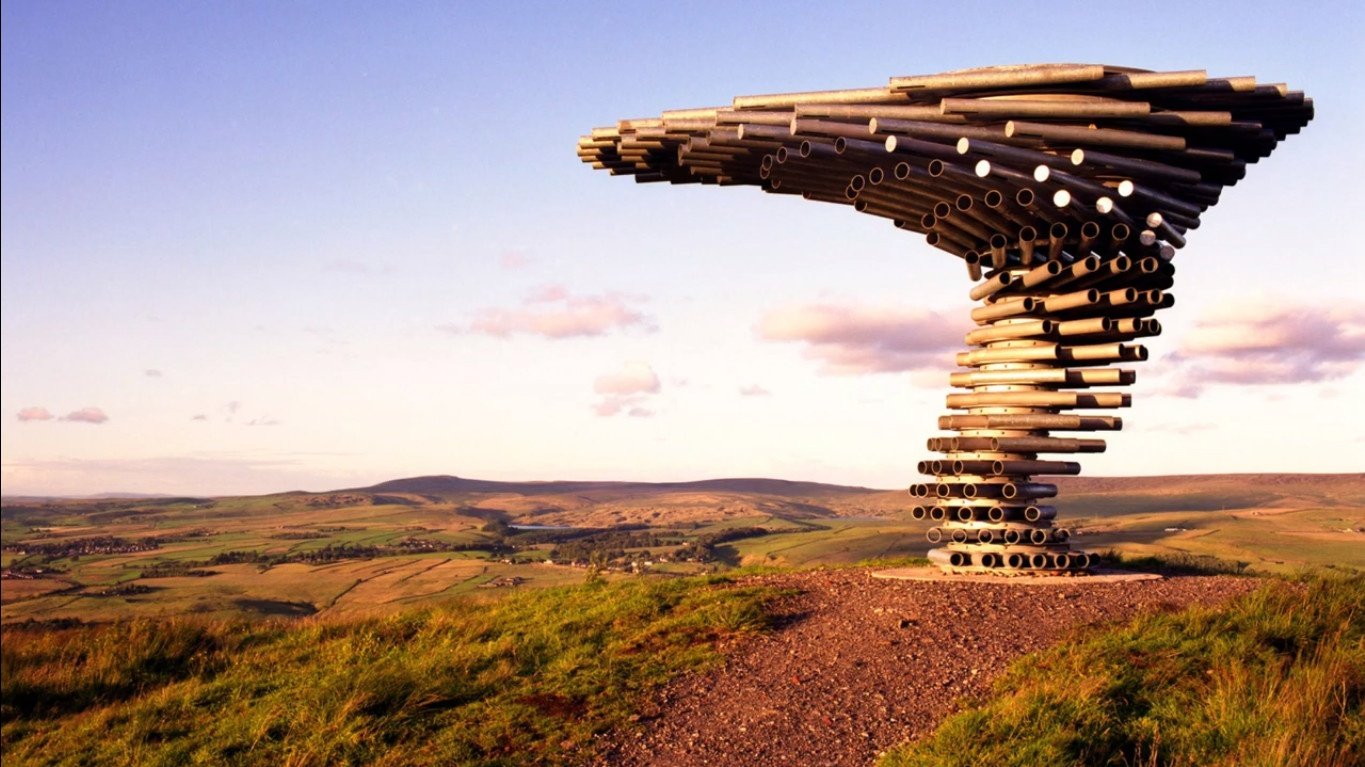
Sometimes, in multiple ways.
When people refer to space in an artwork they could be referring to various aspects of the artwork. such as the actual place the artwork is created, or the positive or negative space in an artwork.
Site-specific art
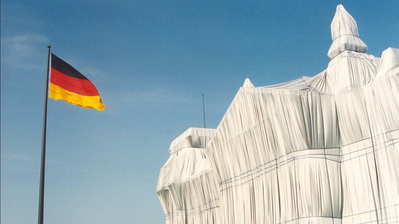
Site-specific art is artwork created to exist in a certain place. Typically, the artist takes the location into account while planning and creating the artwork.

For this type of art, it’s impossible to isolate the work from its surrounding environment. These can include sculpture, graffiti, installations and land art.
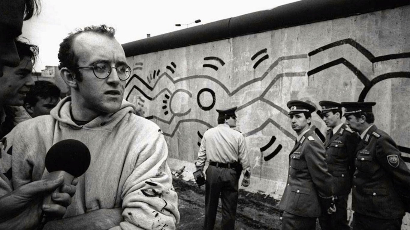
One of my favourite site-specific artworks is a 300 m mural painted by street art legend Keith Haring painted on The Berlin Wall.
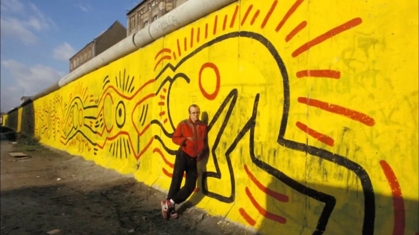
The Berlin wall was a guarded concrete barrier that physically and ideologically divided Germany into two. Keith Haring painted his distinctive figures in a form of a human chain interlocking their hands and feet. to represent the people and their unity against the Berlin Wall.
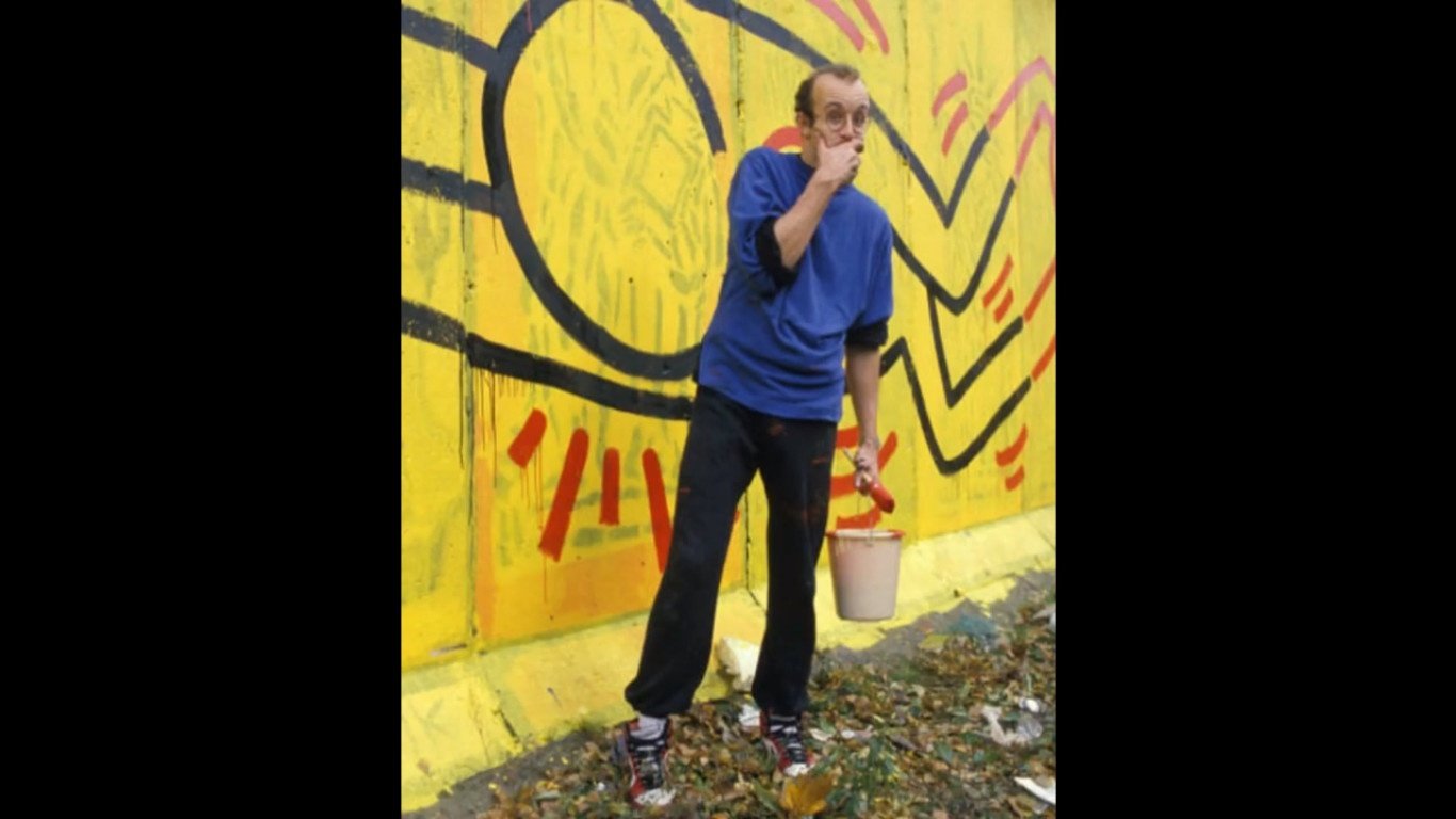
He did so, using the colours of the German Flag. The creation and process brought a lot of attention to that specific place and space in History.
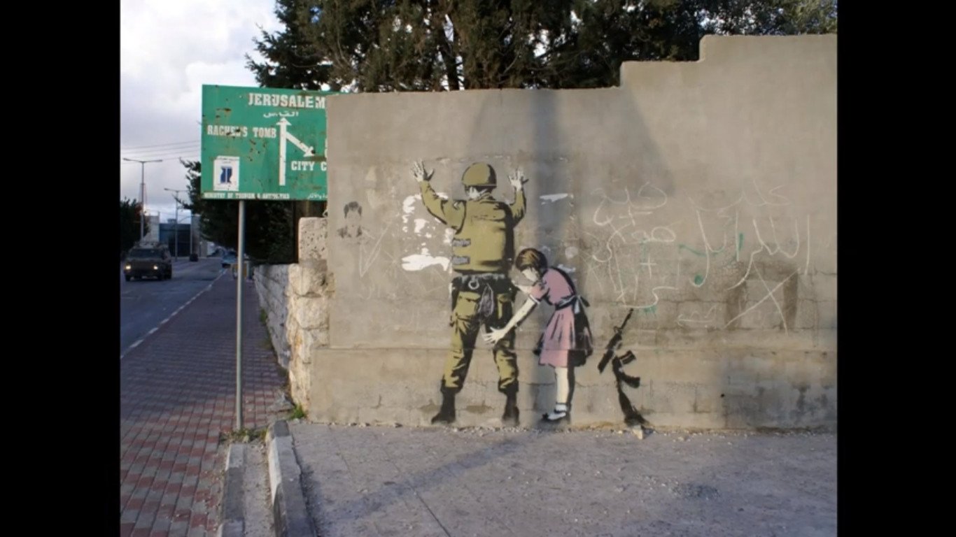
This is similar to Banksy that created similar artworks on the Palestinian wall in the Gaza strip.
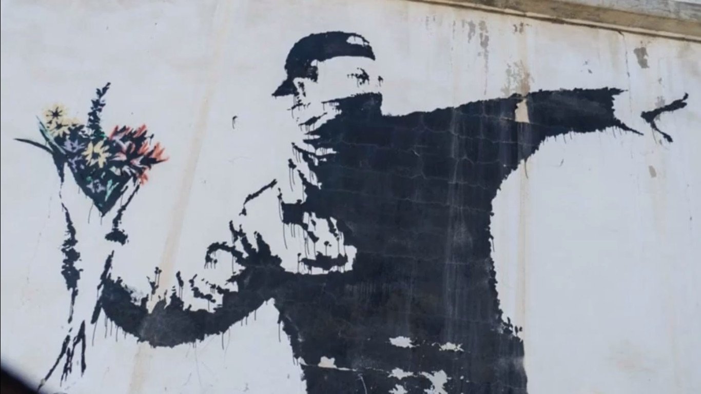
In 2011 there was an uproar has the artworks were literally cut out of the stone wall, and removed from the Palestine wall to be exhibited in galleries.
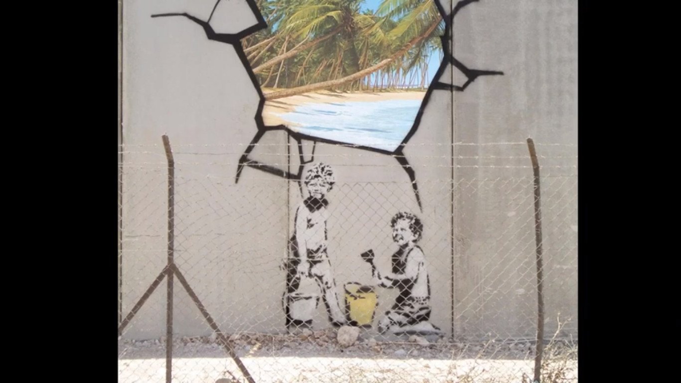
Banksy’s followers argued that the artworks were created for the Palestinians and out of context it does not have the same humour and significance.
There are two types of space, Positive and negative space.
The actual object is the positive space.

The area around the object is the negative space.
Sometimes artists intentionally try to blur the boundaries between positive and negative space.
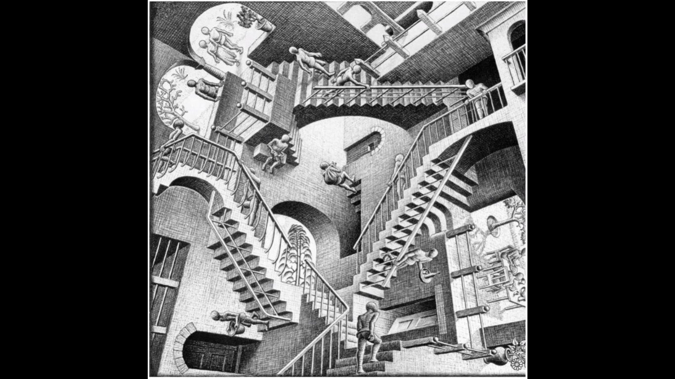
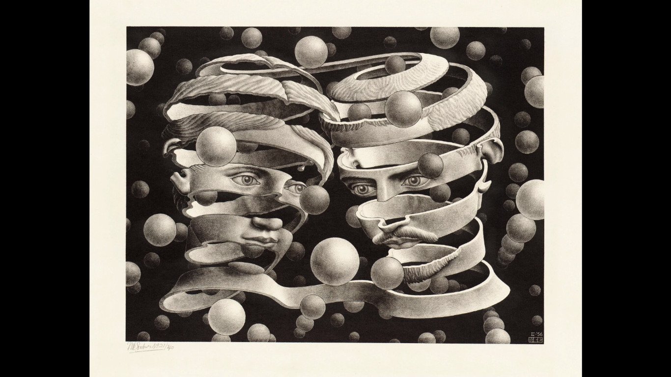
Dutch artist MC Escher often plays with positive and negative space in his art, creating interesting optical illusions.
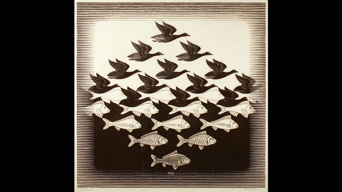
He often toys with our perception of depth to create interesting visual puzzles.

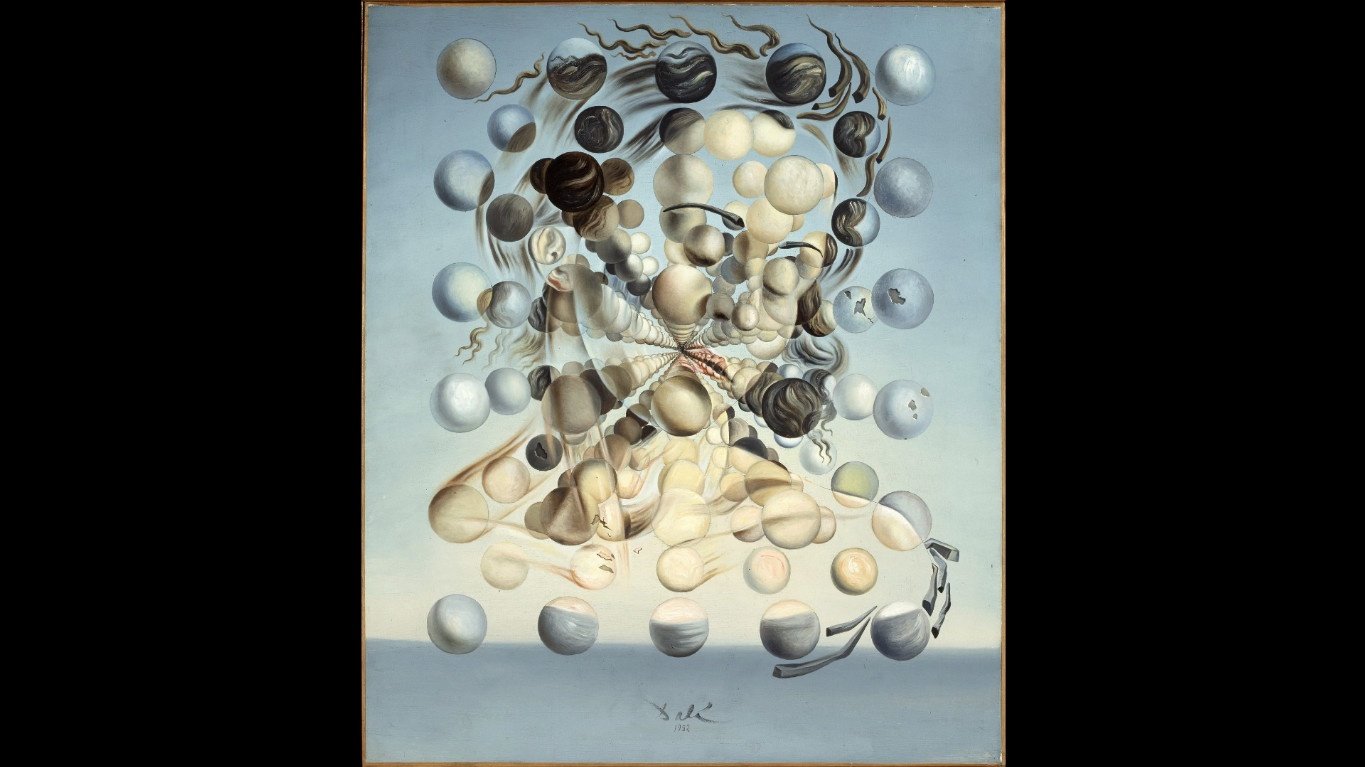
The surrealist painter Salvador Dali also loved to play with positive and negative space in his artwork. This is a beautiful painting of his true love, Gala.
Understanding positive and negative space is also very important when artists do print-making.
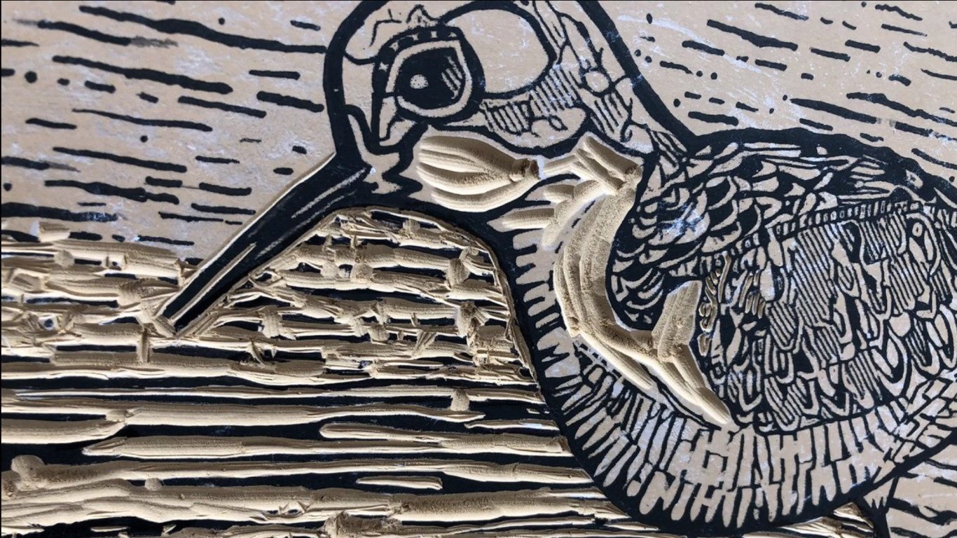
Print-making like linocut where artists have to cut away the negative space to get a positive print.

In sculpture and other 3 dimensional artworks, we call it open and closed spaces.

Open spaces are empty and closed spaces contain physical structures.
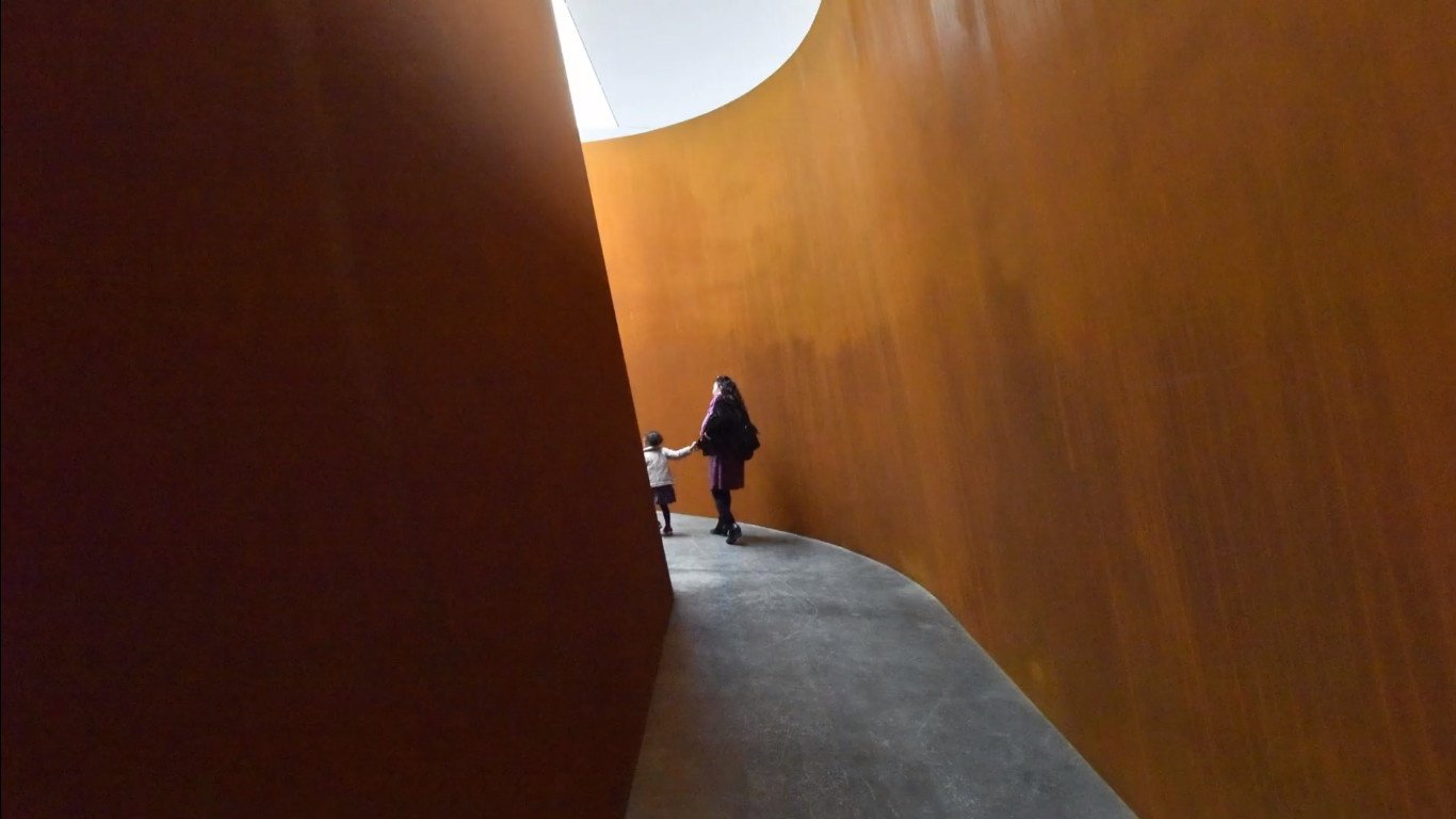

Then there is also white space.

In design and art, we often talk about white space, and white space isn’t always white, it is a design term.
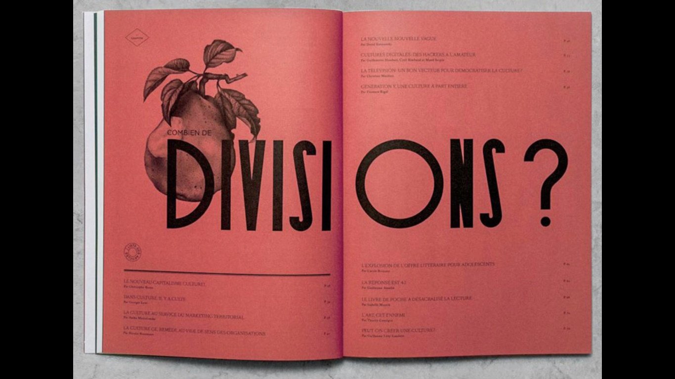
It is an empty space in a composition or to create breathing space or focus in an artwork.

The area you do not fill in your artwork or design and is the key element in your art.

We also use space in 2-dimensional artwork such as paintings and drawings. As artists we are often taking a 3d object and portraying it in a 2d space., so we need to create an illusion of depth.
Many 2d artworks create the illusion of 3d space by using some very specific techniques. Artists often combine these techniques in various ways to create depth in their artwork.
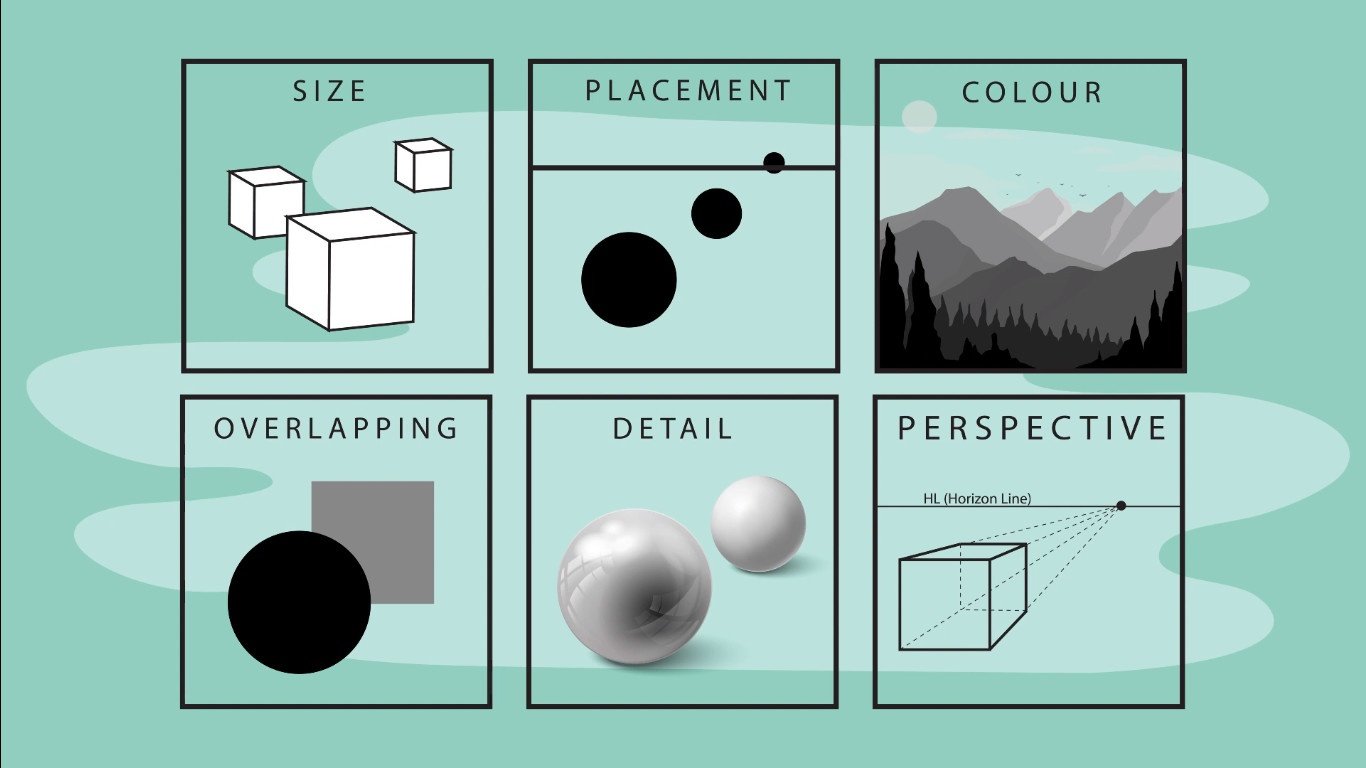
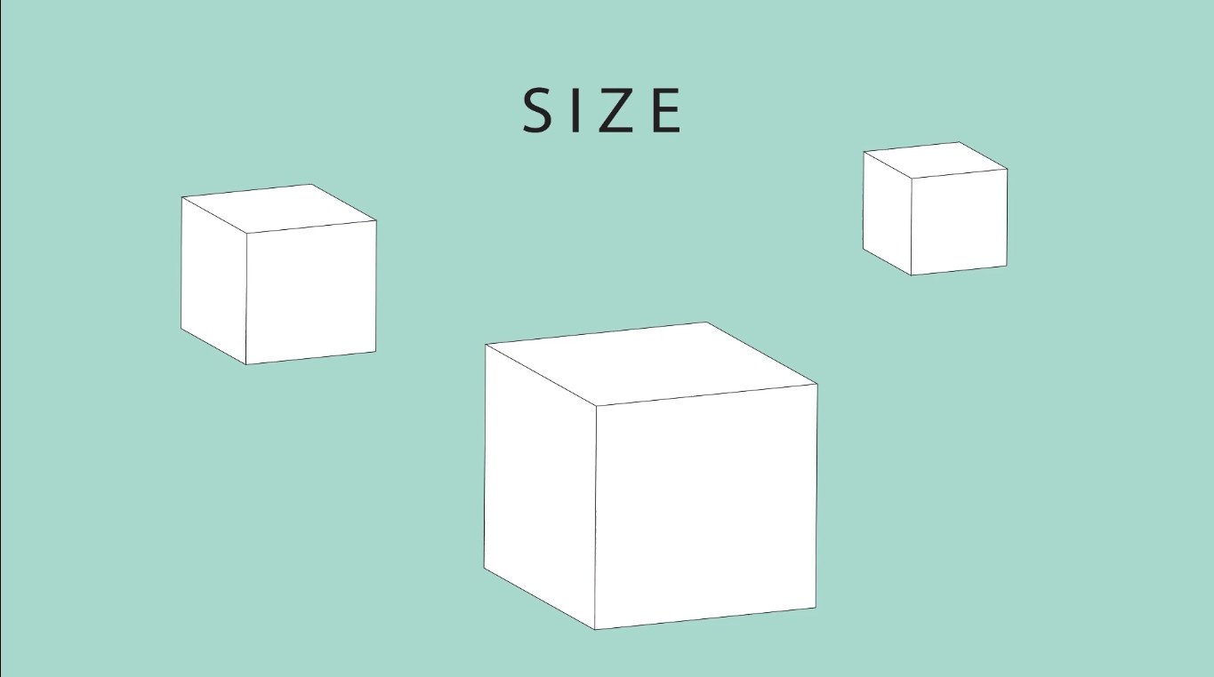
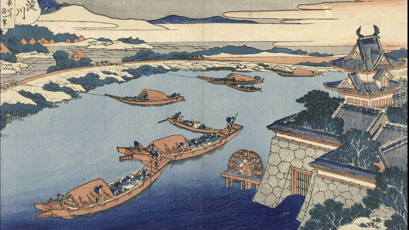
These techniques include size, where we scale objects with a smaller object being further away from the eye.
Here we can see Japanese Artist Hokusai artwork on how he uses size to create depth, with the smaller boats being in the background and the bigger boats in the foreground.
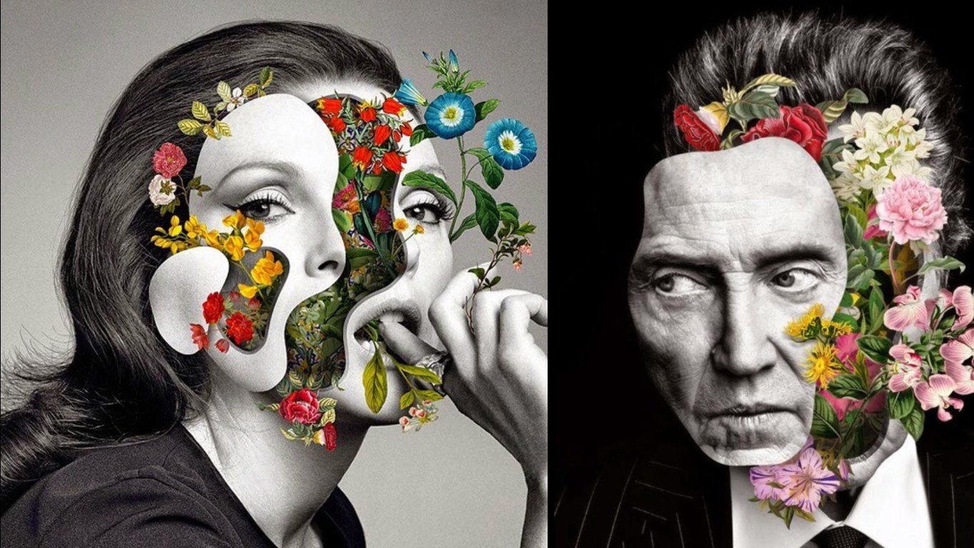
Another technique artists use to create depth is overlapping where we put one object behind another to show that the one is further away and one closer to the eye.

Collage artist Marcelo Monreal creates amazing depth by overlapping various layers of his portrait.
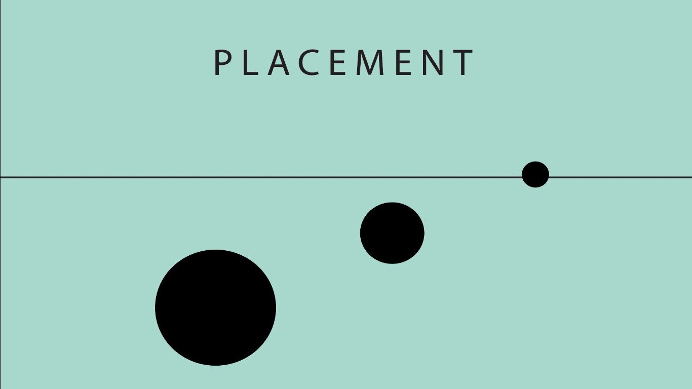
Another technique artists often use is placement. where we place objects on the plane, where we move further towards the horizontal line and we create an idea of depth.
Another technique artists use, is detail, by giving the object that is closest to the eye more detail than others that are further away. Here, hyperrealist artist Jason De Graaf uses this technique by blurring objects in the background and painting objects in the foreground with extreme detail.

Another technique artists use is detail. We give the object closer to the eye more detail than the objects further away.

Another technique artists use, is detail, by giving the object that is closest to the eye more detail than others that are further away. Here, hyperrealist artist Jason De Graaf uses this technique by blurring objects in the background and painting objects in the foreground with extreme detail.

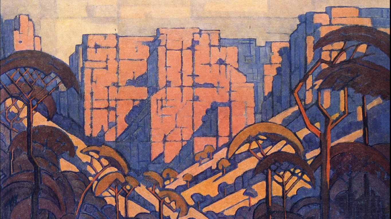
Artists can also use colour and value to create the illusion of depth.
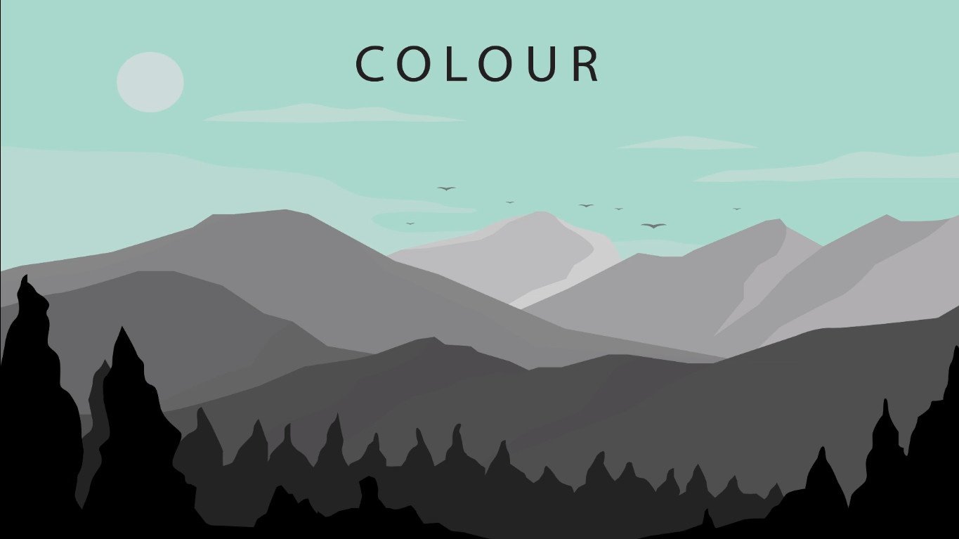
By giving the objects closer to the eye a much darker value and then gently decreasing the value as it recedes to the back.
Here we can see South African artist Pierneef using this technique to create depth and a sense of space.
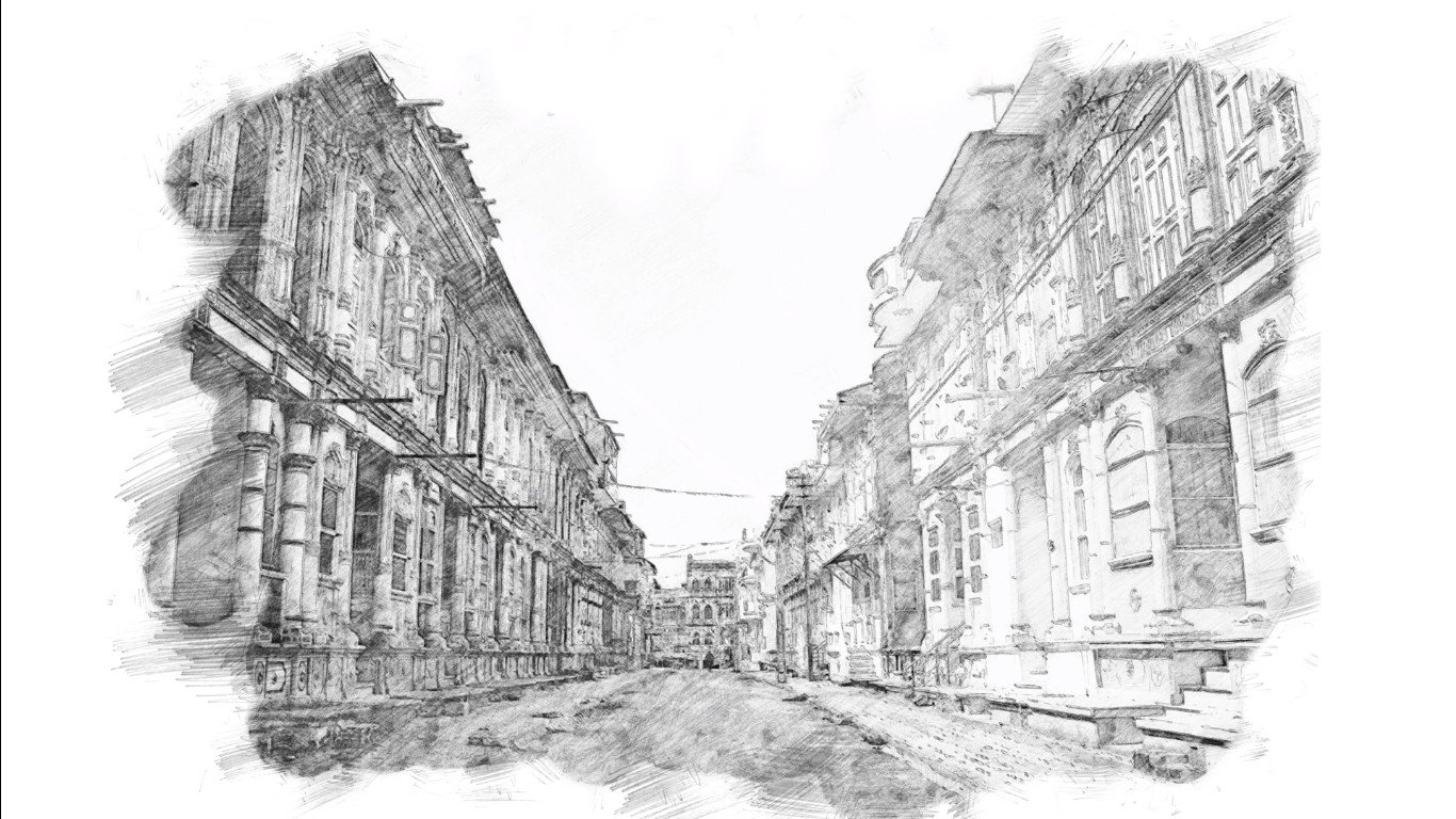
Artists often create the illusion of space through the use of perspective drawings.
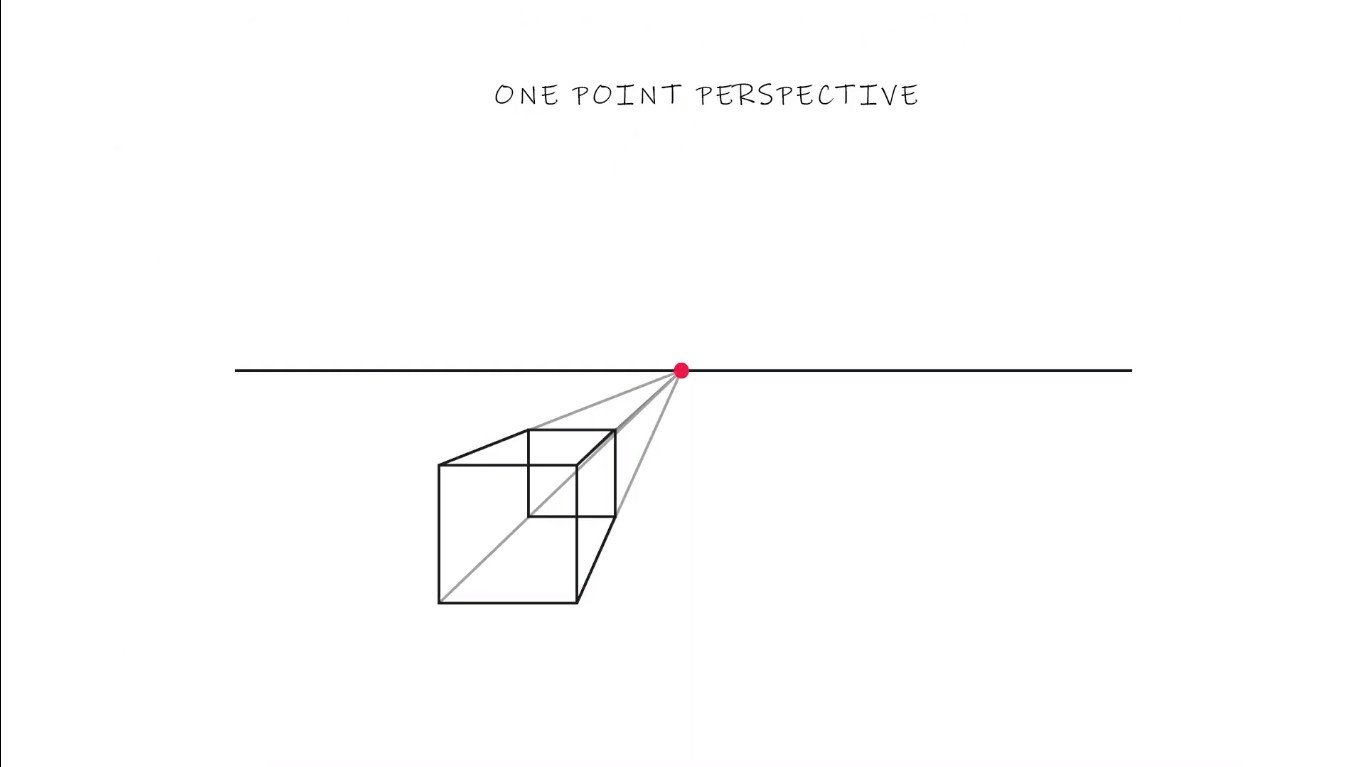
In art, we get one-point perspective,
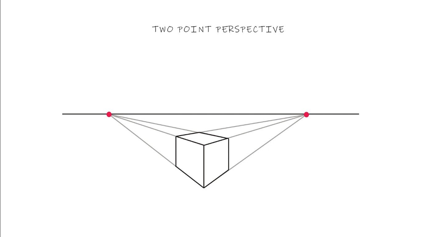
two-point perspective and
three-point perspective.

We create linear perspective with vanishing points and horizontal lines.
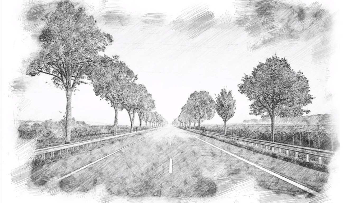

The Renaissance art movement is known for its dramatic shift in using space and depth.

With early work, using shallow depth and later works incorporating lots of depth.
Leonardo Da Vinci is known for using perspective drawings to create the illusion of depth in his work.
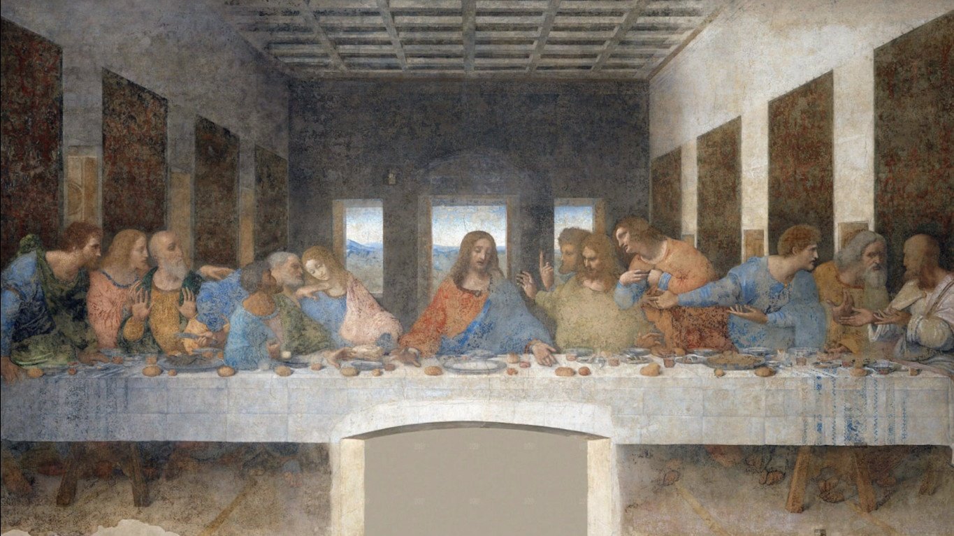
One of his most famous works is the Last Supper, where Christ’s head is the vanishing point.

When creating depth as an artist you also need to consider your layers. This includes your background, foreground and middle ground. But usually, you need a lot more layers to create an expansive sense of space.

When creating lush environments like this animation by a studio you can see that you end up using hundreds of layers.

Some other ways to describe how artists use space includes dense space, where we have very little white space.
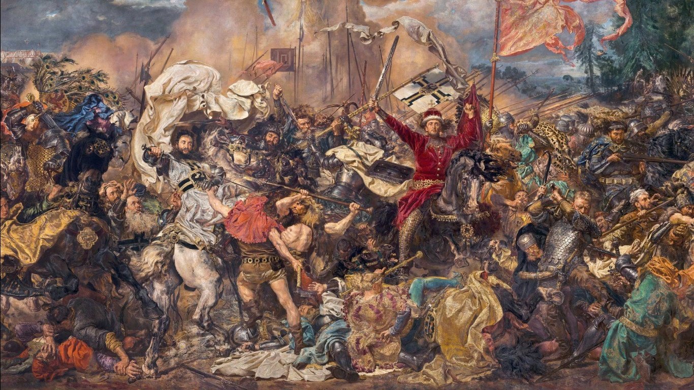
Open space with lots of breathing space in an artwork.

Cluttered space, can create a feeling of being trapped or overwhelmed.
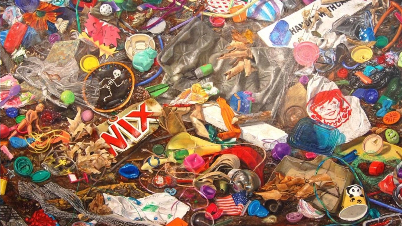
Symmetrical space, creating a feeling of balance.
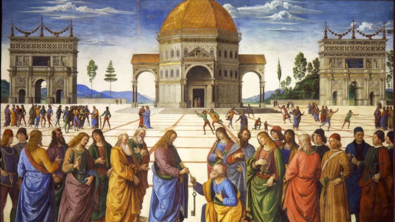
Shallow space that has very little depth
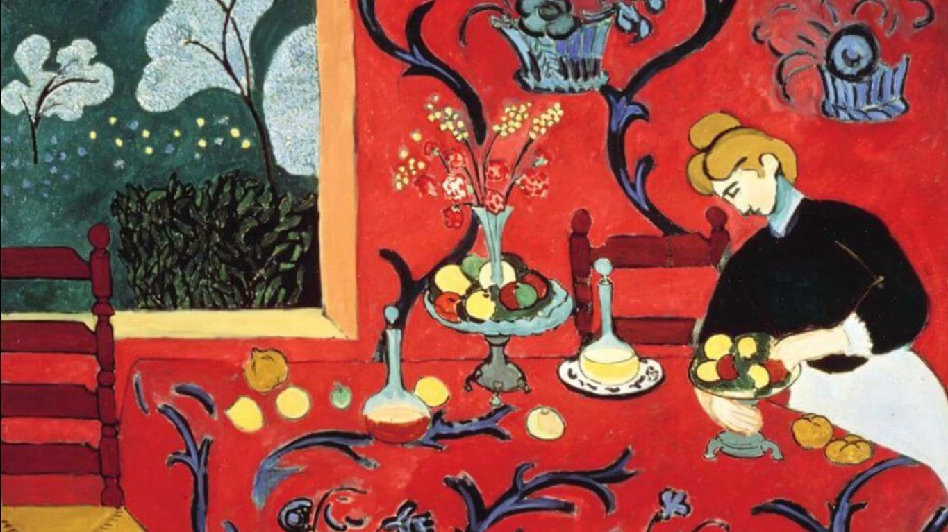
and flat space.

Next time you visit a gallery, and you are looking at a painting, photograph or sculpture, how would you describe the way artists approach space, what qualities do you see?
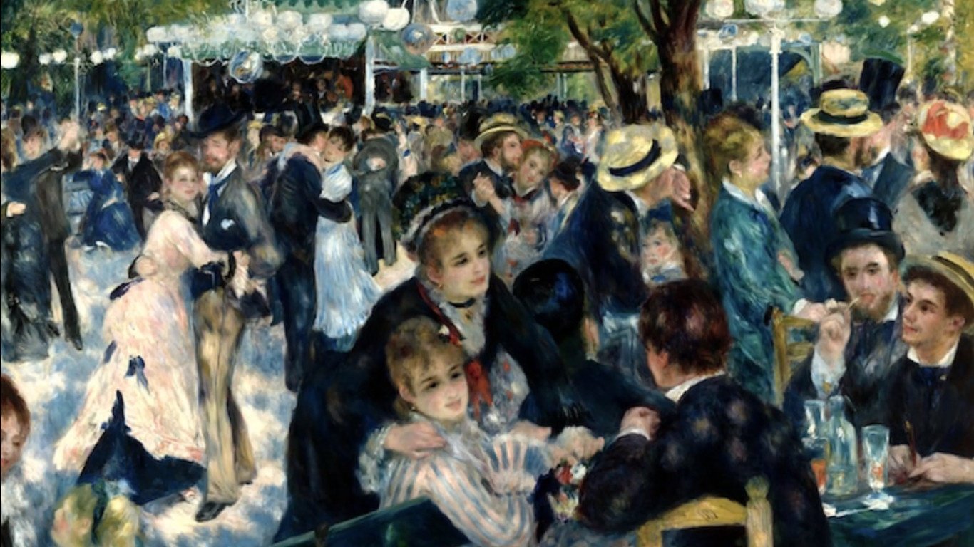
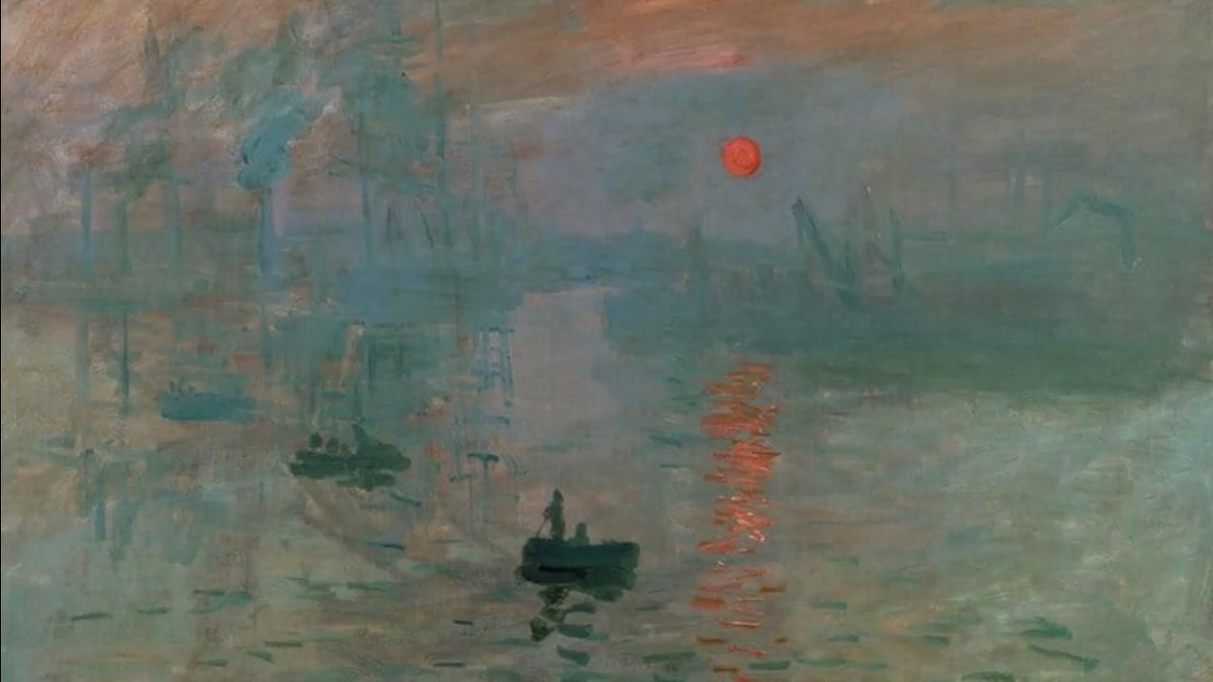
Now, let’ improve your art.
How can you create a better sense of depth in your artwork? Which techniques can you combine and which techniques do you need to practice to get better at it.

And that’s our lesson on space.
FREE online videos available on our YouTube video for each worksheet.

