Art History
Shepard Fairey: Who is the amazing and influential street artist ? 5 Artworks you should know about
Introduction
Shepard Fairey is an American contemporary street artist, graphic designer, activist, illustrator, and founder of OBEY Clothing who emerged from the skateboarding scene.
He is one of the best known and most influential street artists ever. He first became known for “Andre the Giant has a posse” stickers which later became Obey. He catapulted onto the world stage when he designed the Obama Hope Poster.
Let’s get to know Shepard Fairey and his art.
USA Skateboard Culture
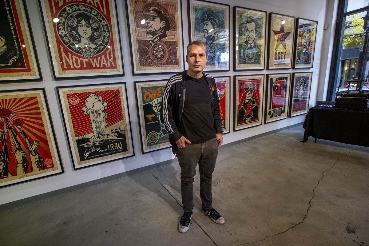
Shepard Fairey was born in 1970 and raised in Charleston, South Carolina, America. His father is a doctor, and his mother a real estate agent.
Shepard Fairey started skateboarding at the age 14. He worked in a skateboarding shop for additional income; he made T-shirts with various band logos and skateboarding brands on it.
Obey – Andre the Giant
One day a friend asked Shepard Fairey to teach him how to do a graffiti stencil. So they were paging through a magazine looking for some inspiration and Shepard saw a photo of Andre the Giant. Andre the Giant was this massive wrestler at the time. Shepard paused and said to his friend “Why don’t you do this?” And his friend was like “Nah?!” so Shepard decided to make a stencil of Andre and he kinda got obsessed with it. He spread Andre the giant stickers like wildfire all across the city. Now, why on earth would he do that?

Street Art Sticker Culture
Let’s just back track a bit so that I can explain graffiti culture to you. Graffiti artists take years to develop their style. You don’t just walk up to a wall and create a massive piece (Short for Masterpiece). It takes time to not only develop your skills, but also to develop your confidence. Remember graffiti is vandalism and a crime. So there is a lot of risk involved running around tagging a place. You could get arrested, receive serious fines and even spend some time in jail.
Usually street artists start developing their style and tag in their Black Book. That is like the street artist’s Bible. From there they start making stickers of their work. Why stickers? Because you can take all day making your stickers without the pressure of being caught.
Then once they are all done you can go out and do some sticker slapping. It’s easy to casually walk with a sticker in your hand and simply slap it on public objects. This makes it much harder for Police to catch you. If they do see you, you simply just show them your empty hand and say “that wasn’t me”. Many street artists live by the mantra “It’s only a crime if you get caught” so stickers are low risk.
Another attractive thing about stickers is that it is easy to make multiple copies. This is important because street artists value going ‘All City’. All City is when you bomb a specific city with your tag and brand and people start to notice you. Sticker bombing is usually what young street artists do to get noticed. They slap stickers all over a certain city to get their Graffiti name or up – which is slang for becoming known.
Obey Subculture
So this is what young Shepard Fairey was doing, he was going All City with his Andre the Giant has a Posse stencil and sticker. He started sneaking around at night and sticking them all over the place. He was so anti-authority he even defaced a Mayor’s large Campaign Billboard sticking Andre’s stencil over the major’s face. The Mayor was furious and Shepard was arrested and got into serious trouble but this didn’t deter his commitment to the message of the giant. Soon Andre the Giant went ‘all city’ and people started noticing it. It was like a subcultural secret handshake.
They began to appear all over Shepard Faireys hometown Providence in Rhode Island. By the end of the Nineties they were not all over America but also all over the world. The anti-brand has become a brand in itself.
Usually public spaces are reserved for advertising and government signage. Anything else is an anomaly. When we add something to the monotonous urban environment we make it memorable. Titan Sports Inc threatened Shepard Fairey with a lawsuit and forced him to stop using Andre the Giant as a trademark. Shepard Fairey just simply changed it. He stylised Andre more and added the word Obey.
The word Obey was inspired by a famous novel called 1984 written by George Orwell. The novel is about a Government controlling people. By adding the word Obey, Shepard wanted people to stop and think “What do they Obey?” He wanted to peak their curiosity. We are constantly bombarded by advertisements, political campaigns and the media, and they all want something from us. Are we following blindly, obeying? Or are we conscious about what we consume visually? The obey stickers are a call to consider Obedience. To reflect upon Obedience.
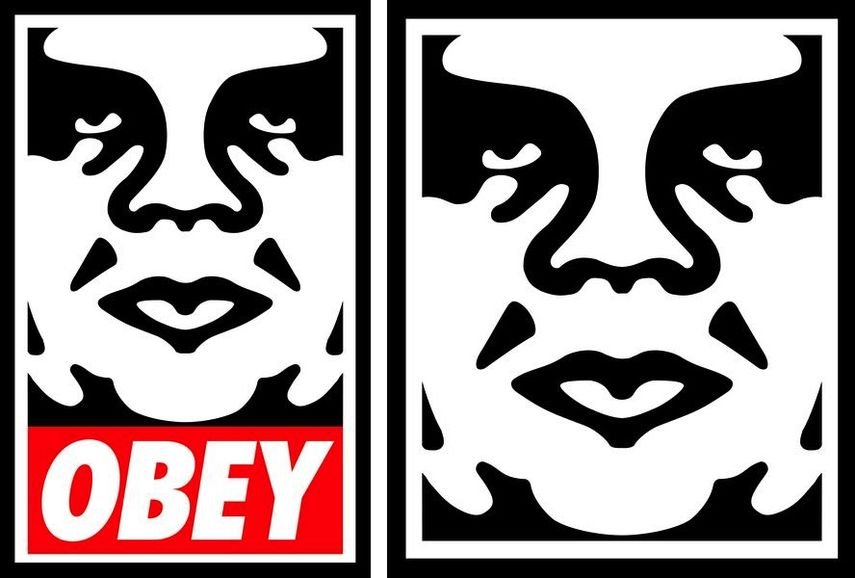
Obey had such a visual impact and cult following it eventually developed into Shepard Faireys own clothing brand with awesome hoodies and T-shirts.
Instrumental to the dramatic increase in the popularity of sticker culture in street art.
Developing a visual language
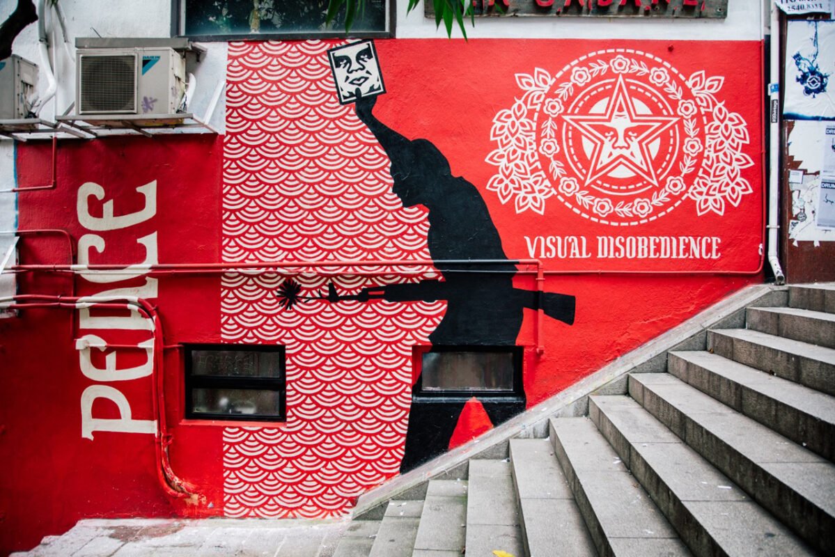
Shepard Fairey’s design and style has evolved throughout the years. One can recognise a Shepard Fairey artwork a mile away. Why is that? It’s because he uses a cohesive colour palette, motifs and symbols. Shepard draws from various sub genres, famous artists, and both communist and capitalist symbols. Let’s look at how he developed his own visual language and identity by combining all these elements.
- Punk Rock Music Graphics
- Skateboarding Graphics
- Pop Art
- Communism and Propaganda
- Americanism
- 1950’s
- Patterns and Mandalas
- Visible History and layers of street art
Punk Rock Music Graphics
In 1979 and early 80’s when Shepard Fairey was growing up a new movement hit the UK and spread to America. It was Punk Rock. Punk Rock started with band such as the Sex Pistols, Ramons and The Clash. It was music designed to provoke and it was anti establishment. At the time the youth of England felt very frustrated with rising unemployment, riots, race tensions, lack of transformation and the British system in general. This angry music created a community of outsiders and misfits.
Punk had a very specific fashion style and with it came a new style of graphic design. Album covers by designers such as Winston Smith for the The Dead Kennedys, Raymond Pettybone for Black Flag and Jamie Reed for the Sex Pistols influenced young Shepard Fairey. It had a Xeroxing feel to it, like someone made multiple photocopies of it. It used Ransom Note Style fonts with layers of collages reappropriating popular images. In Shepard Fairey’s work we see him borrowing the Xeroxing style, Ransom Fonts and re appropriation of images.
Skateboard Graphics
Another influence on Shepard Faireys work was skateboarding graphics. Because Shepard Fairey worked in a skateboarding shop and loved the sport himself, he was also influenced by artists such as Jim Phillips for Santa Cruz, Vernon Courtlandt Johnson for Powell Peralta and Pushead for Zoralac. You can see how Shepard Fairey’s style is also stylised like these skateboard graphics with its use of line quality.
Becoming a Designer
This graphic awareness of skate culture eventually led Shepard Fairey to really want to become an artist. He studied Graphic Design and Illustration at the Rhode Island School of Design. (RISD) This exposed him to a more formal art education. Shepard was particularly drawn to Pop Art.
Pop Art
He loved Andy Warhol’s love for repetition, Roy Lichtenstein’s bold line use and mimicking of printing methods, Jasper Johns use of letters and the American flag and Robert Rauschenberg’s collages combining accessible imagery with new meanings and context.
Communism & Propaganda
Shepard Fairey is also drawn to History and Politics. He was fascinated by the power of Propaganda. How visual images could move entire nations to believe in specific ideals. Examples of propaganda are Hitler’s Nazi Regime, Stalin’s Russia, South Africa’s Apartheid System, Uganda’s Idi Amin and The Peoples Rebulpic of China. Shepard was specifically influenced by communist China. In 1949 China was unified under supreme leader Mao Zedong.
Mao did this by launching an aggressive campaign depicting him as China’s saviour. Stalin also launched his 5 year plans with intense propaganda. Communist designs have a very specific visual language. It is usually predominantly red with some black and white. It often uses rays to focus the eye on a specific element or depict the magnificent glory of a leader or an idea. It combines images with bold type promoting a simple yet clear message. It also uses communist symbols such as the Sickle and Hammer and the 5 pointed Communist star, representing the five fingers of the workers hand.
Shepard Fairey was drawn to the power of propaganda. He was amazed that images could attract people’s hearts and ultimately change their minds. He started wondering if it could be used for good. Could Propaganda spread positive messages? Shepard Fairey is an America which is a Capitalist society and who has spent millions of dollars fighting Communism beliefs. It is Ironic that he uses communist propaganda’s visual imagery to speak to the American people. It is this jarring juxtapositioning that makes Shepard Faireys art so visually layered, complex and recognisable.
Most propaganda is saying this is the answer, this is the end of the conversation. My art is more about being the beginning of the conversation
Shepard Fairey
Iconography of America
Now that we know more about Communism symbols, let’s look at Capitalism’s symbols. The poster child for Capitalism has always been the United States of America. Every nation has symbols, and America has a lot of them. These include America’s National bird, the Bald Eagle, America’s National Flower, the Rose and America’s flag known as The Stars and Stripes. Other symbols include national icons such as the Liberty Bell, The Statue of Liberty and the Empire state building. Then there is the ideal known as The American Dream, that anyone can build their own riches and wealth by changing their stars with hard work.
Another strong American symbol is Uncle Sam, an old man who dresses in the American Flag colours and symbolizes the U.S. Government. Uncle Sam is commonly used in political cartoons, as well as in advertising. Perhaps the best-known image of Uncle Sam was as a recruiting tool for the U.S. Army during World War I. A poster by artist James Montgomery Flagg, shows a stern Uncle Sam pointing at the viewer over the caption: “I Want YOU for the U.S. Army.”
Shepard uses all these American Images in his artworks to represent Western Ideals.
Combining Americanism and Communism
He combines these Americanisms and Communist symbols in contrasting ways. Both ideologies use stars, America in their flag, representing the states. Communism uses the star to represent the working class. Both Communism and America also love using the colour red. Shepard Fairey uses a cohesive colour palette. Using the colours of the American flag but also using the cream that harks back to communism propaganda posters.
The good old days and the dualism of life
You must have heard your grandma or grandpa talk about the Good Old Days? Well what are they talking about? Usually they are referring to the 50’s when the economy was booming in America after World War II. It was a time known for the golden generation called the Baby Boomers.
The media and advertisements promoted traditional family values and ideals. These 50’s advertisements had a certain vintage style to them, specific uses of fonts, and imagery all depicting the perfect society or selling the next incredible life changing product. However all that glitters ain’t always gold. These good old days certainly weren’t great for all members of society. While some people lived in luxury on the top of the pyramid others enjoyed less freedom.
Shepard Fairey uses a lot of the signwriting fonts from the 50’s in his artworks. Posing his designs as if it is an advert from a bygone era. He uses the imagery and style to no only depict a one sided story but also show the flip side. It poses the questions whether an idea, belief or product truly is wholesome and nourishing for society. Everything has a dark side and a light side. A side to be celebrated and a side to be cautious of. Shepard Fairey loves playing with this in his work. Often asking what is our luxury and convenience built on?
Use of patterns and mandalas
He also uses repeating patterns in his work, often complex floral designs that reminds us of homey wallpaper designs. He also uses the Mandalas as a repeating circle pattern. Mandalas are geometric circle designs used in various Eastern Religions. They represent a sacred calm serene space to help people enter a state of meditation. If you look closely at Shepard Fairey’s mandalas they are made up of guns and hand grenades and represent anything but peace and serenity, another visual contradiction.
Matter has memory
A concept that we often see is Shepard’s work is the idea that matter has memory. Street art is temporary and not eternal. People are constantly tagging over others’ works, buildings change, new art goes up and this all creates layers and layers on walls. The history of what the wall, building or art has gone through is visible. Since Shepard Fairey started as a street artist bombing all over the place, he likes to incorporate this aspect of street art into all his artworks, regardless if it is a large mural, a poster or a canvas print. He creates the illusion of layers. Simulating a history to the artwork.
Mediums
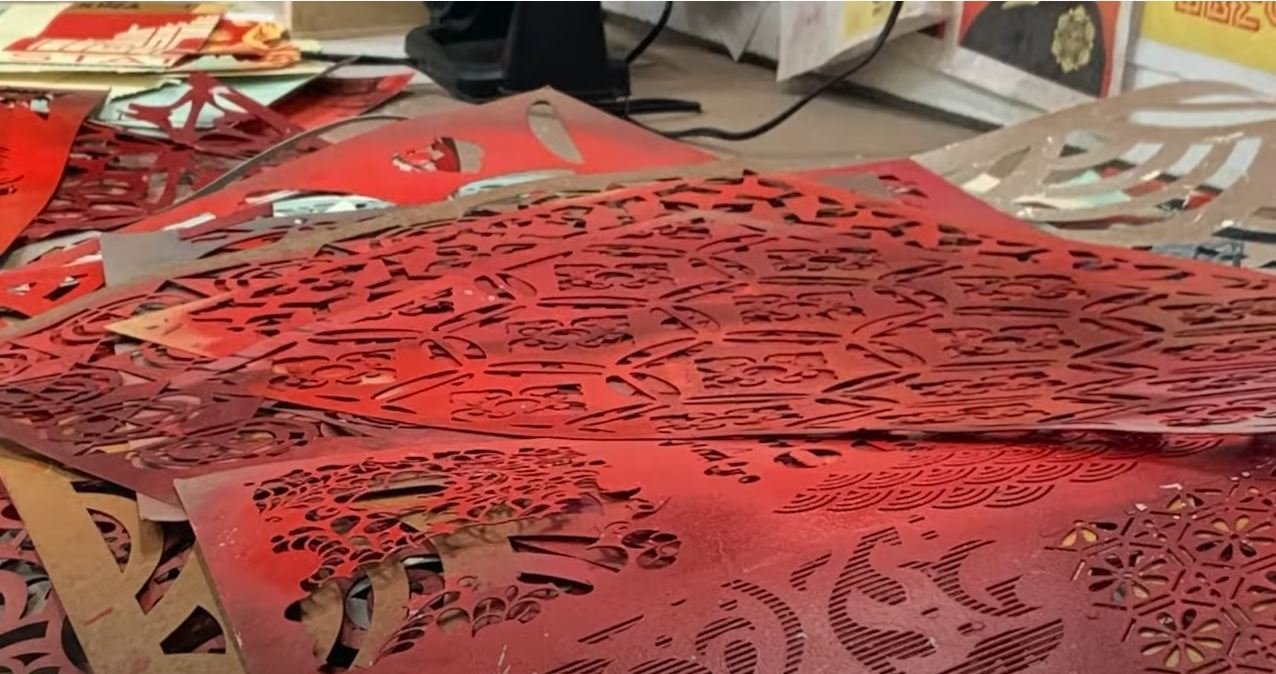
Shepard Fairey combines all these influences and ideas using various mediums. He incorporates photography, collages, Illustrations, screen printing, rubylith, stickers and wheatpastes. He works on wood, concrete, metal and canvas. He merges all aspects of design and art that he loves to create his own unique style. Now that we understand his influence and inspirations let’s look at his art career.
Reaching a larger audience
As Shepard Faireys designs and art created tracktion he started going bigger and bigger with his art, making larger murals to grab people’s attention. This has often gotten him into trouble. Throughout his career he has been arrested more than 18 times, but he just wouldn’t stop. He stayed committed to his message.
He believes that street art breaks through the clutter of the urban environment and makes people stop, observe and think. He believes a visual image is so powerful that it can hit someone in the gut, touch their hearts and ultimately change their minds. It is the anti-advertisement.
A picture is a thing that hits a viewer in the gut, makes their head follow their heart. It is such an important concept in my work. Even if they don’t agree with it, the image will haunt you and cause them to mull it over –
SHEPARD FAIREY
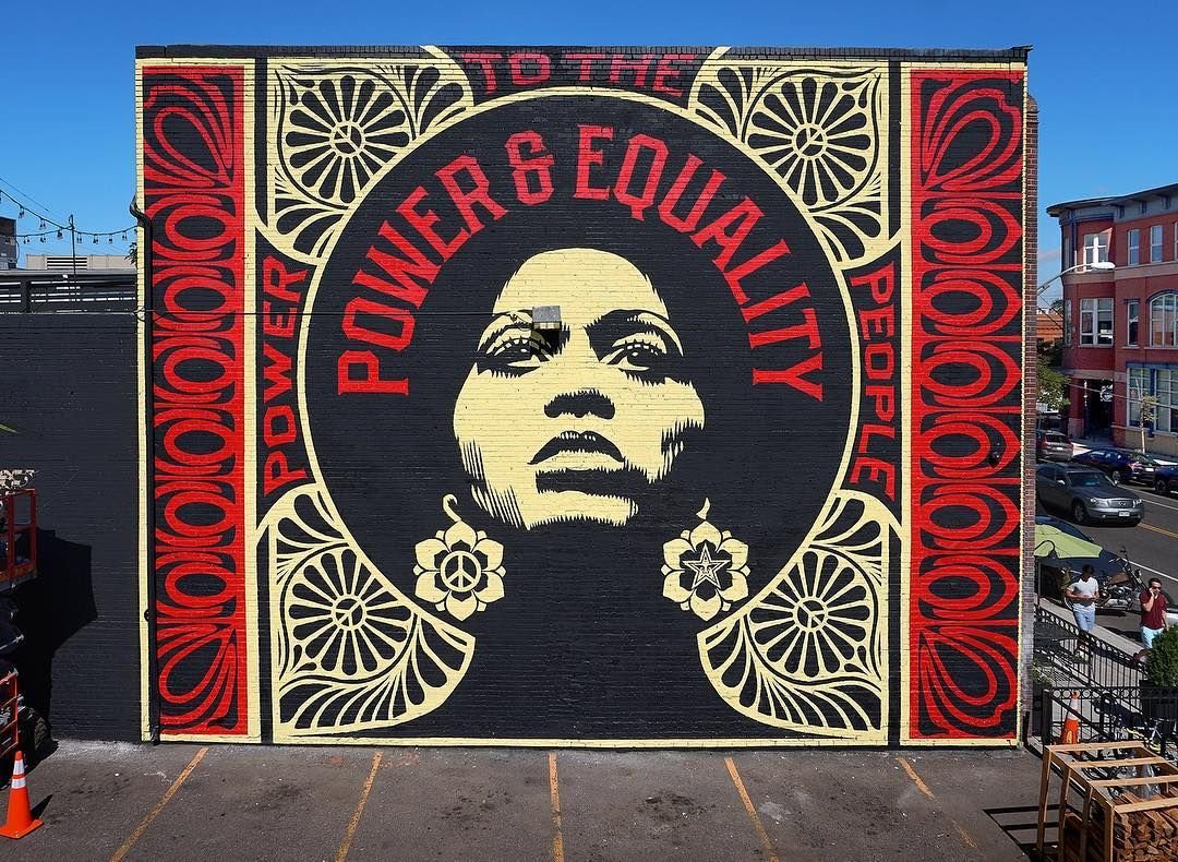
I consider myself a populist artist, I want to reach people through as many different platforms as possible. Street art is a bureaucracy-free way of reaching people, but T-shirts, stickers, commercial jobs, the Internet – there are so many different ways that I use to put my work in front of people.
SHEPARD FAIREY
Owning a design studio and being a creative director
Shepard Fairey is a qualified Graphic Designer. He has been a founding member of a design studio, BLK/MRKT Inc. which specialised in guerrilla marketing, and the development of high-impact marketing campaigns. Clients included Pepsi, Hasbro and Netscape.
In 2003 he founded the Studio Number One design agency with his wife Amanda Fairey. The agency produced the cover work for The Black Eyed Peas’ album Monkey Business and the poster for the film Walk the Line. Fairey has also designed various album covers for bands such as The Smashing Pumpkins‘ album Zeitgeist, Flogging Molly‘s Whiskey on a Sunday, Led Zeppelin‘s compilation Mothership and Anthrax‘s The Greater Of Two Evils.
In 2006, Fairey joined NYC based Ad agency Project 2050 as founding Creative Director and Shepard developed creative work for Virgin Mega Store and Boost Mobile. Because of all of his graphic design for major brands some people view him as a sell out from his original street culture roots. However it is important to remember that he did study graphic design and marketing and this is what he was trained for. It is also important to consider that Shepard Fairey does a lot of humanitarian work and a lot of the money he earned from working with big brands he uses to fund charities of his choice.
Anti-establishment Anti Bush
While doing commercial work Shepard Fairey has always made political art with a rebellious streak, opposing authority. He was particularly against president Bush in America and the Iraq war. He made a series of posters anti-Bush to expose his corruption and falsehood. One was that Bush had oil investments in Iraq and was benefiting personally from America’s war on Iraq. Shepard Fairey tried to expose Bush’s hidden agendas in his art with all his designs. However, President Bush was re-elected. This felt really demotivating to Shepard Fairey.

Creating the Barack Obama Hope Poster
In 2007 when Barack Obama announced his candidacy it sparked Shepard Fairey’s interest. This time he decided to change his tactics. Instead of breaking down a bad leader maybe he needed to help promote the good leaders? Barack Obama seems like the opposite of what Bush represented. He was pro saving the planet, wanted to establish health care for all Americans and wanted to change education and immigration policies in America. Shepard Fairey designed a sticker and poster with Obama’s face in America’s flag colours. Obama is seen looking towards the future as a competent leader. He printed 300 000 posters and half a million stickers and started as a grassroots activist movement.
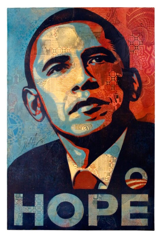
A lot of people feel like spectators in Democracy. They don’t feel like they have the power to make a difference. The more people participate in a democracy the better it works.
SHEPARD FAIREY
He also posted a blog post asking people to do their own research and make up their own mind if they wanted to support Obama… AND IT WENT VIRAL.
Eventually Barack Obama become the first black president of America. In February 2008, Fairey received a letter of thanks from Obama for his contribution to the campaign.
This launched Shepard Fairey and his art onto the global stage.
Addressing Global Issues
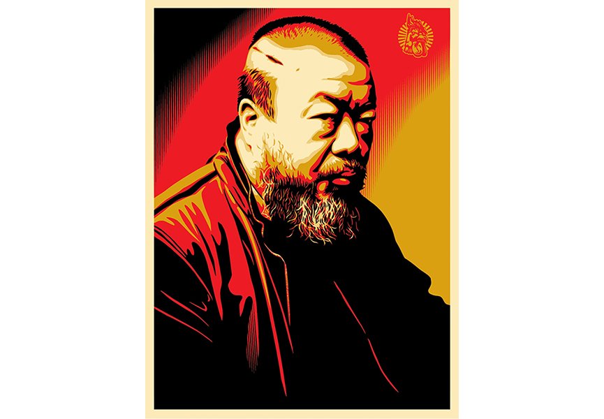
This world recognition has also caused Shepard Fairey to focus on more global issues and not just issues pertaining to American Politics. These included Burma’s fight for democracy, Terrorist attacks in France, the arrest of Chinese Artist Ai Weiwei and most recently the Black Lives Matter Movement.
Great art lets the world feel a little bit less terrifying. It makes things feel a little bit more intertwined
SHEPARD FAIREY
Public Space vs Gallery Space
Shepard Fairey has moved from a small subculture, the punk rock skateboarding community, to being in prominent galleries with crowds of people flocking to see his work. This is ironic because, for so long the elite artworld did not regard street art as high art. Street art has often been scoffed at by curators and art critics. However the rise of Street Art has been rapid and streets have become large global art galleries, filled with independent public art, free from the confines of an establishment. It is this freedom that street artists revel in.
Since shepard often exhibits in galleries some people call him a sell out, conforming to the high art establishment. However Shepard sees this differently. He calls it an inside-out strategy. A way to infiltrate the system and ultimately change it.
However he stays true to his roots often doing large public installations with a gallery exhibition. The kind of person that visits a high end gallery is usually very different to the large public and Shephard wants his message to reach as many people as possible. Public art has a much bigger reach than a gallery ever will. It has more potential to change public opinion on a matter.
I am making work that may or may not inspire someone to reconsider their position on something. But if I don’t put it out there in the public it will have less of a chance of impacting someone.
SHEPARD FAIREY
A Famous Graphic Designer and Illustrator
Now enjoying a lot of attention and respect, Time Magazine has commissioned Fairey twice to design their cover. Once in 2008 for Person of the Year, with Barack Obama and again in 2011 to honour The Protester.
5 Artworks by Shepard Fairey you should know
Here are 5 other Shepard Fairey artworks you should know.
1. The Mandela mural – 2014
In 2014, Fairey painted a towering mural, 9 stories high, paying tribute to Nelson Mandela and the 25th anniversary of the Purple Rain Protest. In this protest, the police were using a new water cannon with a purple dye whose purpose was to stain protesters for later identification and arrest. Protesters were warned to disperse but instead knelt in the street.
When the cannon was turned on them, some protesters remained kneeling while others fled; some had their feet knocked out from under them by the force of the jet. On the Parade, a large contingent of policemen arrested everyone they could find who had purple dye on them.
It is a public artwork on Juta Street in Braamfontein, Johannesburg, overlooking the Nelson Mandela Bridge. The mural is Fairey’s first work in Africa and is seen by many as a sequel to the iconic Barack Obama HOPE poster.

2. Marianne – 2015
In November 2015 Paris suffered from a series of terrorist attacks executed by suicide bombers. A lot of civilians died and suffered attending a football match, a rock concert and by sitting in cafes and restaurants. The attacks were the deadliest in France since the Second World War.
As a tribute to the victims, Fairey created a poster representing Marianne, the French national icon, surrounded by the national motto Liberté, égalité, fraternité (Liberty, equality, fraternity) In June 2016, this design was painted as a mural on 186 rue Nationale, Paris. Fairey made a gift of the poster to Emmanuel Macron, who hung it in his office upon assuming the presidency of France.

3. We the People series – 2016
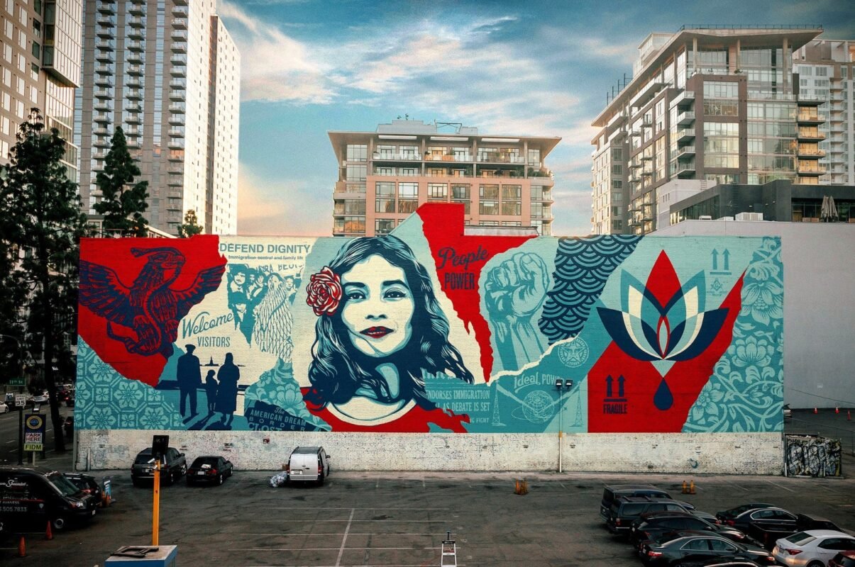
This series was made during the 2016 presidential campaign as a protest against racism. This work aims to promote gender equality and fights discrimination against minorities. This work stands out to many as it provokes people to respect their common humanity. The title of the work comes from a line in the American Constitution and features portraits of Native Americans, African Americans, Muslims, and Latinas, aiming to defend their dignity.
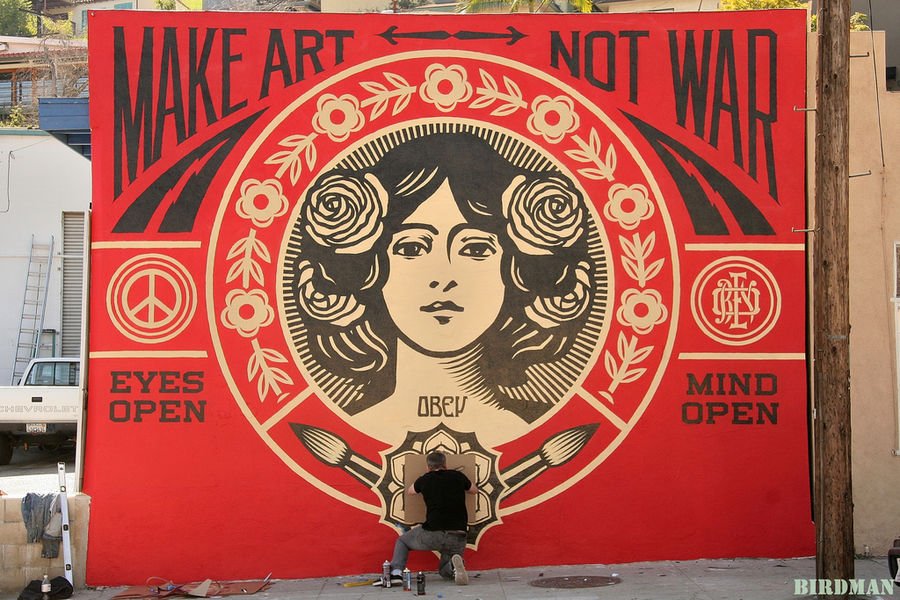
4. Make Art Not War – 2013
In February 2013, Fairey painted Make Art, Not War. The mural is a large-scale version of one of Fairey’s most popular works, an anti-war print originally created during the Iraq War. The title is a play on the famous 1960s anti-war slogan, “Make love, not war.” There is a repetition of colour that includes the black and red cartoon-like style with repetition of symbols such as roses.
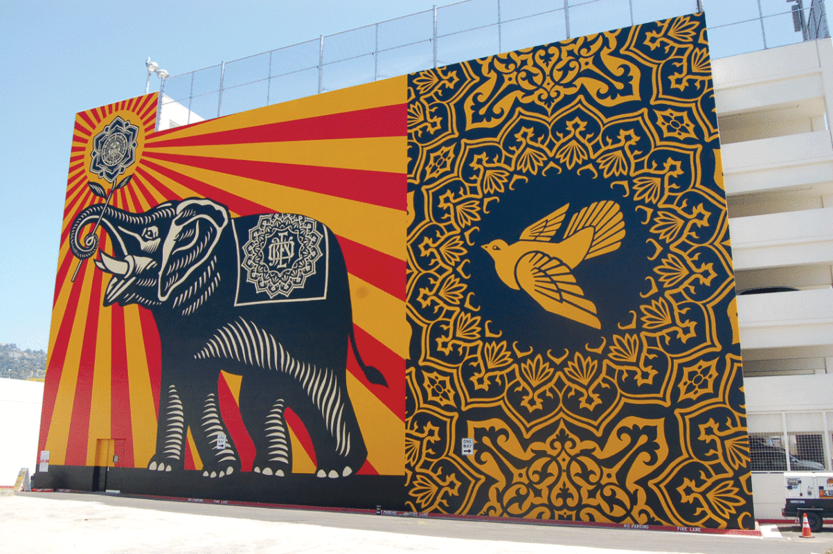
3. Peace Elephant – 2011
Peace Elephant located in Los Angeles. The enormous artwork measures 106 feet, 32 meter long and features a large elephant holding a flower from which red and gold rays of sun emanate. A large dove also figures in the piece.
When asked why an elephant? The artist answered: The core values of West Hollywood were something I did research on. I wanted the work to be appropriate for the philosophy of the city. Peace, freedom, creativity, tolerance. Peace is the central theme of the mural, an elephant holding a flower is a pro-peace image.
Conclusion
Now you have a much deeper understanding of Shepard Fairey’s artwork. He has been instrumental in shaping street art culture. Popularising stickers but also in spreading political ideas to the mass public and ultimately across the globe.
His art is an act of defiance. A questioning of authority. He has successfully transformed his views into visual masterpieces. Calling the public’s attention to social taboos and exposing political oppression in creative ways.
He explains that
The real message behind most of my work is to ‘question everything’.
SHEPARD FAIREY
He gives the public something to dream about, something to reflect upon, something to escape to and something to engage with. Fairey’s artwork is intimate, powerful, passionate, full of energy and controversial. Yet remains accessible to the larger public.
It is political activism that triggers both astonishment and contemplation. He seems to have hit an artistic sweet spot combining exceptional skill with concept and message. It is art that does not simply ask us to view it and admires its skill, but calls us to social and political action. He has shown us that every single action can make a difference, even if it is just a small sticker.
Anything that stirs the debate has value.
SHEPARD FAIREY
BUY OUR SHEPARD FAIREY WORKSHEETS
Worksheet pack that includes notes and fun activities. Ideal for art students and history students to learn more about Shepard Fairey

