The 7 Elements of Art
The 7 Elements of Art: Colour
Feb
Watch this lesson for free on our YouTube channel
Free Lesson on the 7 Elements of Art by artist Lillian Gray
This is a video and blog series teaching the 7 Elements of Art in an easy-to-understand way. The series consists of 7 lessons presented by artist Lillian Gray.
Today’s lesson is all about colour. Have you ever felt overwhelmed by colour?

Do you keep on mixing muddy dirty colours, and you generally just feel lost?

Do you ever wonder how some artists seem to just have it? They always come up with the perfect colour combinations and it just works every time.

Well, it is not just art it is science and we call it colour theory.

In this video I’m not just going to show you the colour wheel but teach you how to use it.

We will also cover basic colour formulas, known as colour harmonies or colour schemes.
These will help you to choose colour combinations that are appealing and cohesive.
First things first. You need to know that there are various colour wheels and, depending on the discipline that you are busy with, there are different colour wheels.
These colour wheels are important but, we’ll talk about them in a different video.

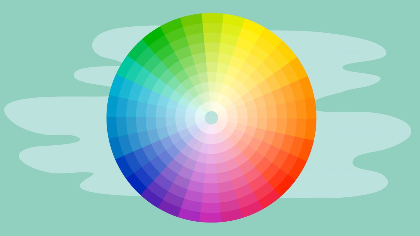
This video will be focusing on the traditional colour wheel developed by Isaac Newton.
It is still our best resource for understanding colour harmony and, how colours work together to create beautiful artworks.
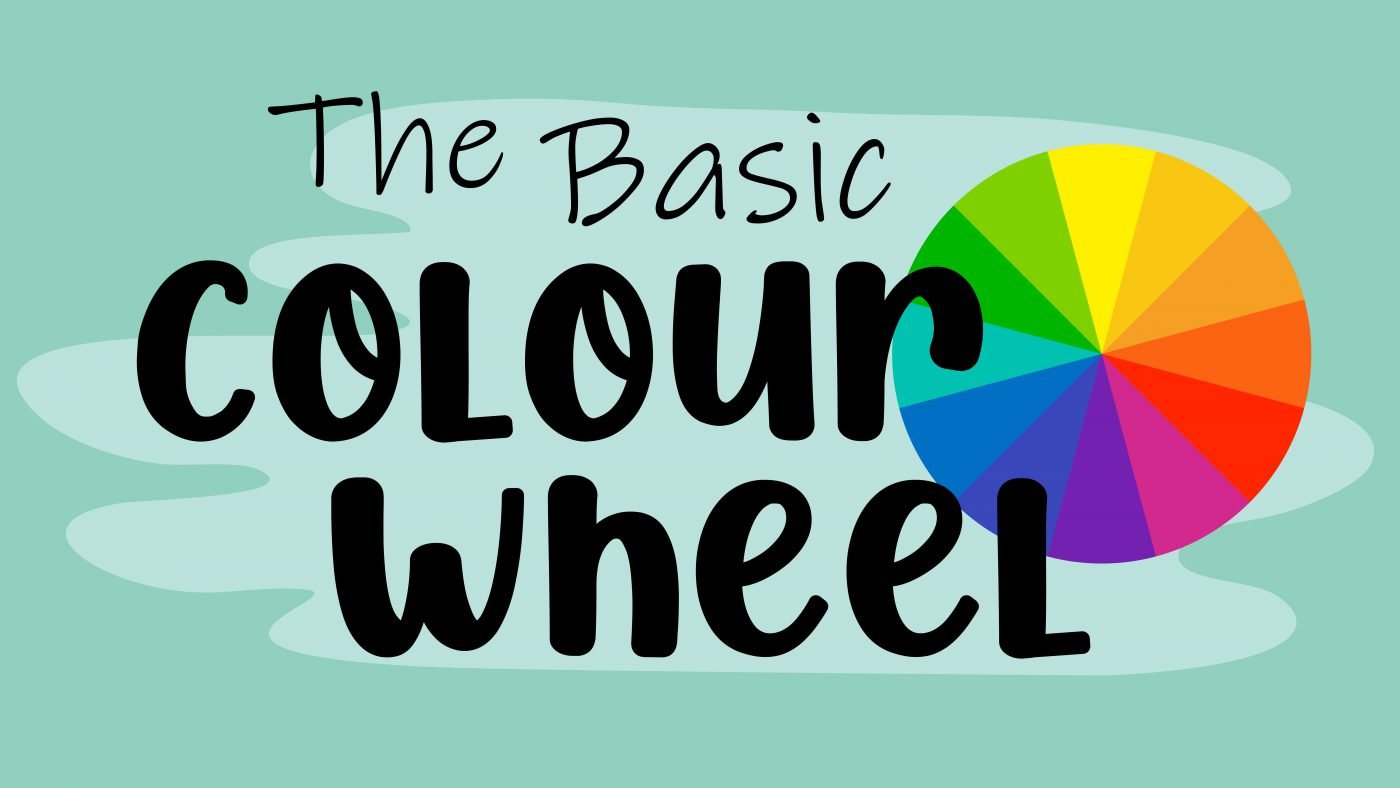
Our wheel uses 12 main colours, but we can also work with all the colours in between.
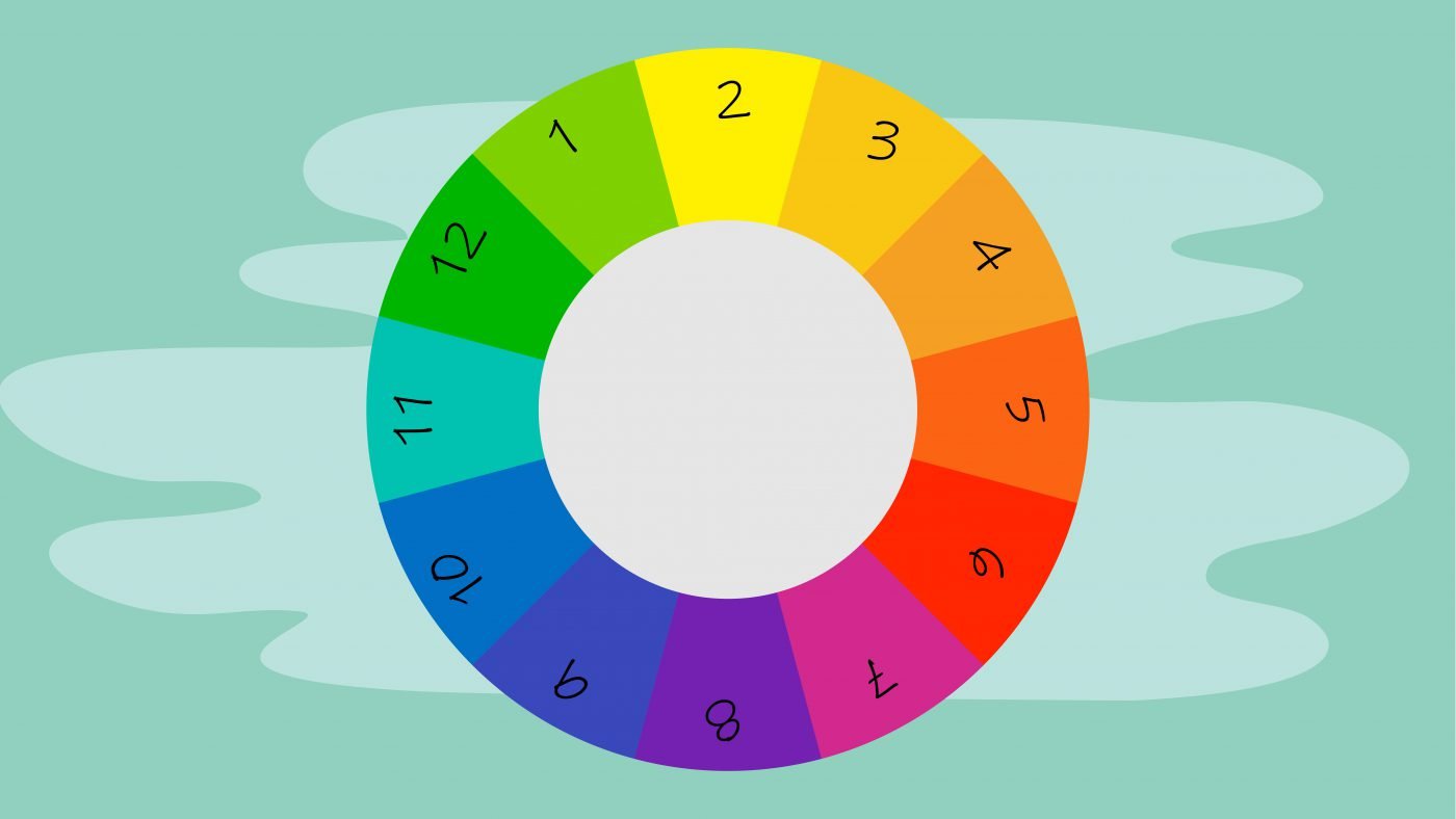
Let’s start with a basic colour wheel.
You need to understand the colour wheel so that you can empower yourself to properly, mix colours and to choose different cohesive colour palettes.

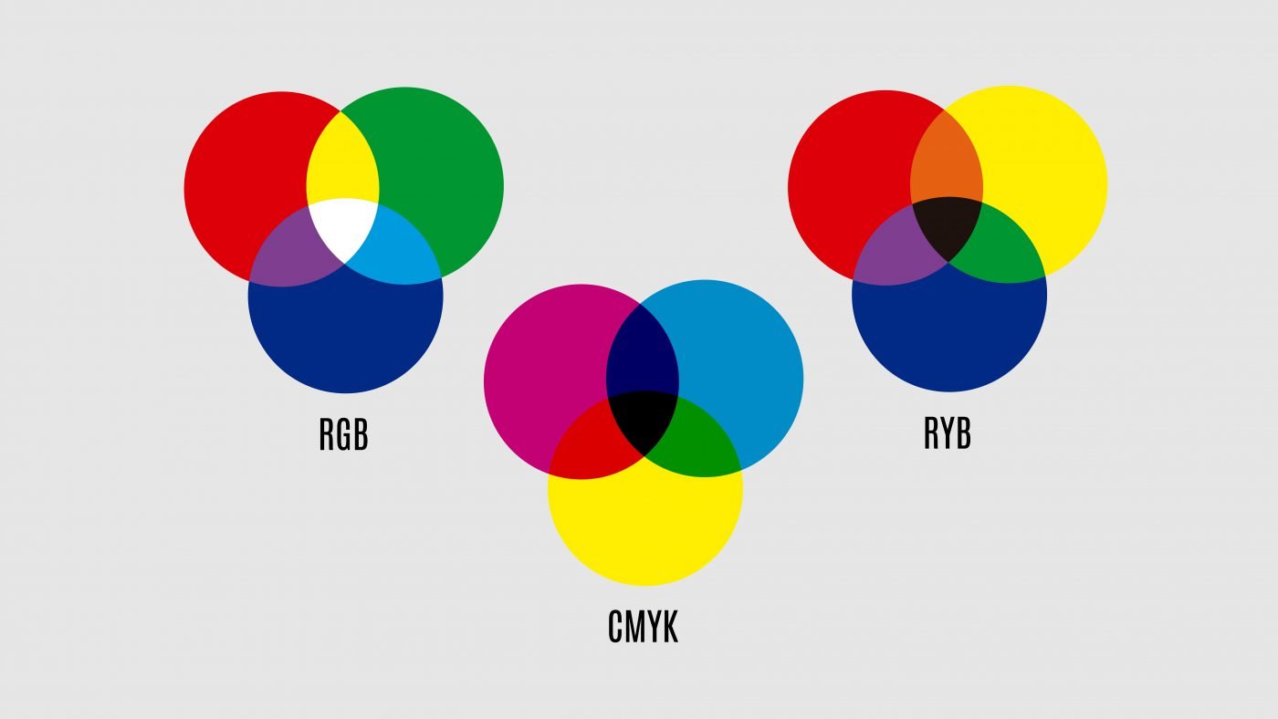
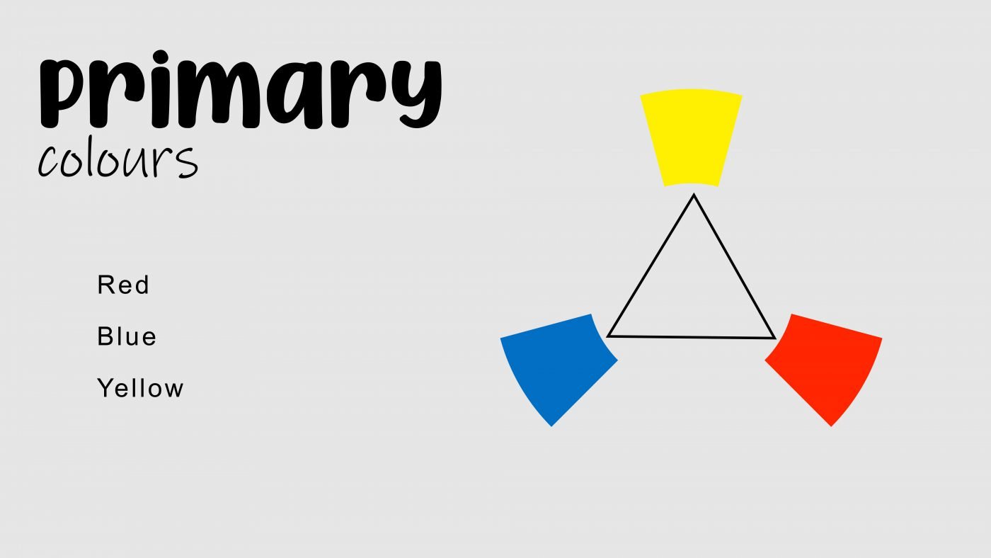
All you need to start, are the three primary colours, red, blue and yellow. All other colours can be created by mixing these in different ways.
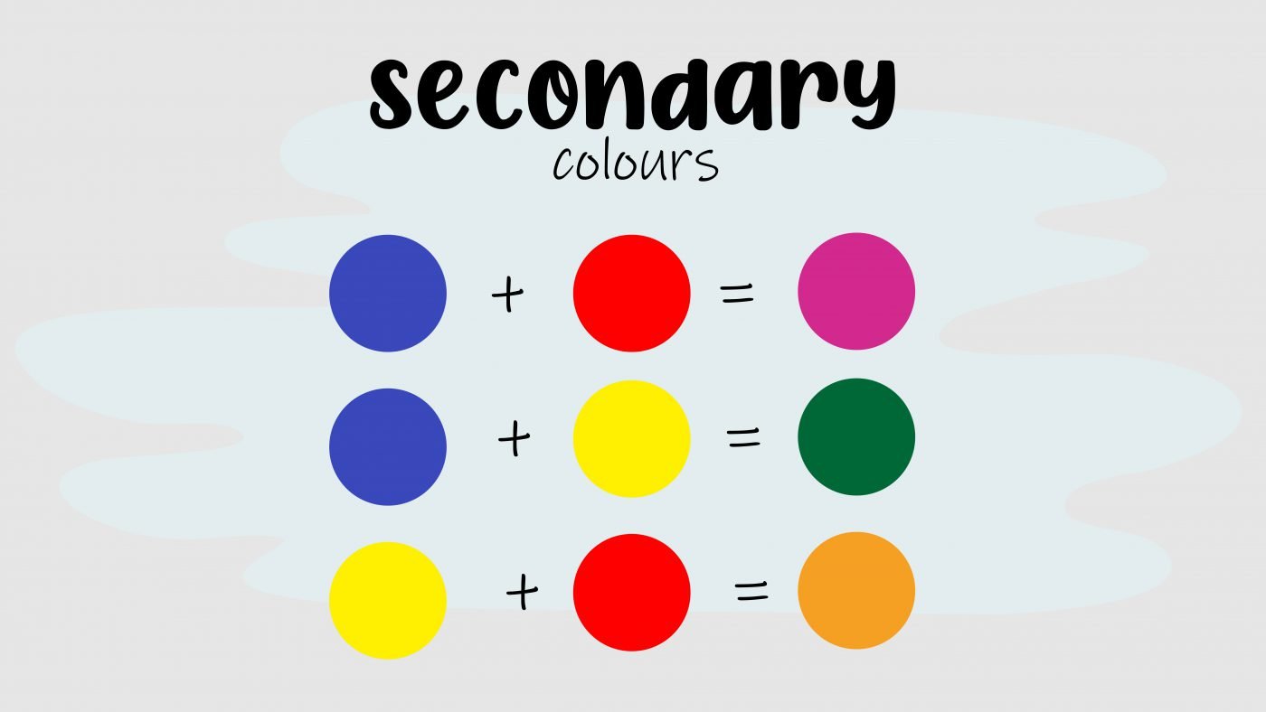
The secondary colours, purple, green and orange are created by mixing primary colours.

Red and blue make purple, blue and yellow make green and yellow and red make orange.
Tertiary colours are created by mixing a primary colour with a secondary colour.
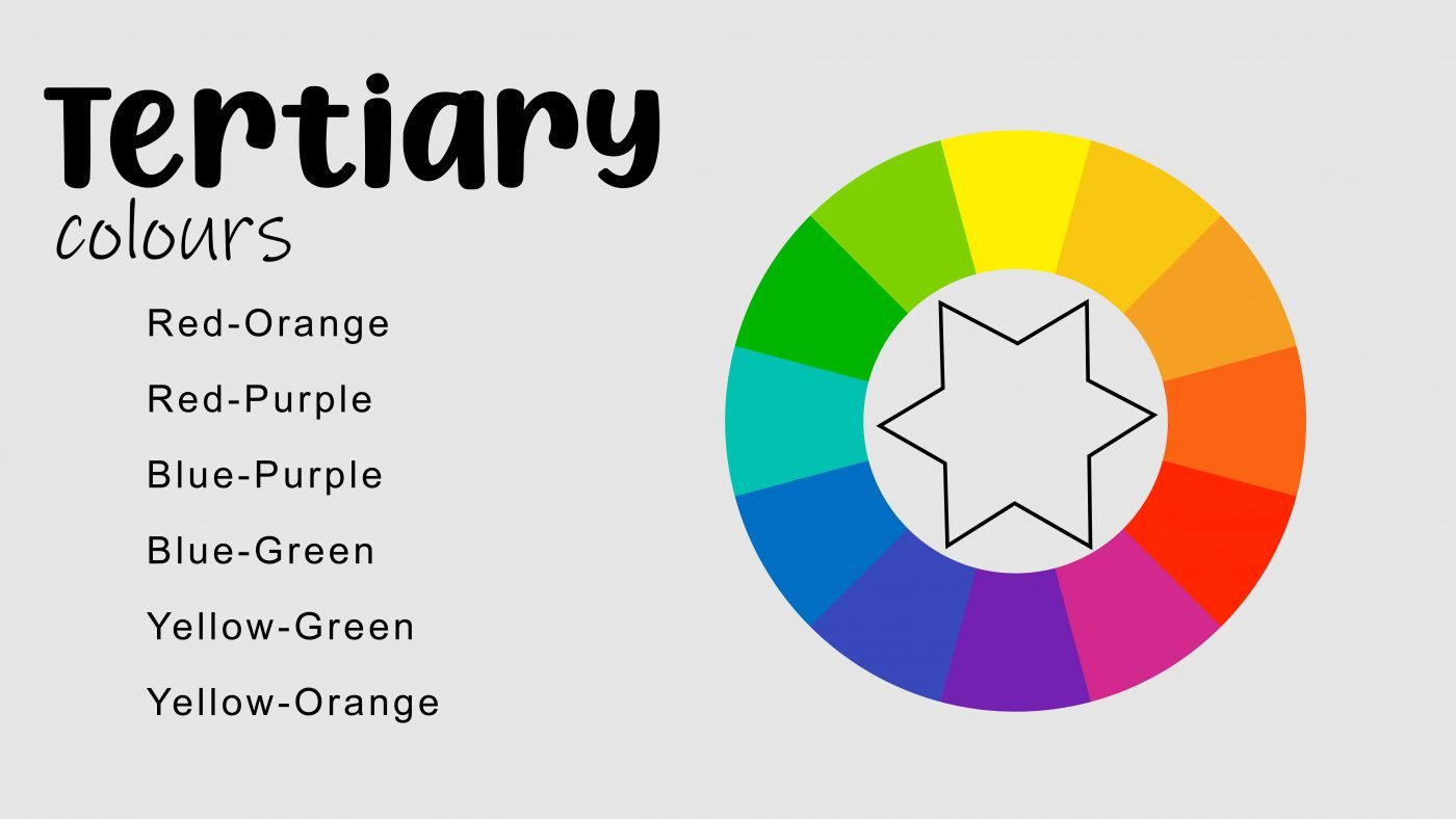
These are red-orange, red-purple, blue-purple, blue-green, yellow-green and yellow-orange.
Now we have a basic colour wheel.
To recap, you start with the primaries, mix those to create secondaries, and then mix one of each to create tertiaries.

Let’s move on to colour vocabulary.

We need to cover some basic terms to help you understand and to empower you to talk about colour theory.
A hue is just a fancy way of talking about colour, it is simply the name of the colour like red. blue, green, yellow and orange. Those are all hues.

Saturation refers to the intensity or purity of a colour and can also be called chroma. This tells us how vibrant a colour is.
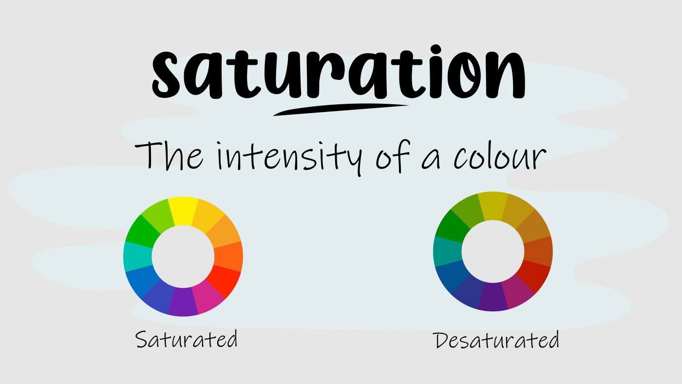
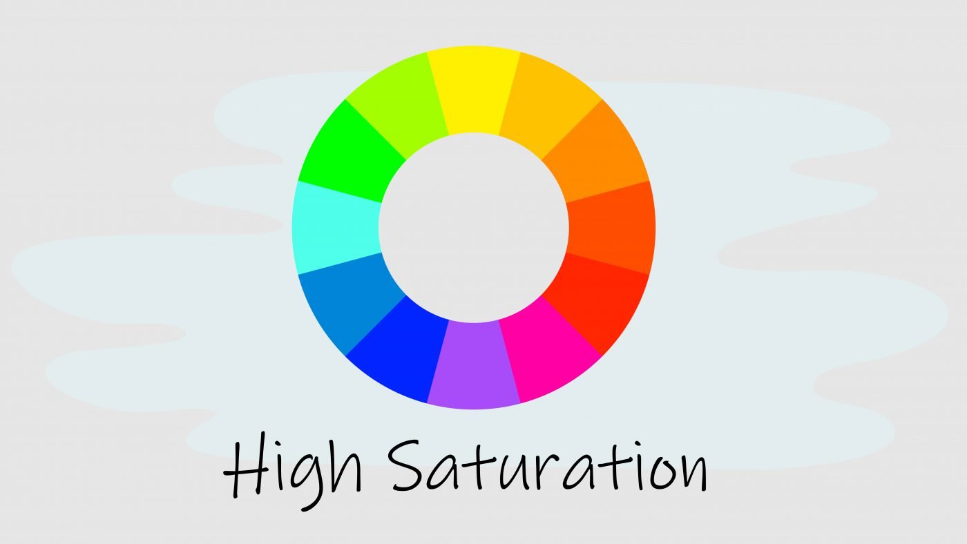
High saturation means the colour is very bright.
Desaturation means the colour looks washed out and greyed out.

Value refers to the degree of lightness or darkness of a colour. This value scale shows you a full range of values.

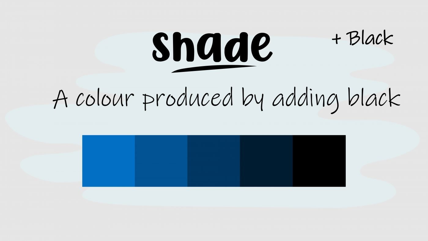
A shade is a hue, produced by adding black. Here you have a variety of shades of blue, made by mixing the blue with increasing amounts of black.
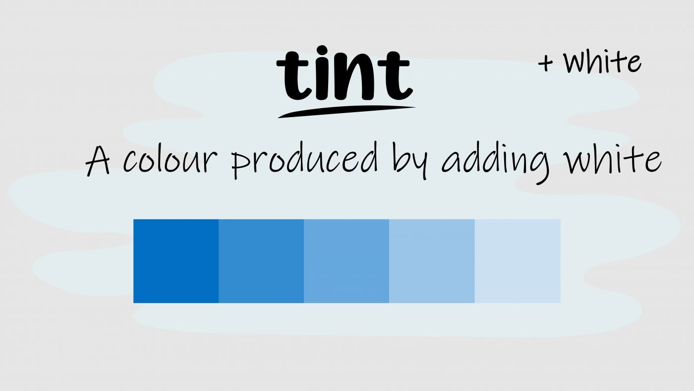
A tint is a colour produced by adding white, now you have a variety of blue tints, made by mixing the blue with increasing amounts of white.
A tone is a colour produced by adding grey, now you have a variety of blue tones made by mixing blue with increasing amounts of grey.

The colour wheel can be split into two main groups: warm colours and cool colours.
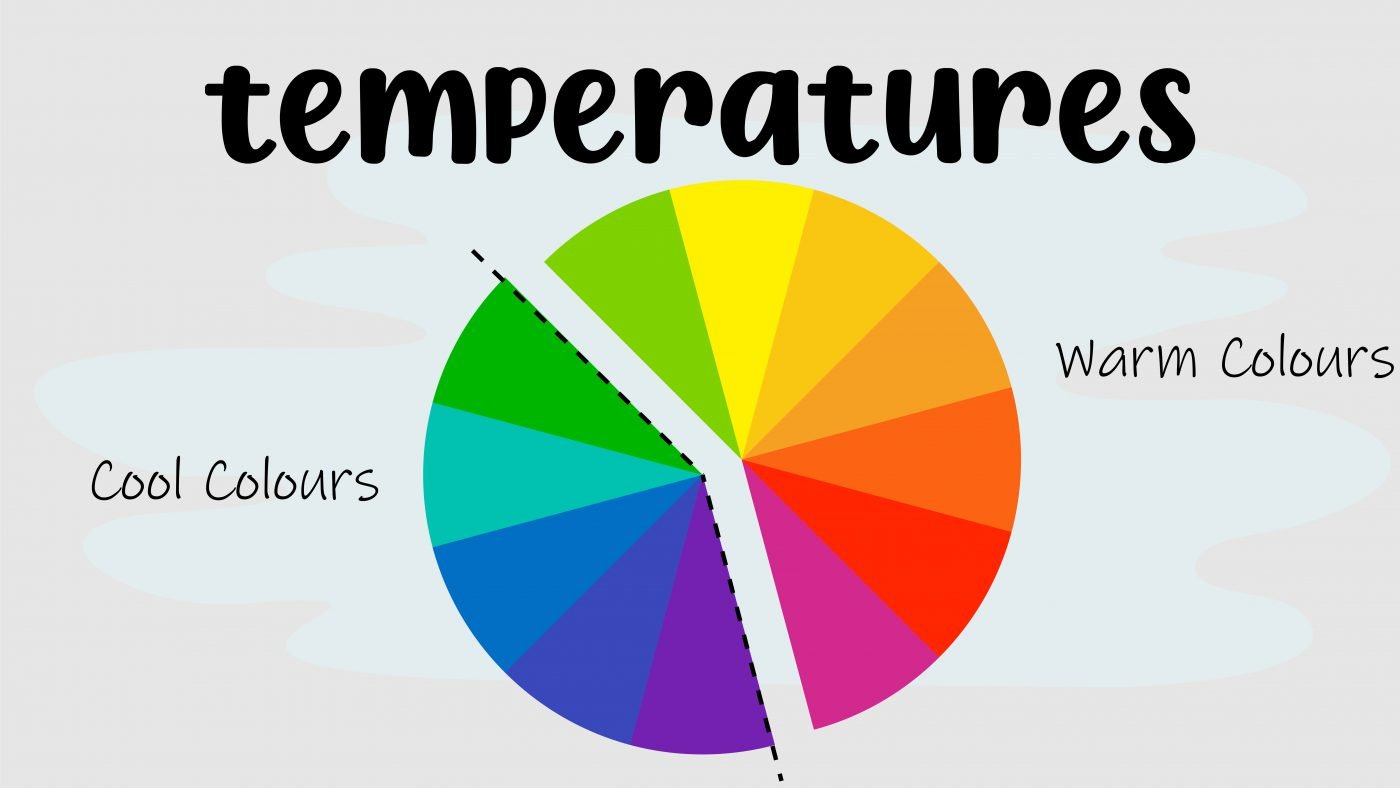
When artists talk about warm colours, they usually mean reds, oranges and yellows.

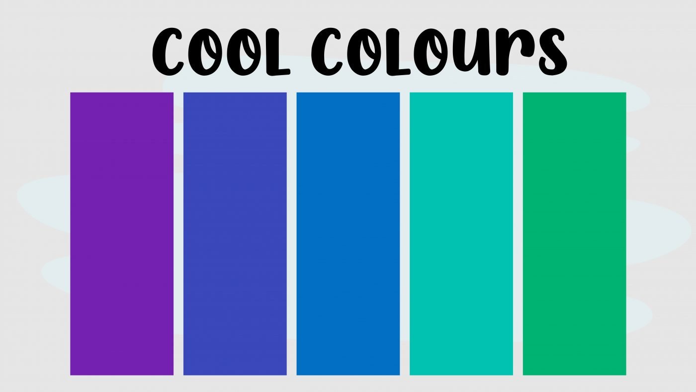
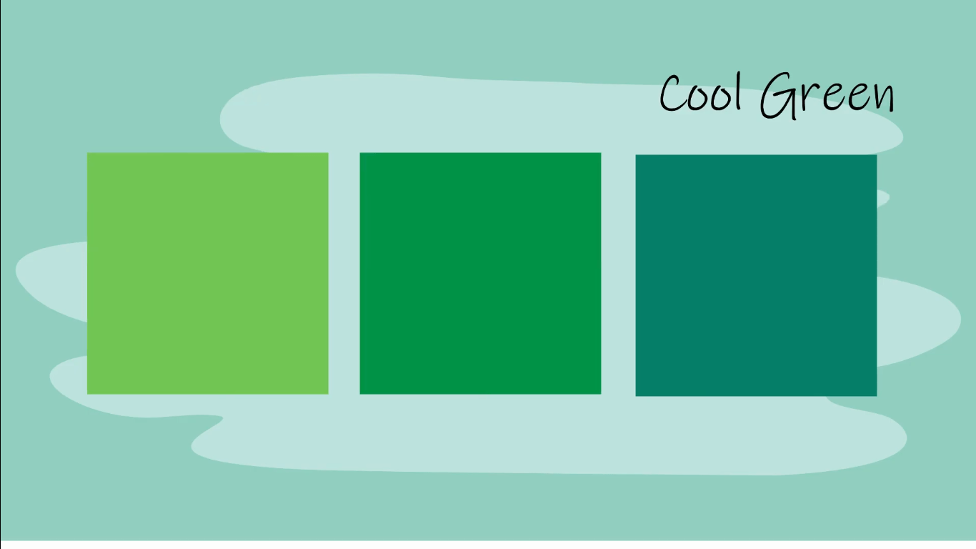
Cool colours refer to purples, blues and greens.
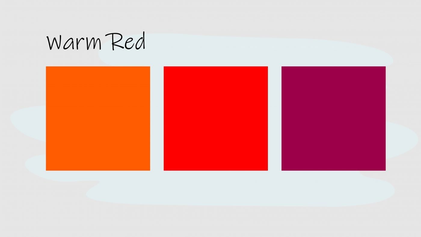
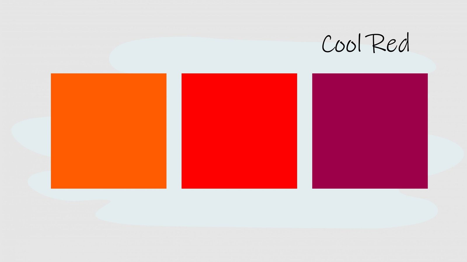
Individual colours can also change in temperature as we move around the colour wheel, a warm red includes more yellow, a cool red includes more blue.

Opposite temperatures create visual contrast and have different psychological effects.
Generally, warm colours appear bright, cheerful and happy, while cool colours appear dark, mysterious, gloomy and even sad.
This is not always the case though, it depends on how you present the colours. Now you know all the fancy colour lingo, let’s move on.

How do we use all of these colours together? We can use our 12 basic hues on the colour wheel, along with some easy to follow formulas, to create an endless collection of colour combinations, that look balanced, that’s appealing and that can make your work wow.
These formulas are known as colour harmonies or colour schemes. By using and understanding colour harmonies, you can create a mood a story and be in control of the communication of your artwork.
When you don’t use colour harmony, your art can appear bland, boring or maybe even chaotic.

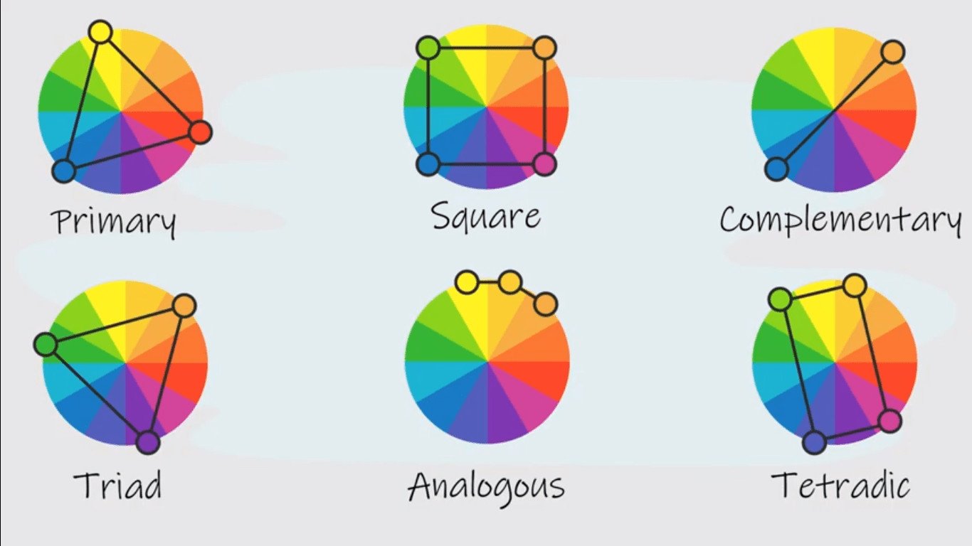
Here are some of the most common types of colour schemes:

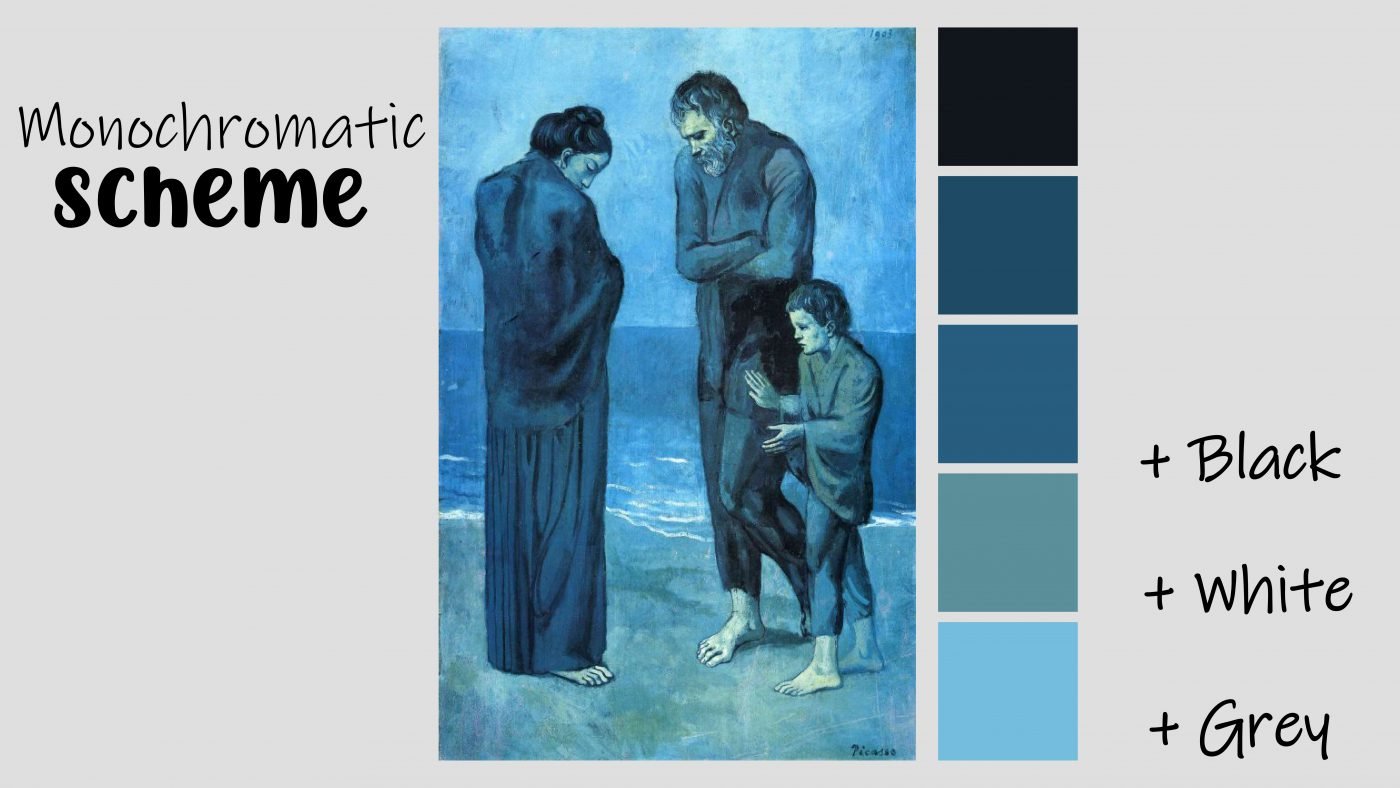
A monochromatic colour scheme is made up of one colour, mixed with either black, white or grey. Here you have a variety of tints, tones and shades of blue. It is one of the easiest colour harmonies to create and looks simple, cohesive and organized.
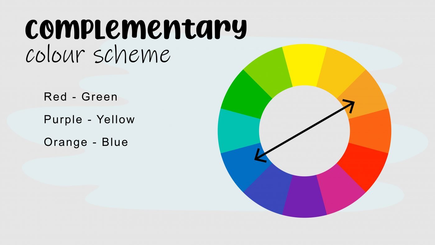
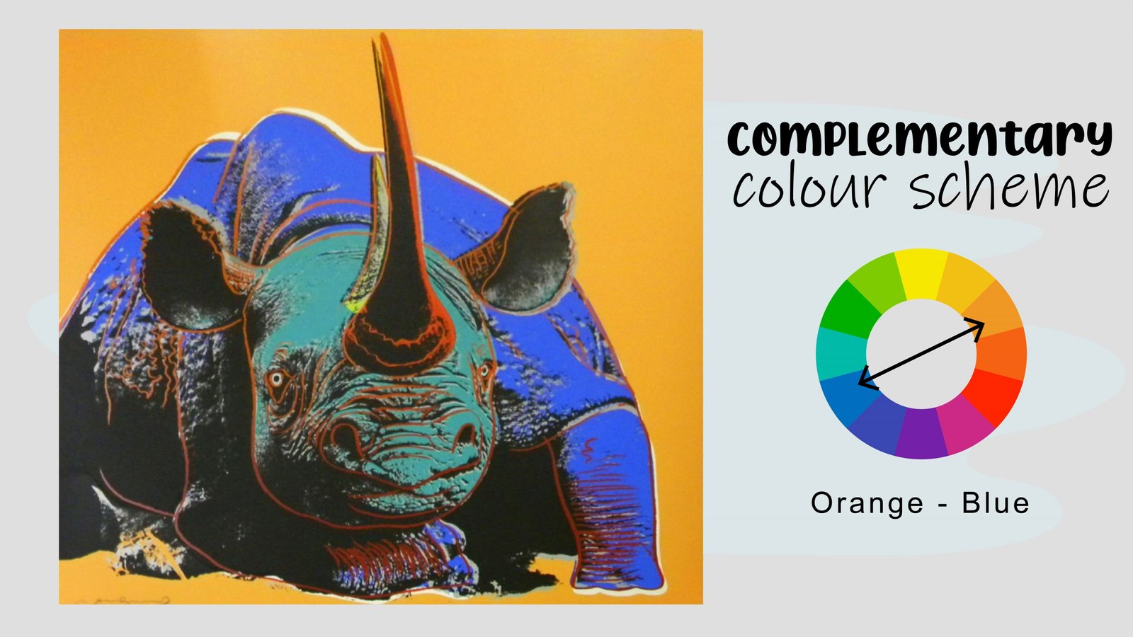
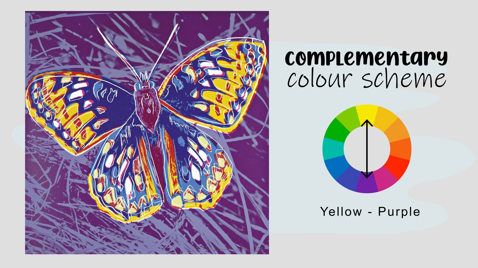
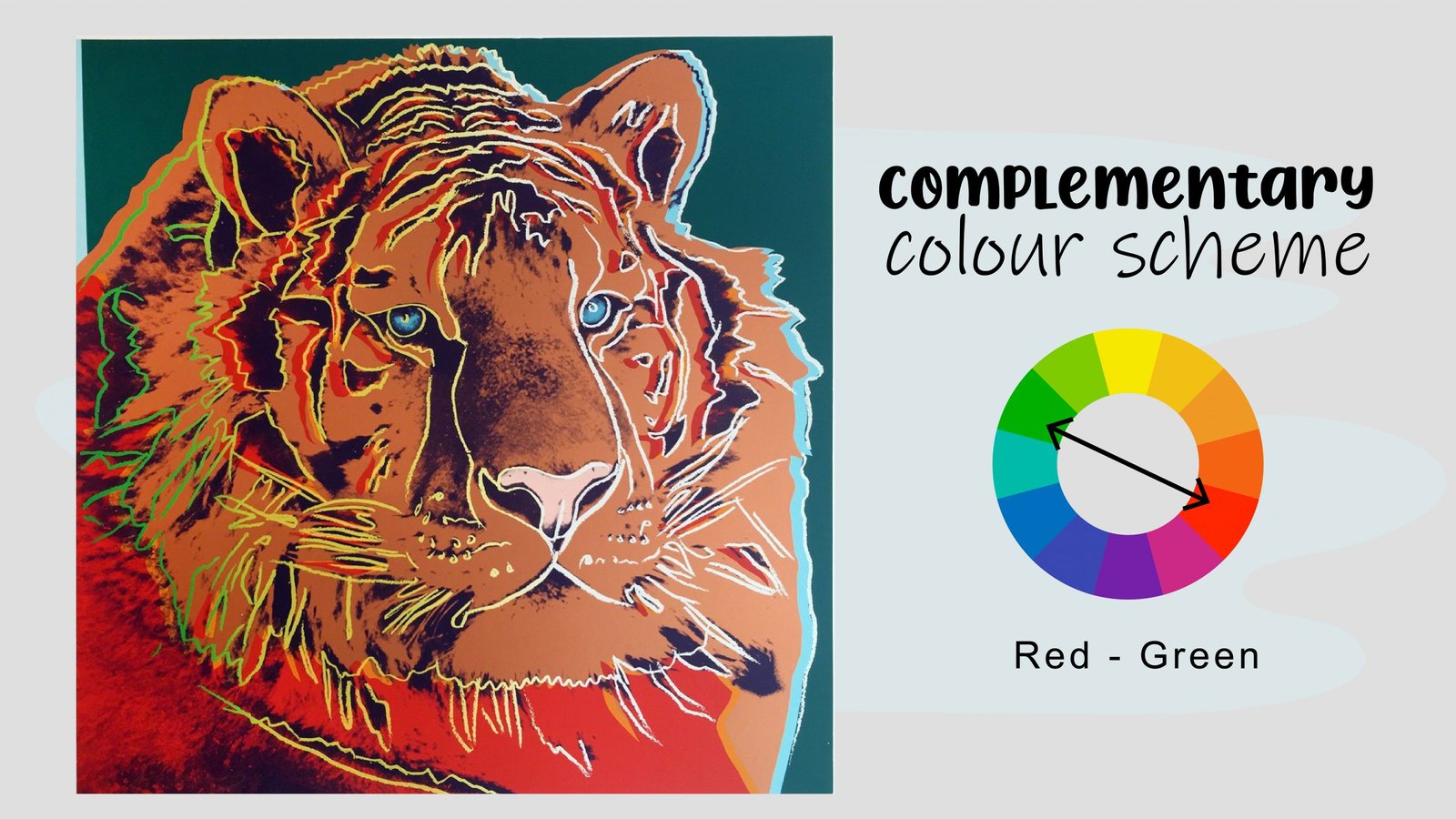
Complementary colours sit across from each other on the colour wheel. The most common pairs are red and green, purple and yellow, and orange and blue. Putting these next to each other creates a great contrast and visual interest.

Just a word of caution: They can easily overpower each other, so it is important to use them carefully and with skill.
An analogous colour scheme is made up of two or four colours sitting next to each other on the colour wheel.
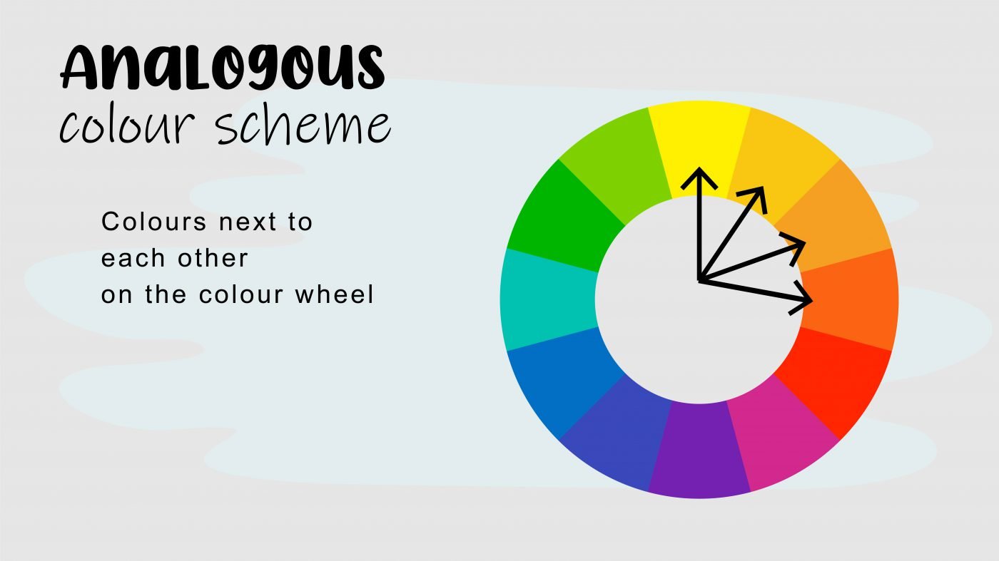
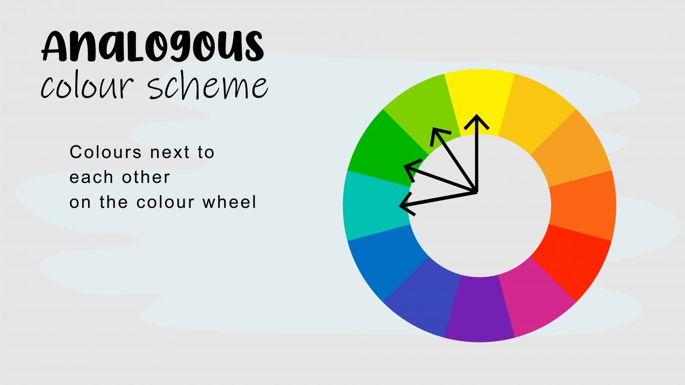
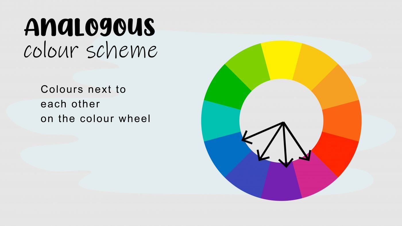
This is one of the simplest and most appealing colour harmonies and works best if you choose one dominant colour, and then use the other colours as accents. Here are just a few examples of analogous colour schemes.
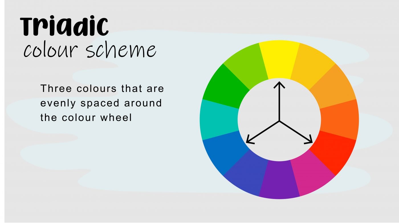
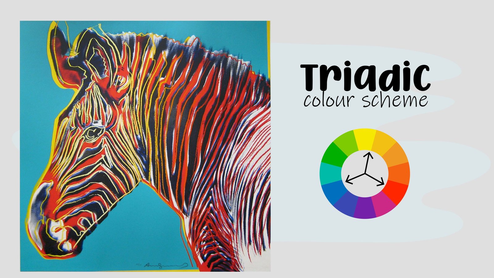
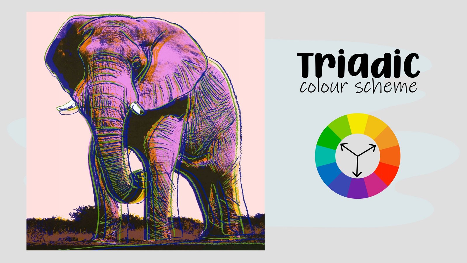
A triadic colour scheme is made up of three colours that are evenly spaced around the colour wheel like a triangle. These colour combinations are often bold and vibrant.
A split complementary colour scheme is similar to a complementary colour scheme, except one of the colours is split into two nearby colours.
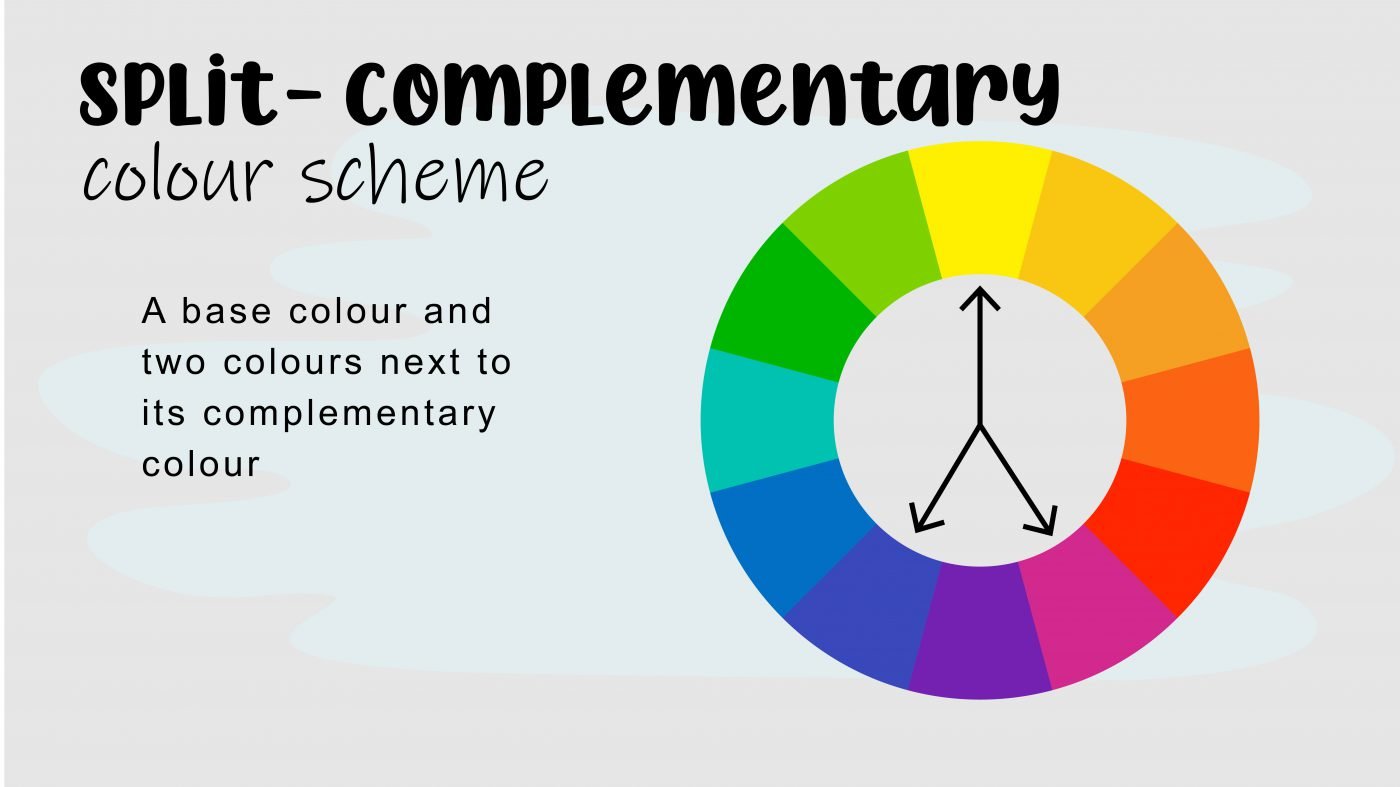
This keeps the high contrast of the complementary colour scheme, but it also adds a little bit more variety.

A tetradic colour scheme is made up of four colours, arranged into two complementary pairs.


I know some of you are feeling overwhelmed now.
But don’t worry after you started applying these methods you’ll start to pick up an intuition for colour, a colour confidence that just works well.

These different colour harmonies are a great guide to create colours that work well together.
Just remember, you can also create more variety by changing the shades, the tones and the tints within each colour palette, giving you endless ways to mix and match colour that looks great.
I always tell my students, first know the rules then break them.

Think of the colour wheel as a fun dance floor where you get to skip and hop around in different patterns to get to understand colour.

Now that you are super clued up and smart regarding colour, let’s play a game and see if you can identify which colour schemes these famous paintings are using?
First up we’ve got this bluish painting, bonus points for those who can guess the colour scheme and the artist who painted this before I tell you.
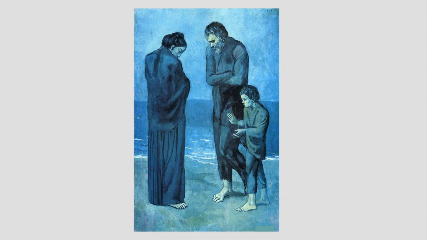
Yes, it is a monochromatic colour scheme. It uses blue with variations by adding black, white and grey so blue with various shades, tones and tints.
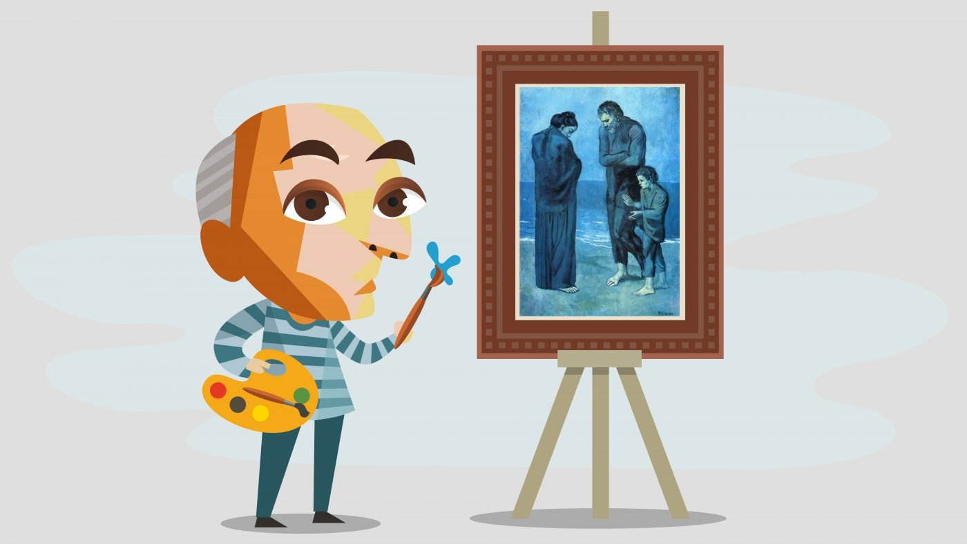
Did you know that this painting was created at a time when Picasso was really sad and depressed?
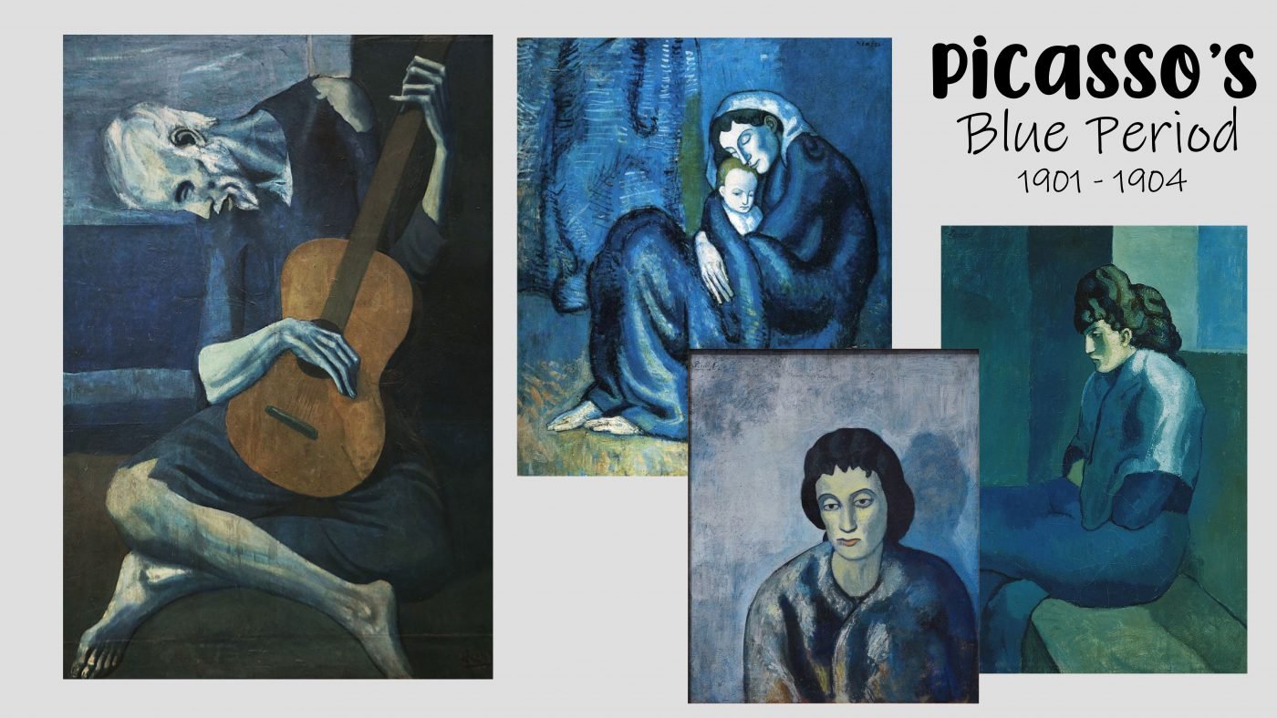
His friend died and he was feeling very lonely. For almost four years, Picasso only painted monochromatic paintings and we call this his Blue period. This is also interesting because now you can see how the colour temperatures and the mood that it evokes play a role in this artwork.
How about this painting?

You’ve guessed it. It is also a monochromatic colour scheme, but what Picasso has done, he’s added a little bit of brown here and there in his monochromatic Blue period. He often did that. He painted predominantly in blue by adding a touch of brown for warmth.

Next up is a painting of two Harlequins. What colour scheme is being used here?

It is an analogous colour scheme. I know it is tricky, but look at this! He predominantly uses the reds, purples and blues that are found next to each other on the colour wheel.

The reds and blues aren’t vibrant, they are saturated, dull and a bit greyed out. Various tones of these reds and blues were used.
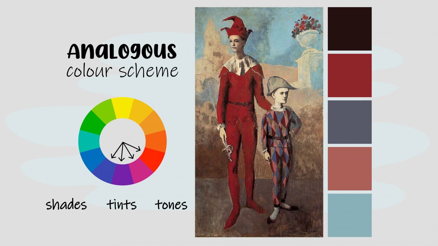
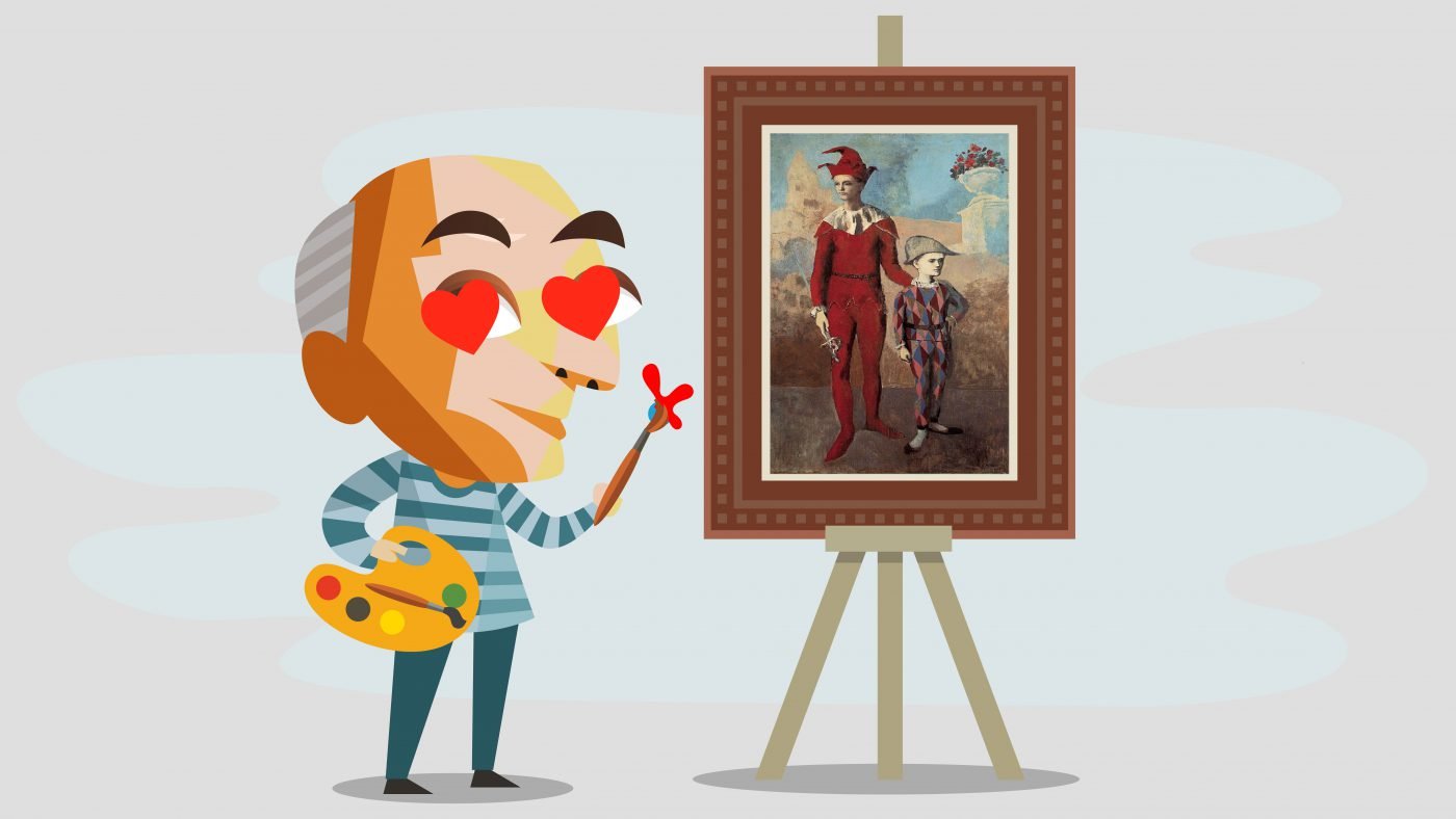
For interest sake, this painting is also done by Picasso and this is a period that is better known as the Rose period.

What on earth could have made Picasso make such a dramatic switch from the blue depressing period to this fun rose period, using lots of harlequins and clowns.
You guessed it! He fell in love. The red here suggests a lot of passion.
Let us move on to a different famous artist, a true master of colour theory. What is the colour scheme of this painting? Bonus points if you can guess the artist!

Yes, it is complementary. This painting is painted by the famous artist, Claude Monet.
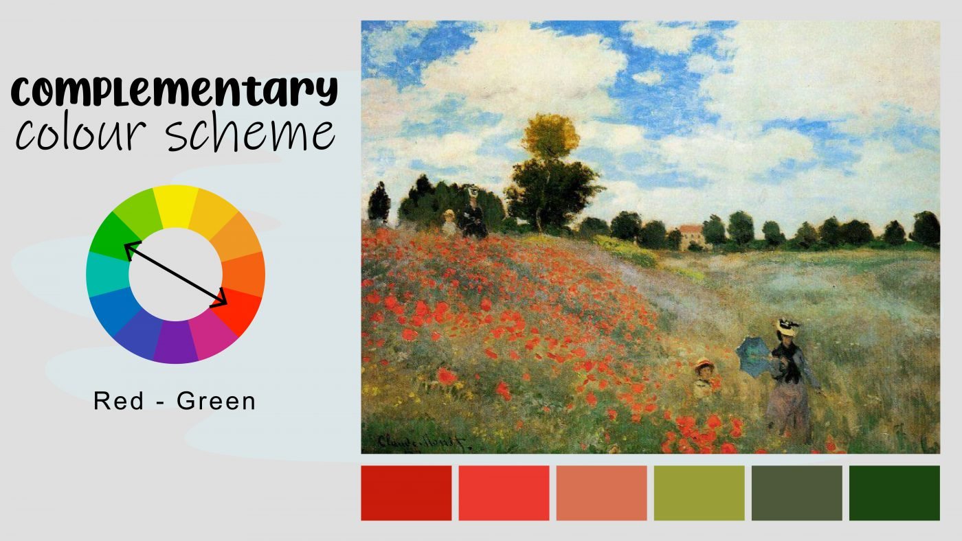
How beautiful are the contrast and vibrancy between the red and the green? Claude Monet is famous for his water lily paintings and most of them use a specific colour scheme. Can you guess it?
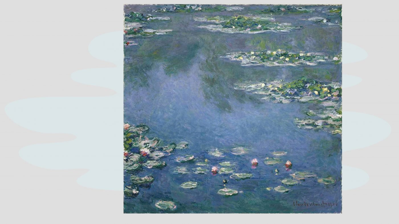
It is an analogous colour scheme, these colours are next to each other on the colour wheel, all the blues and greens grouped together.

This is a beautiful painting that Claude Monet did of his wife Camille and his son.
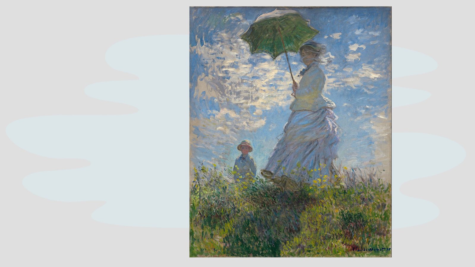
What is the colour scheme? Analogous again, and this is a great example to show you that cool colours, the cold colours of the colour wheel doesn’t always need to be sad.
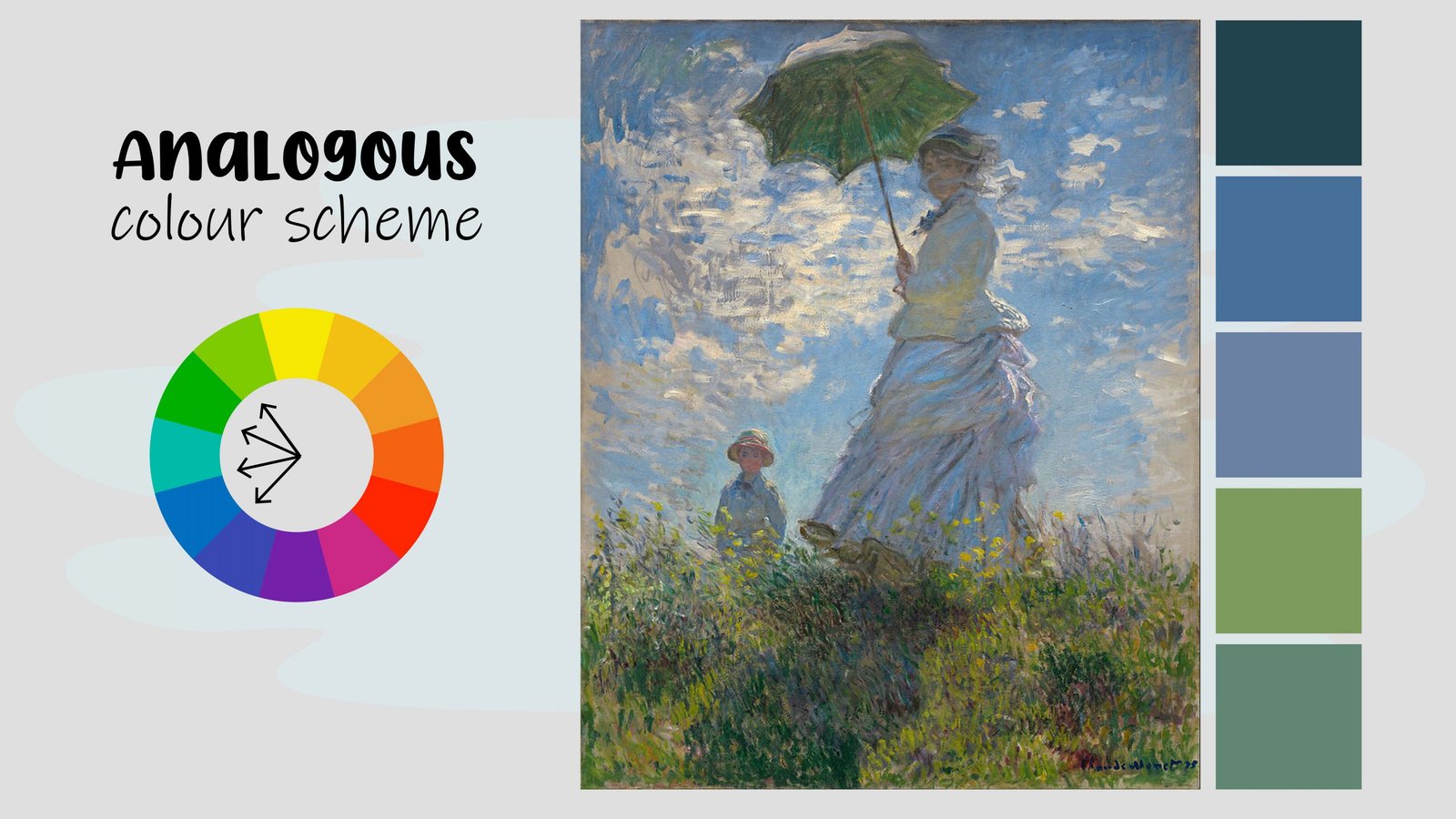
I find this painting quite happy and positive.
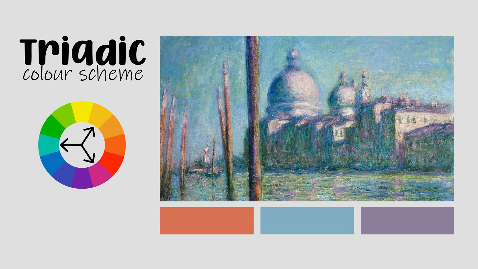
This is a vibrant, beautiful painting Monet did in Venice.

The colour scheme is complementary, using blue and orange on the opposite sides of the colour wheel.

This painting is so vibrant and intense, using high saturation of colours.
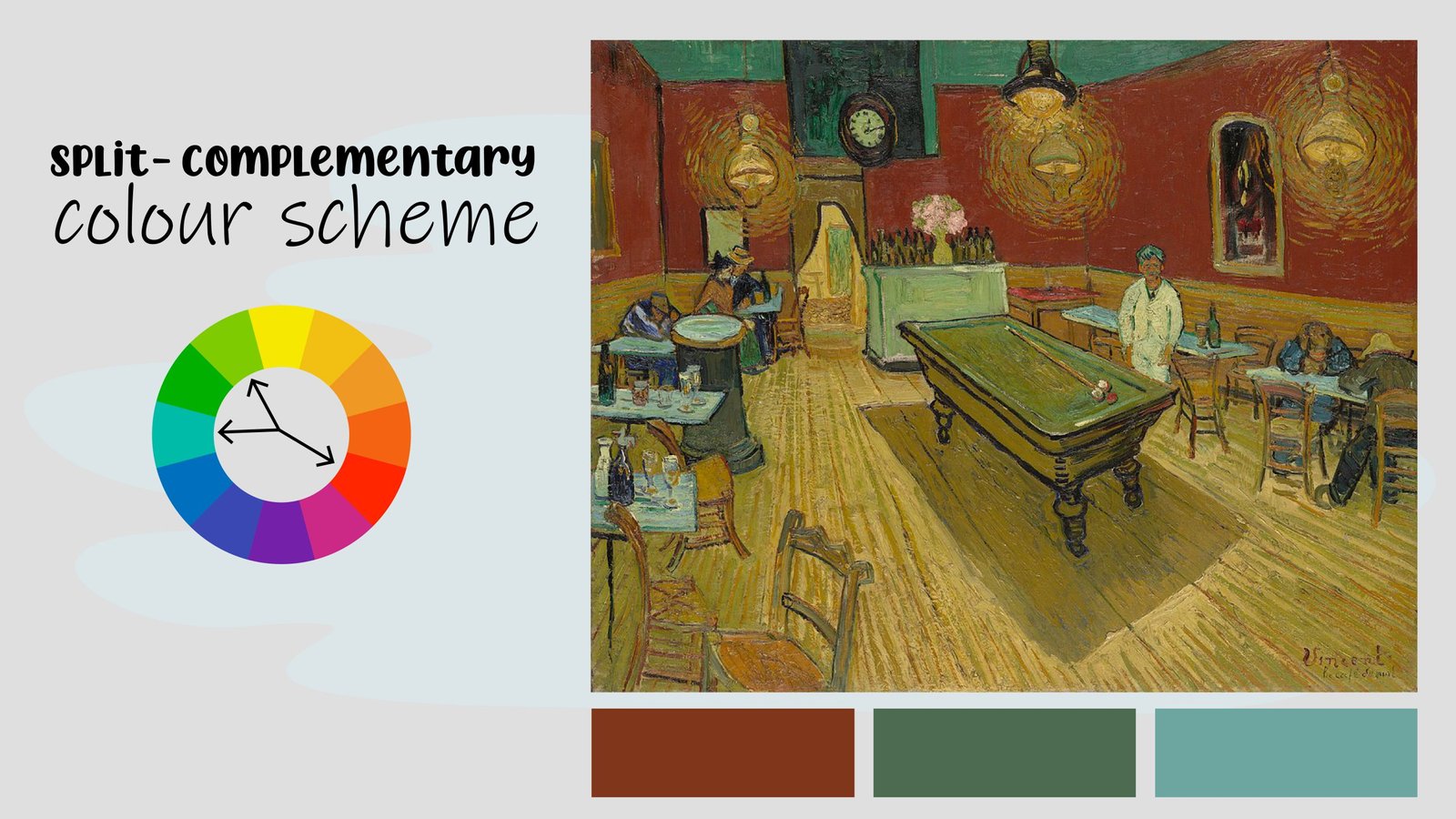
Let’s consider this painting. The famous painting called Impression Sunrise, which the whole Impressionist art movement was named after.
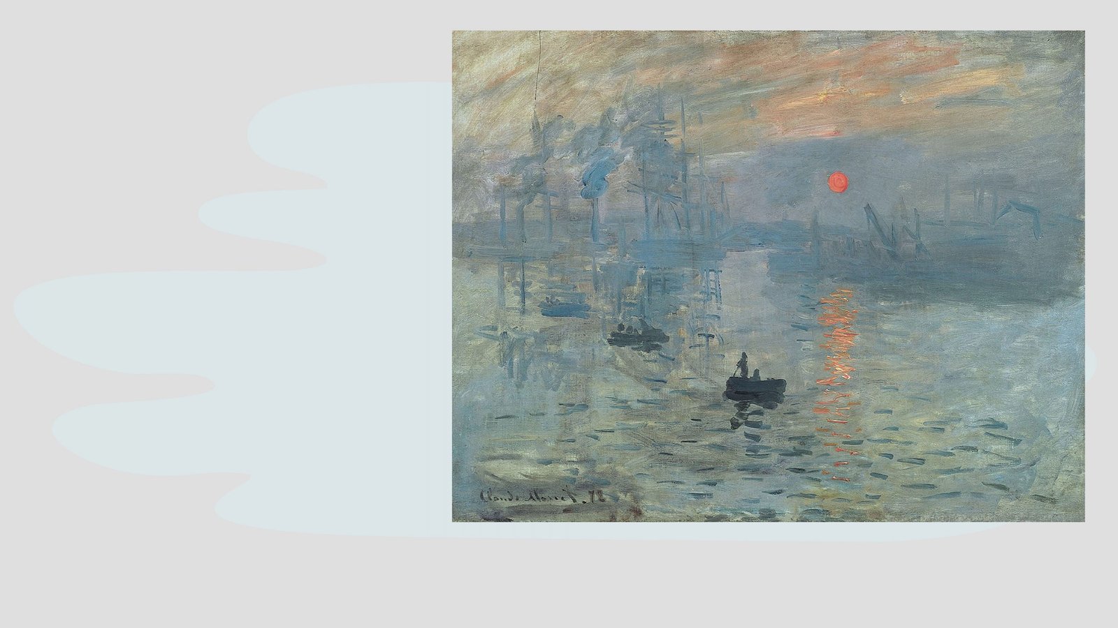
It is also a complementary colour scheme, but quite different. The colours are desaturated, dull and greyed out. This helps Monet to create that early morning mist and fogginess of the harbour.

The impressionist artists were fascinated by colour. This painting is quite tricky, can you see the colour scheme? It is a triadic colour scheme, you see it makes a little triangle on the colour wheel, it uses orange, purple and blue.
The Impressionists embraced colour because they were very much opposed to the industrial revolution that was taking place. Cities were filling up with smog, steam engines and there was a lot of pollution.
People generally felt that machines were taking away their jobs.
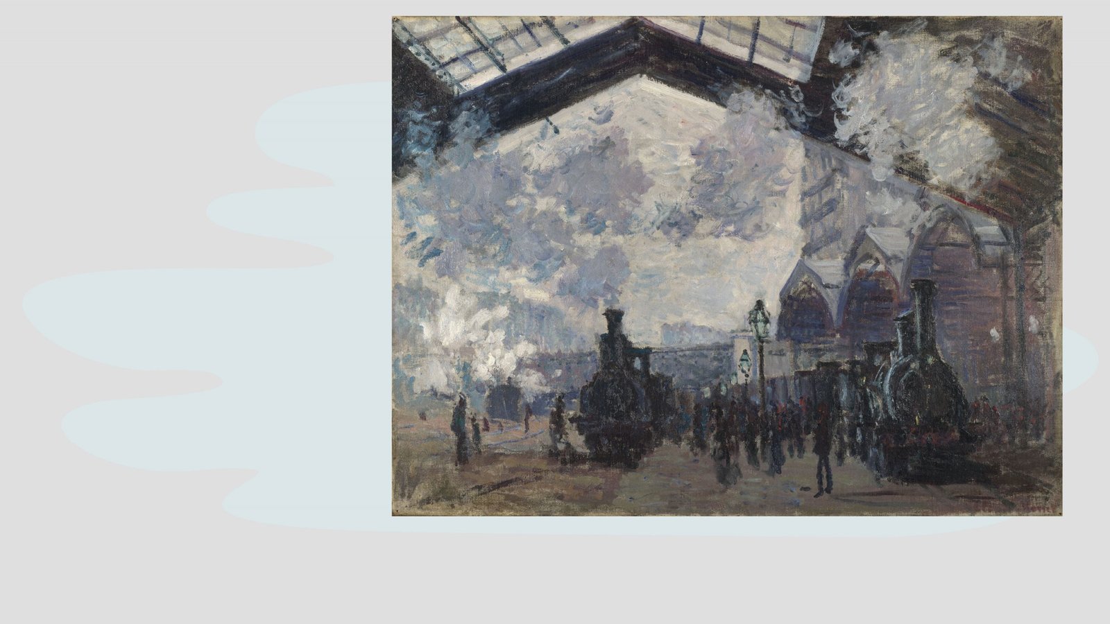
In this painting, Monet uses a monochromatic colour scheme.

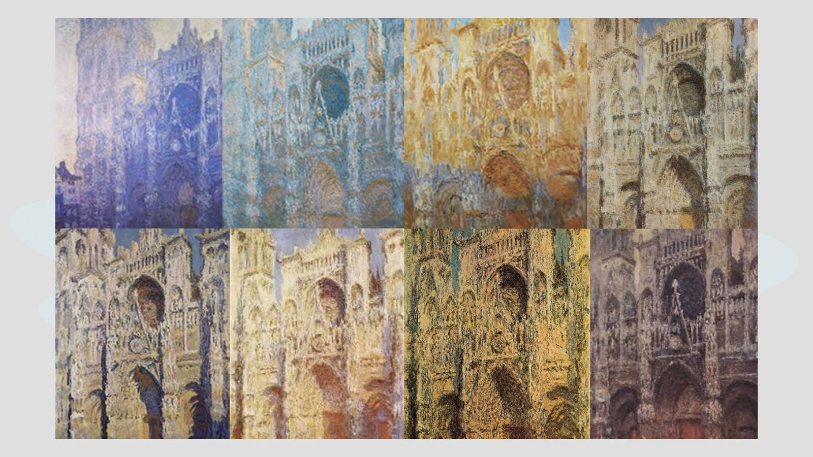
It captures the smog and the smoke that the trains created in Paris at the time. Being fascinated by colour, Monet often did a colour series where he would take the same object and paint it at different times of the day. As the day progresses, and the sun rises and sets, the colour temperatures and colour reflections on the object would change.
Here’s a bit of a curveball.

In this painting, we see two pairs of complementary colours, green and red, orange and blue, and that makes a square on the colour wheel called a tetradic colour scheme.
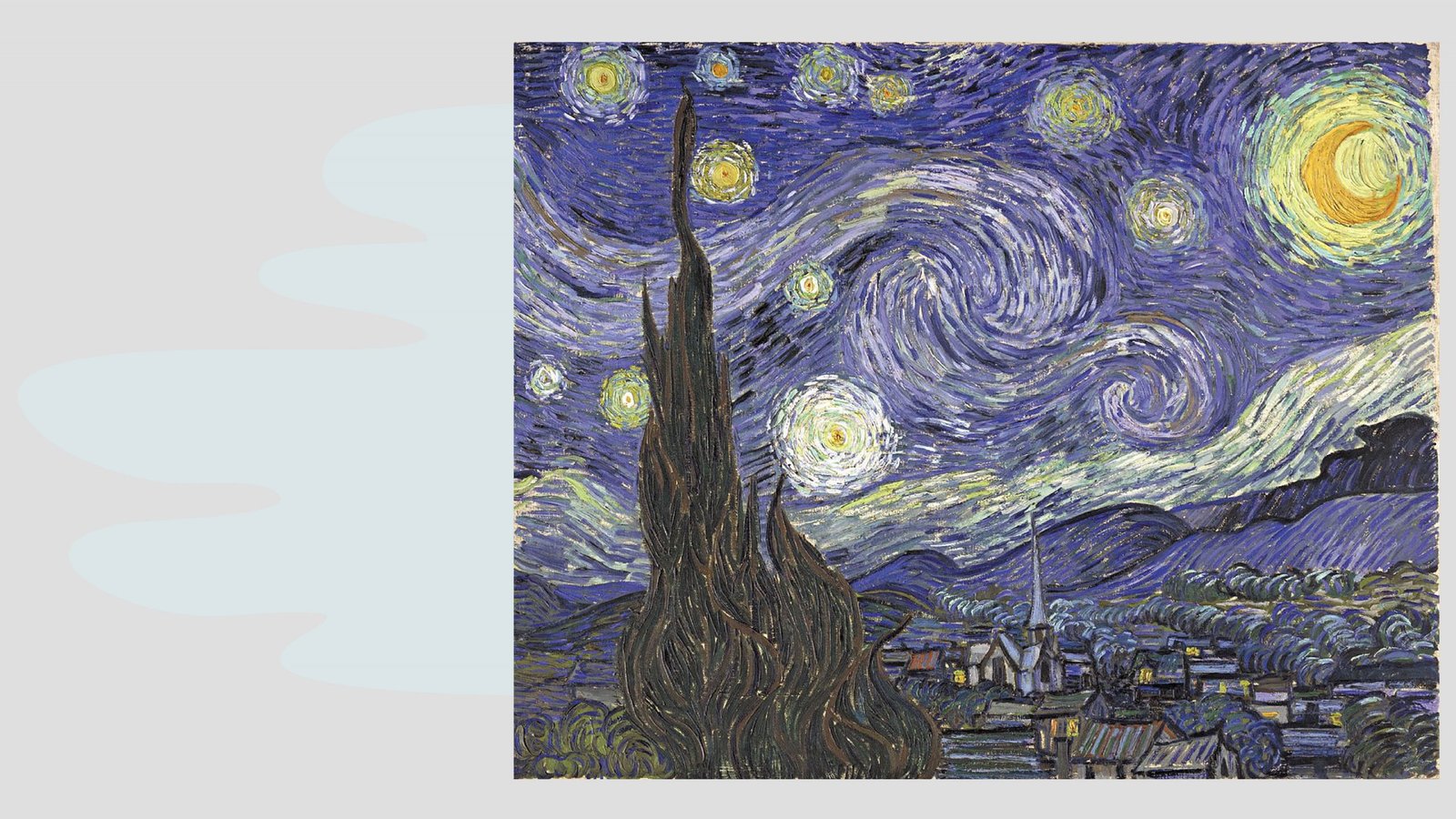
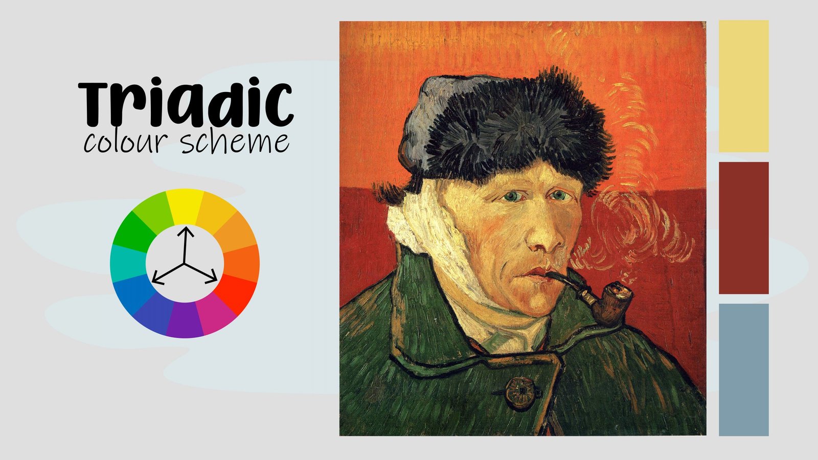
Ever wonder why The Starry Night by Vincent Van Gogh was such a major crowd-pleaser? It is because of its colour theory.
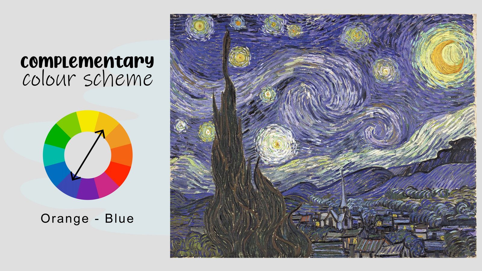
It uses complementary colours. He has this vibrancy, this intense contrast, that he creates between the orange and the Prussian blue. Your eyes dot around the painting between the orange and the dark blue, giving the night sky its shimmering effect.
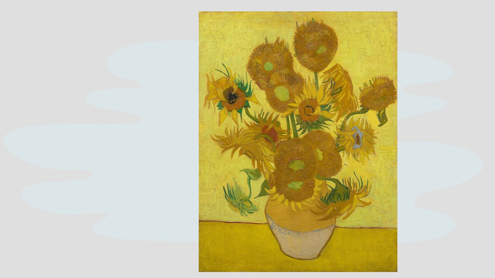
What colour scheme do Van Gogh’s famous Sunflowers use?
Analogous! The colours are next to each other on the colour wheel.

Van Gogh is truly a master of colour and often used complementary colours in his artwork to create vibrancy, but he often danced around the colour wheel using various colour combinations.


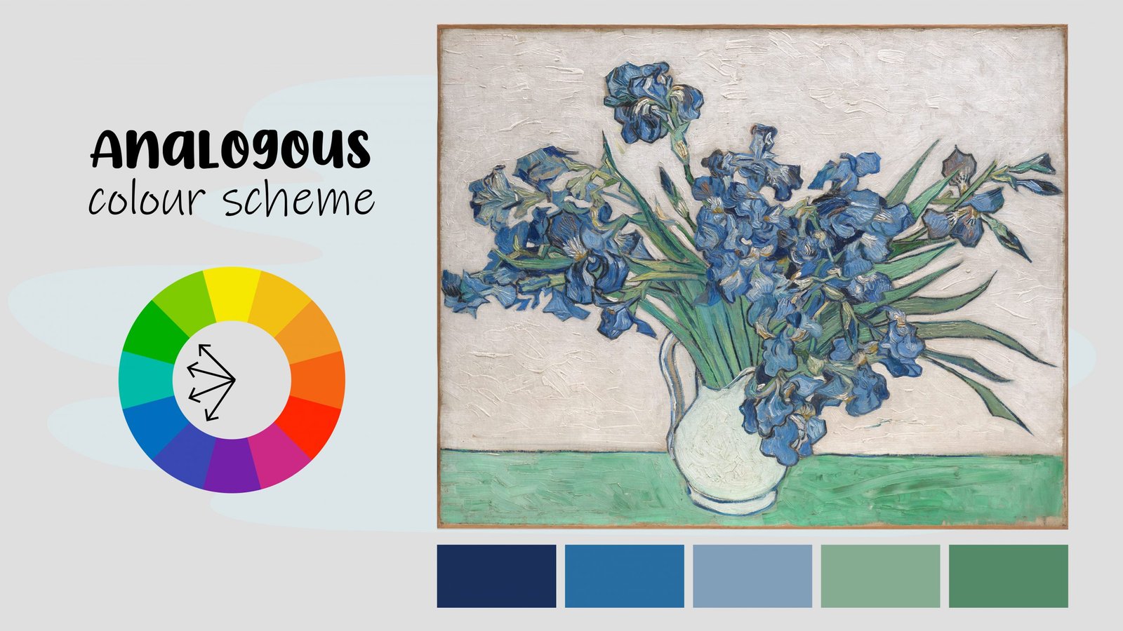
Look at these beautiful pots of Irises. What is the colour scheme?
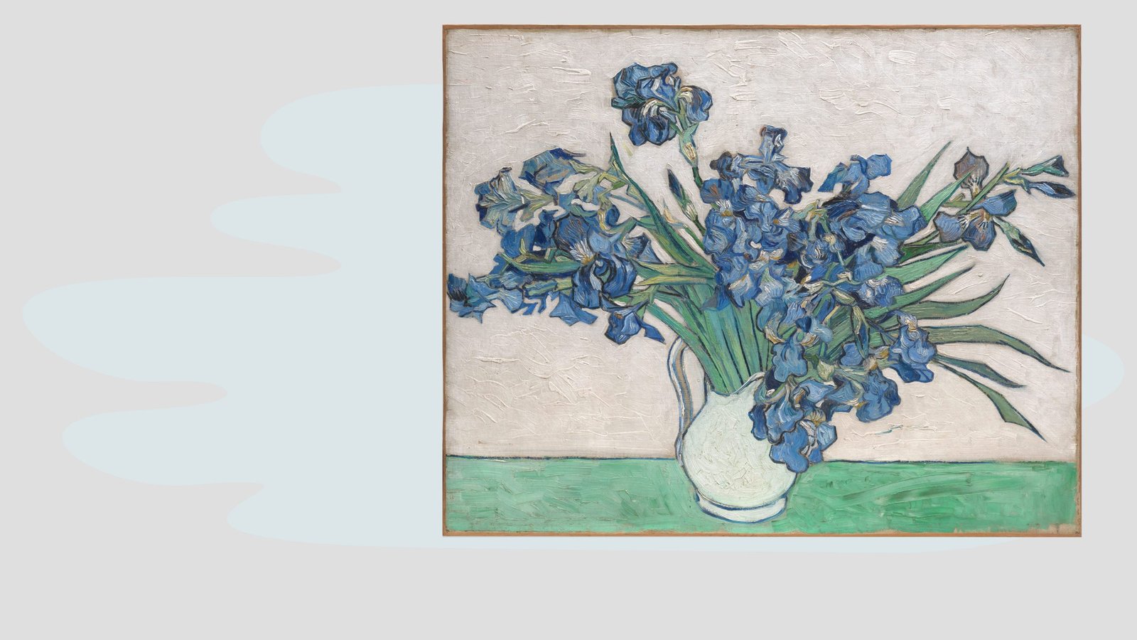
Analogous!
Van Gogh also used more complicated colour schemes.
Can you spot this one?

It creates a triangle on the colour wheel, a triadic colour scheme.
In this painting, Van Gogh uses an interesting colour scheme. It is a split complementary colour scheme.
Instead of the high contrast created by green and red, he veers to the sides of the green and uses the colour adjacent to the green.

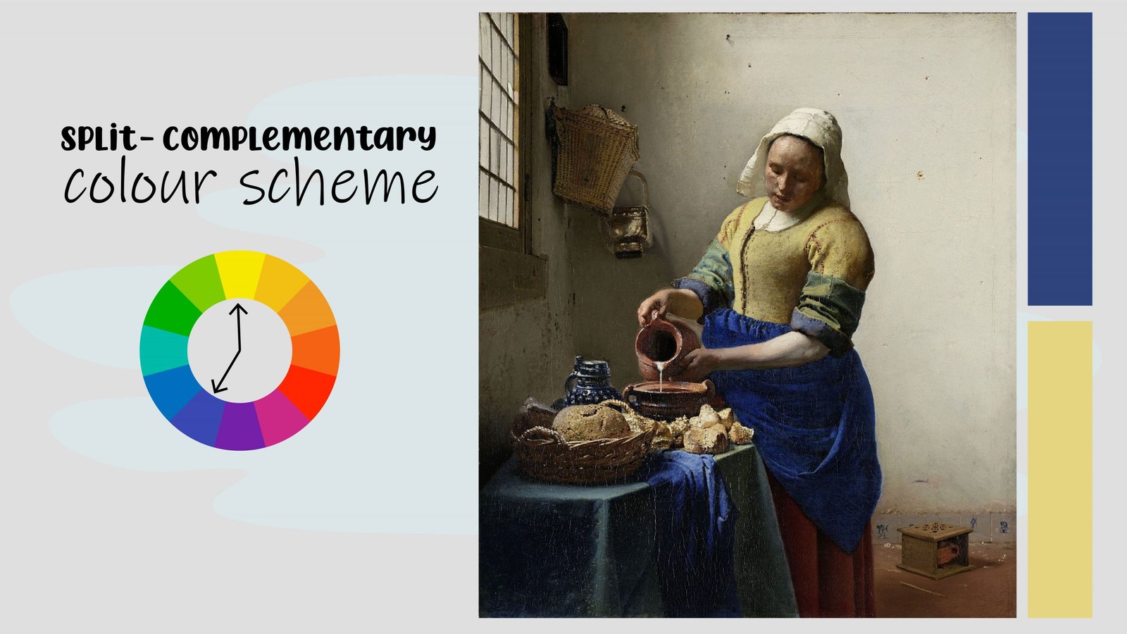
In this painting artist, Johannes Vermeer is famous for using split complementary colours in a highly successful way. Instead of using the blue and orange, he veers off just slightly and often uses blue and yellow in his paintings.
If we jump through time and hop over to the Pop Art movement we get to see the awesome colourful paintings by Andy Warhol.

This is one of my favourite series about endangered species. One of the first things I have noticed about this series is Andy’s amazing command and use of the colour wheel.
Can you help me identify which two major colour schemes he uses?
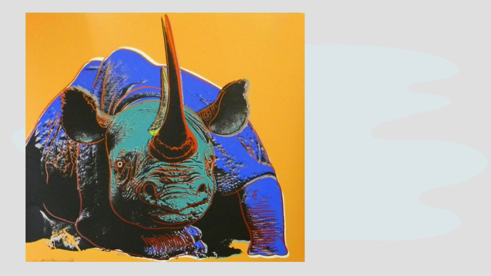
Some of them use the famous complementary pairs, orange and blue, purple and yellow, green and red.
The other screen prints in this series use the triangle colour scheme, known as the triadic colour scheme.
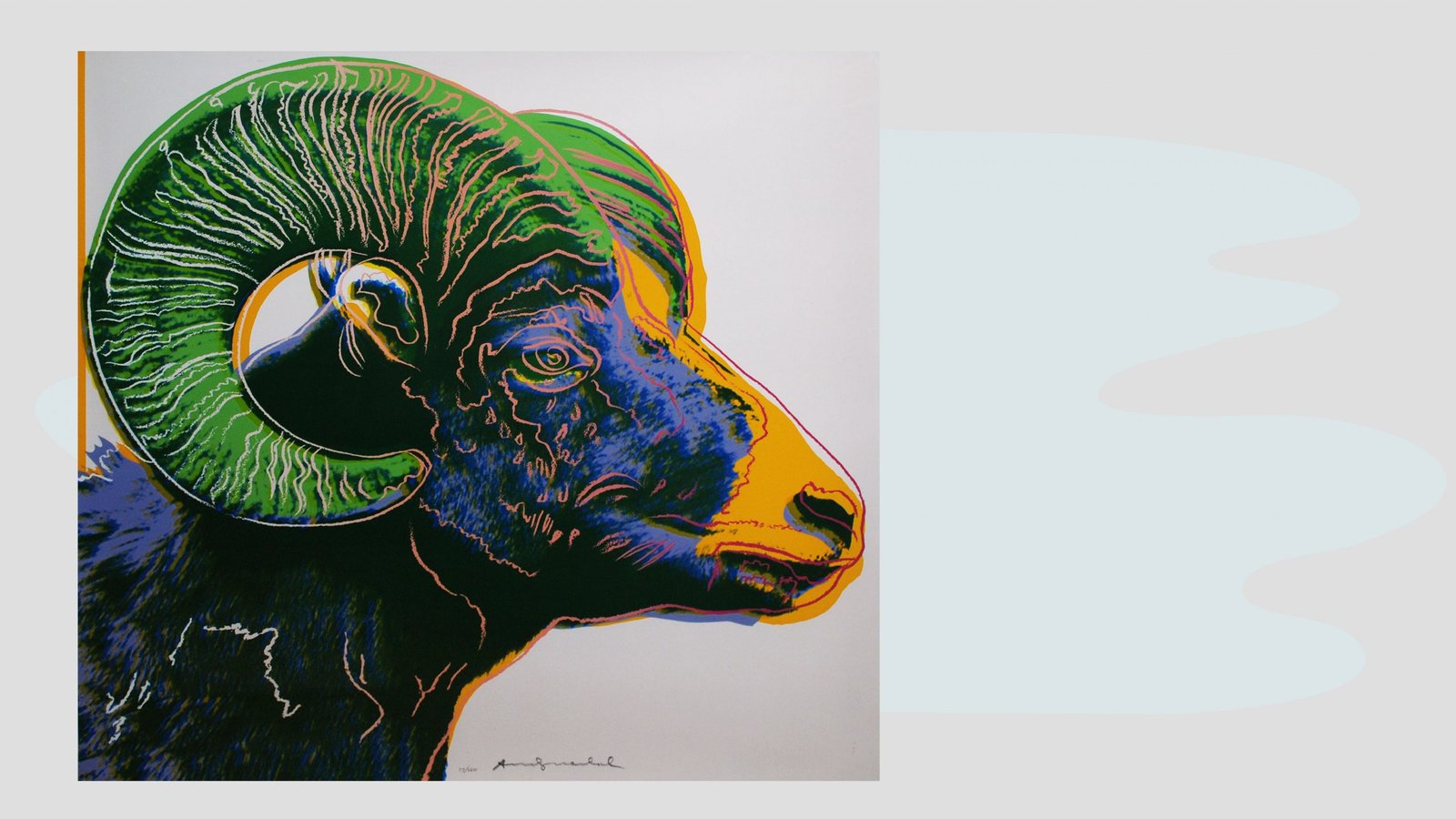
Andy Warhol moves freely around the colour wheel, creating some interesting and striking colour combinations in his artwork.
Now let’s make your art awesome.

Here are some of my general colour mixing tips.

First of all, keep your brushes, your turpentine or your water clean.
Know what not to mix!
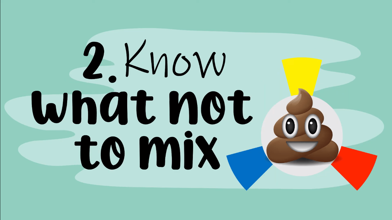
Do not mix complementary colours with each other you will get MUD!
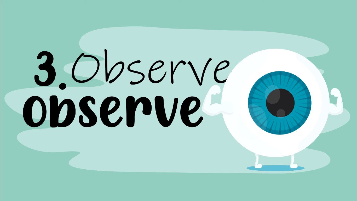
The most important tip of all is to observe, observe, observe! Study your reference. When you get lost, sit on your hands, sit back and observe!
Take the time to match your colours correctly to your reference.
You can do this by holding your mixed colour on your paintbrush next to your reference. Make sure it is a correct match.

If you struggle to identify the exact hue, use a viewfinder to isolate the colour. That helps your eye to be less confused.

There are lots of other different tips and tricks that I use for various mediums.
Here are some of my helpful tips for when I am doing oil paint.

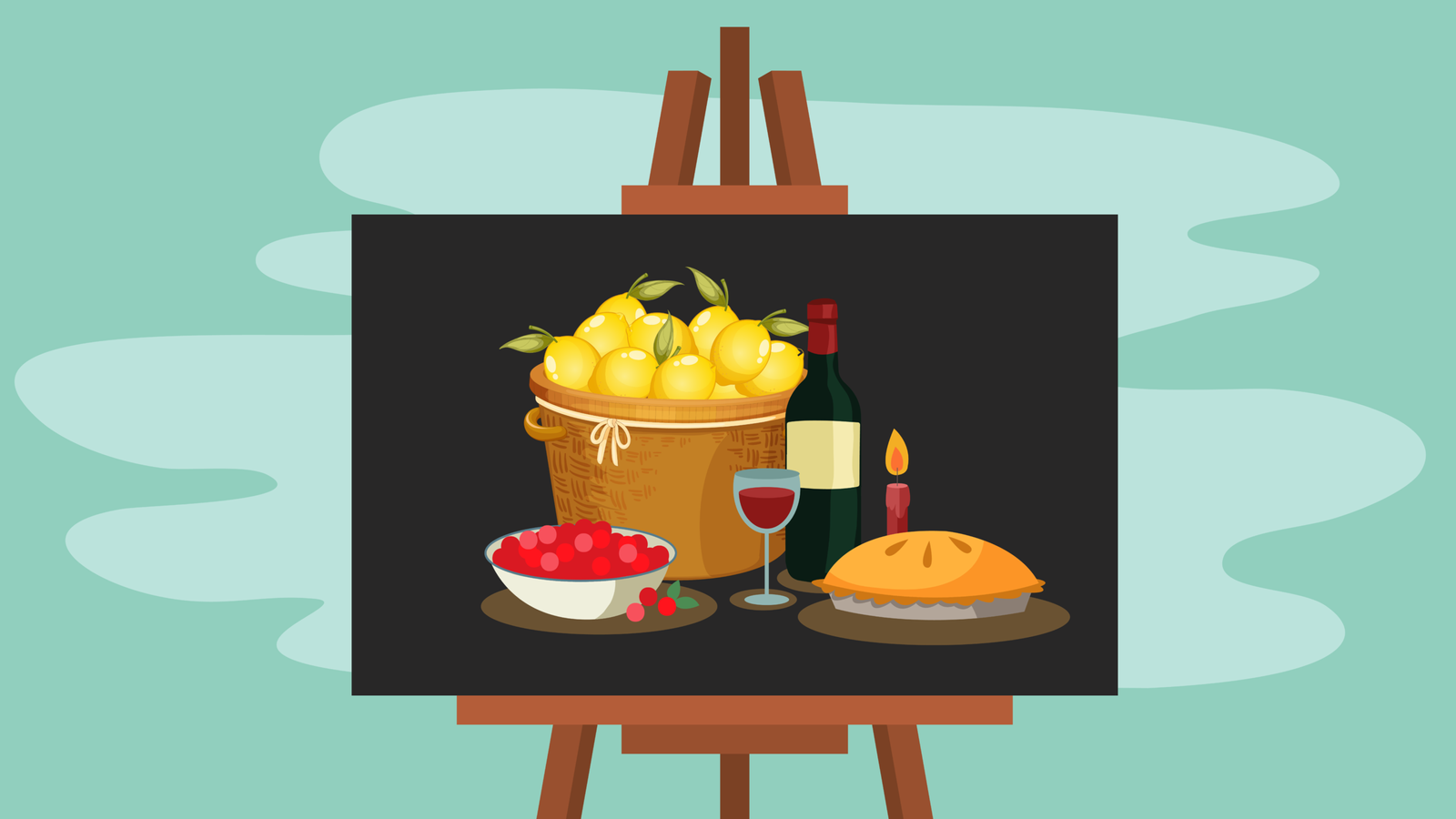
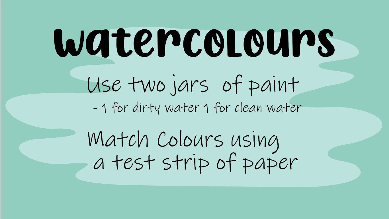
For watercolours, I’ll do videos on these later.
Here are tips for general colour choices:

First, pick one dominant colour, whichever colour harmony you choose. Using one dominant colour will create a sense of balance in your artwork. You can choose one main colour and then use the rules of colour harmonies to find other colours that work as accents or that would be great for smaller details in your artwork.
Another tip I’d like to share is to limit yourself to just a few colours.

Remember, simple is best. Adding too many colours to your artwork can quickly become overwhelming and chaotic to your viewers. Choosing just a few colours, really mastering them and applying them can create bold but simple and interesting artworks.

Another thing to consider when mixing colour is that a colour is always two things it is not just one. Ask yourself, is this a warm red or is it a cool red?
It is not just a red, it is either warm or cold. Which way is it leaning on the colour wheel? The same goes for all the other colours, is it a warm green or a cool green?

Now that you know most of the colour theory, how are you going to challenge yourself?
In your next artwork, you should maybe be making an analogous painting or try your hand at a complementary colour scheme artwork,
That’s our lesson on colour. I hope you guys know now what different values, hues, tints and shades are, and how to use them all. I hope you understand the colour wheel.

BUY THE 7 ELEMENTS OF ART WORKSHEETS
A 32 Page Worksheet Pack focused on teaching the 7 Elements of Art. Ideal for art students to learn how to apply the 7 Elements of Art and reinforce the principles.
FREE online videos available on our YouTube video for each worksheet.