The 7 Elements of Art
The 7 Elements of Art: Value
Jul
Watch this lesson for free on our YouTube channel
Free Lesson on the 7 Elements of Art by artist Lillian Gray
This is a video and blog series teaching the 7 Elements of Art in an easy-to-understand way. The series consists of 7 lessons presented by artist Lillian Gray.
Using Value as an element in improving your art
This lesson is about one of the 7 elements of art: value. Value is simply the light and the dark of a picture. Values can be better understood when they are visualized as a scale. I like working with a value scale from one to ten dark to light. The darkest value is 100% black and the lightest value is 100% white and the halfway value between these two extremes is gray.
Okay, so most of you have seen a value scale before but do you actually know how to use it in your art or how to apply it to various artworks? Let’s dive deeper into it.
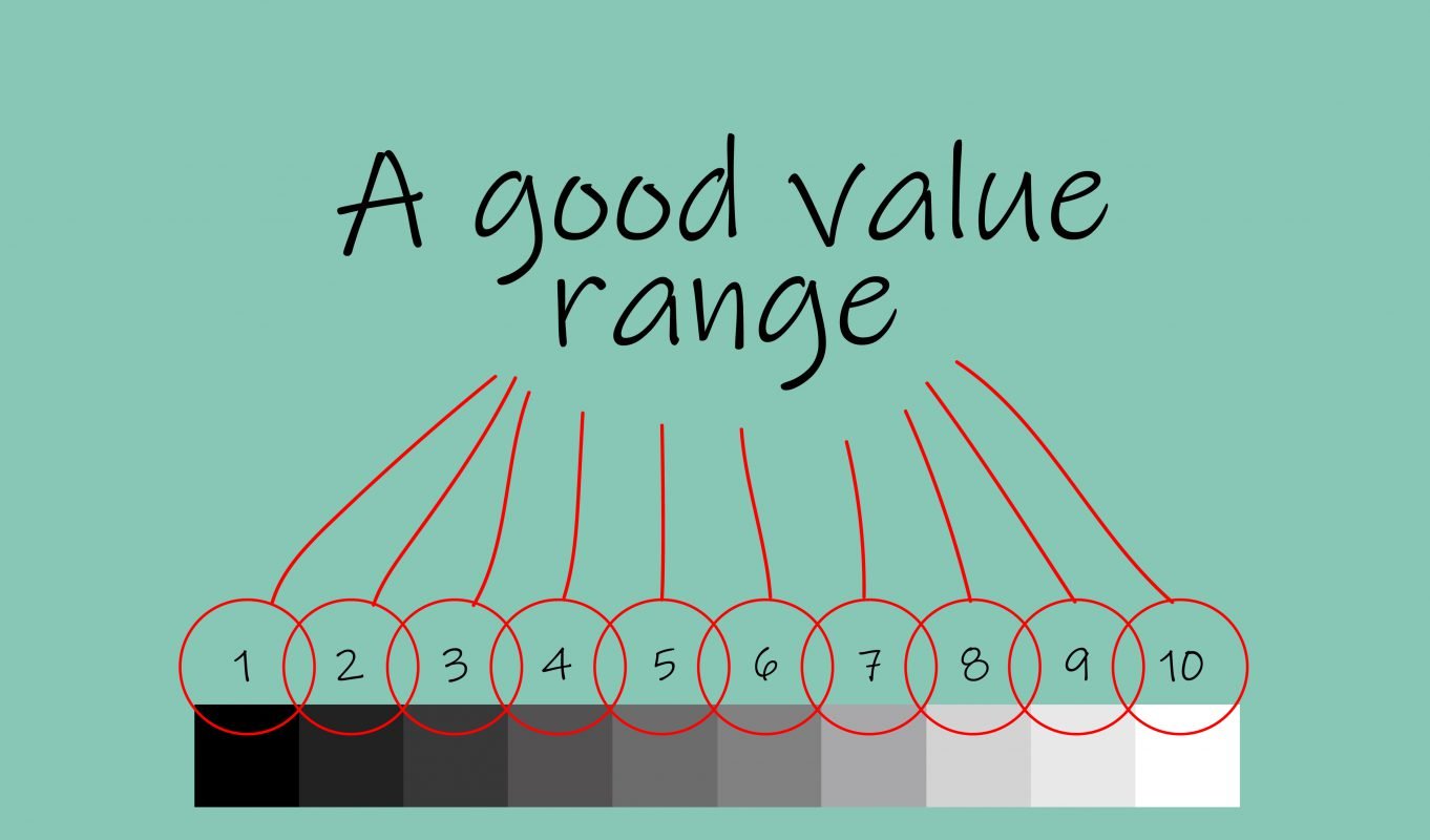
Generally speaking when we are creating an artwork, we’d like to depict a wide range of value so if I number my value scale one to ten I need to be able to find every single number within that drawing.

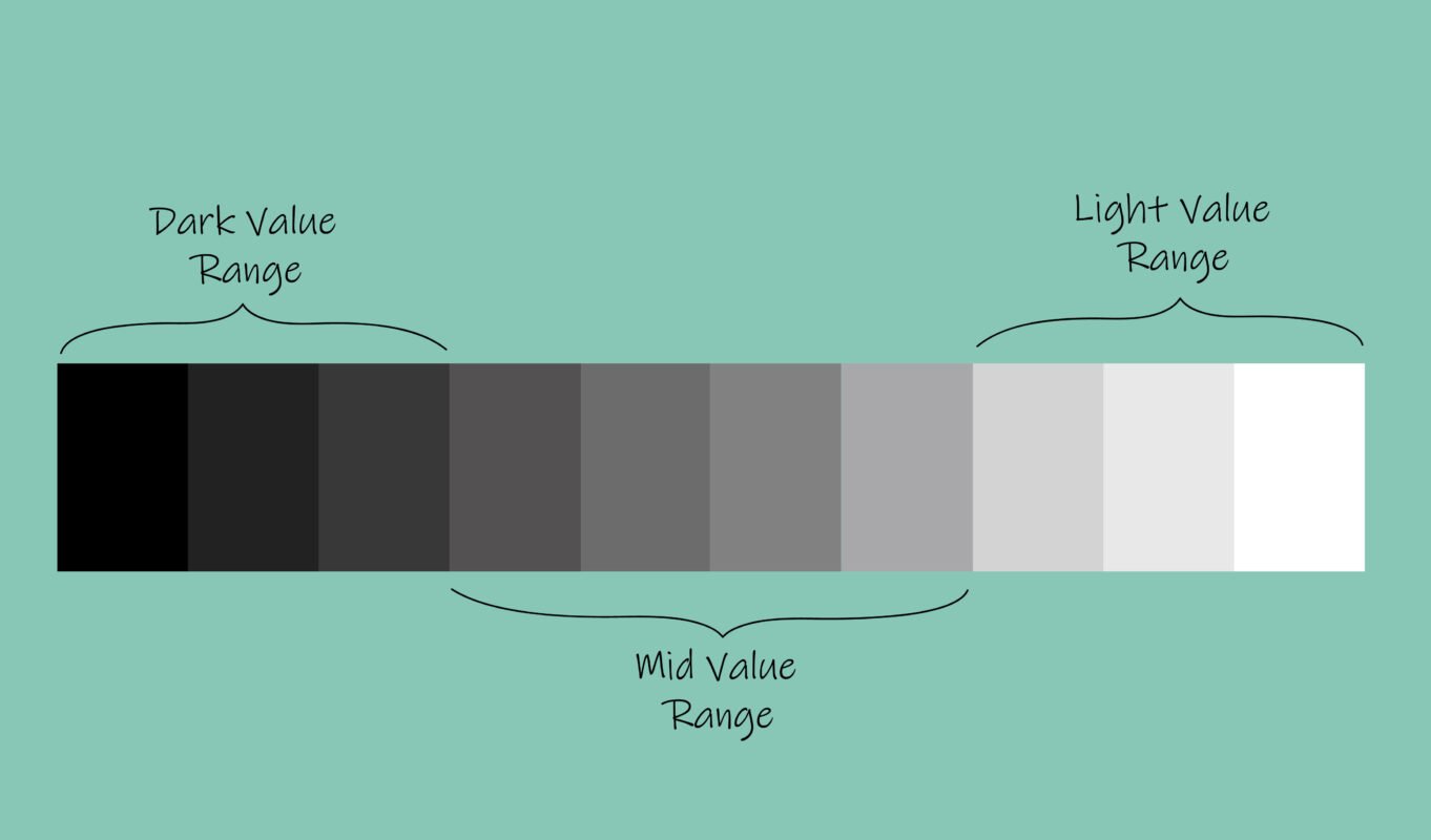
When an artwork depicts the entire value scale from one to ten it’s called having a good value range or good value. However, not all artworks do this whether it’s intentional or unintentional a lot of artworks only tend to use certain sections of the value scale. When we look at the value scale in more depth we can break it down into three sections: the dark value range, the mid value range, and the light value range.
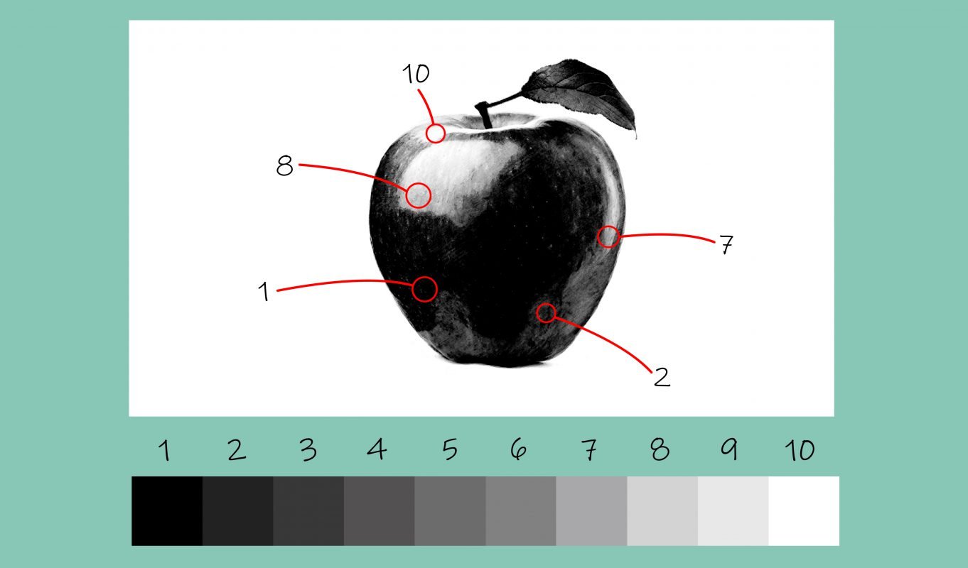
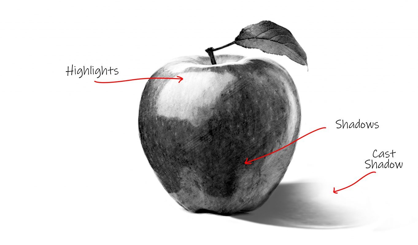
Let’s look at this apple. This apple only uses various numbers from the value scale and it jumps from very dark to very light quite quickly. It lacks values in between. This is called a high contrast image.

Now let’s look at the picture of this apple, it is quite a high value range and it lacks the value numbers from the lower ranges.When we do this it is called low contrast. Low contrast means we’re only using a certain section of the value scale it could be the lower scale, the higher scale, or the middle scale.
Depicting Light and Dark
As artists, we need to figure out how to depict light and dark. We see in 3D and then we draw on a 2D surface. We need to learn how to create the illusion of depth. Artists create the illusion of light and form by being able to produce a wide range of tonal and color values. As artists we create value with shading: the most common way to do this is with hatching convincing shading is done by looking at the highlights and the shadows of the picture.
The highlight is where the light hits the object and the shadows is where the light cannot reach, the cast shadow is placed on the opposite side from the highlights.
Understand the texture of the object
It helps to understand the texture of the object to be able to render the values correctly: when we look at a banana skin we notice that the light is absorbed into the skin and the value range is quite low when we look at the reflections on glass they are crisp and bright with gloss we see high contrast in the value scale. So, whenever you are drawing always consider what kind of texture is the object, does it absorb light does or it reflect light and that will give you a clue on how to render the values.
Value and colour
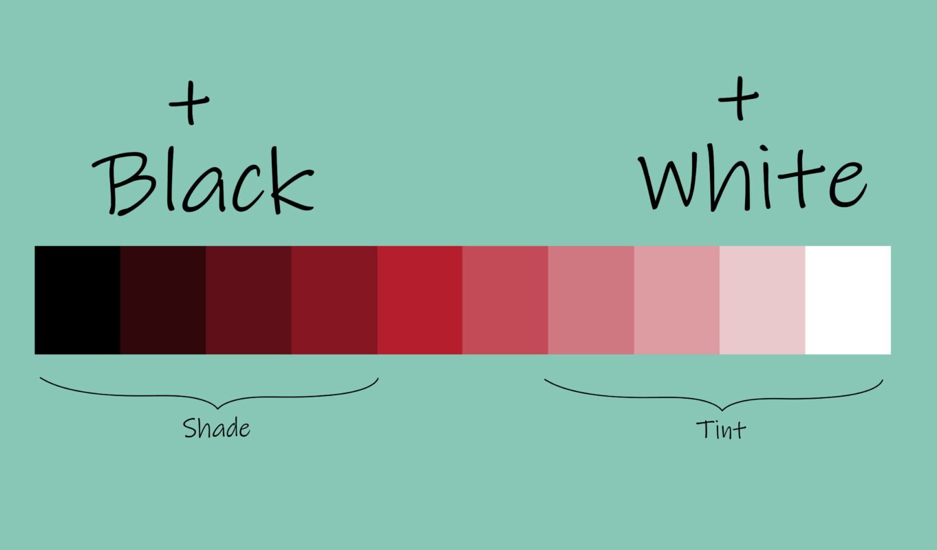
We tend to think of value as only black and white but any colour, any hue, can also have a value range. A hue is just a fancy name for colour so yellow, green, red, blue – those are hues. Any hue has a similar scale from dark to light: we lighten it by adding white making a tint and we darken it by adding black creating a shade. When a picture uses only one colour we call it monochromatic, mono means one, so monochrome means one colour.
All colour has value

Famous Artists and their use of value
Now, let’s look at some famous artworks artists and art movements and their use of value.
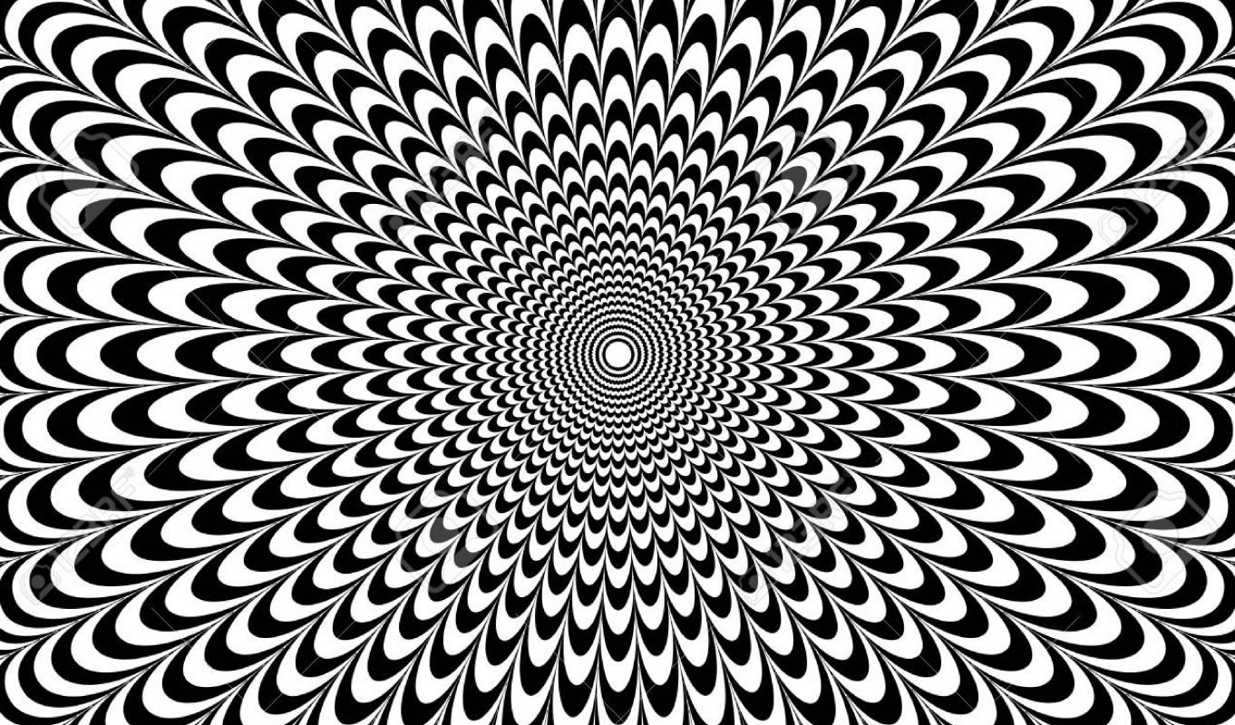
Op Art
First, I’d like to look at opt art, short for optical illusion art. It’s actually impossible for our eye to focus on the highest value and the lowest value at the same time so our eye bounces around which creates movement. When we use these high contrast images, it almost seems like they are moving hence the name opt art.
Rembrant van Rijn
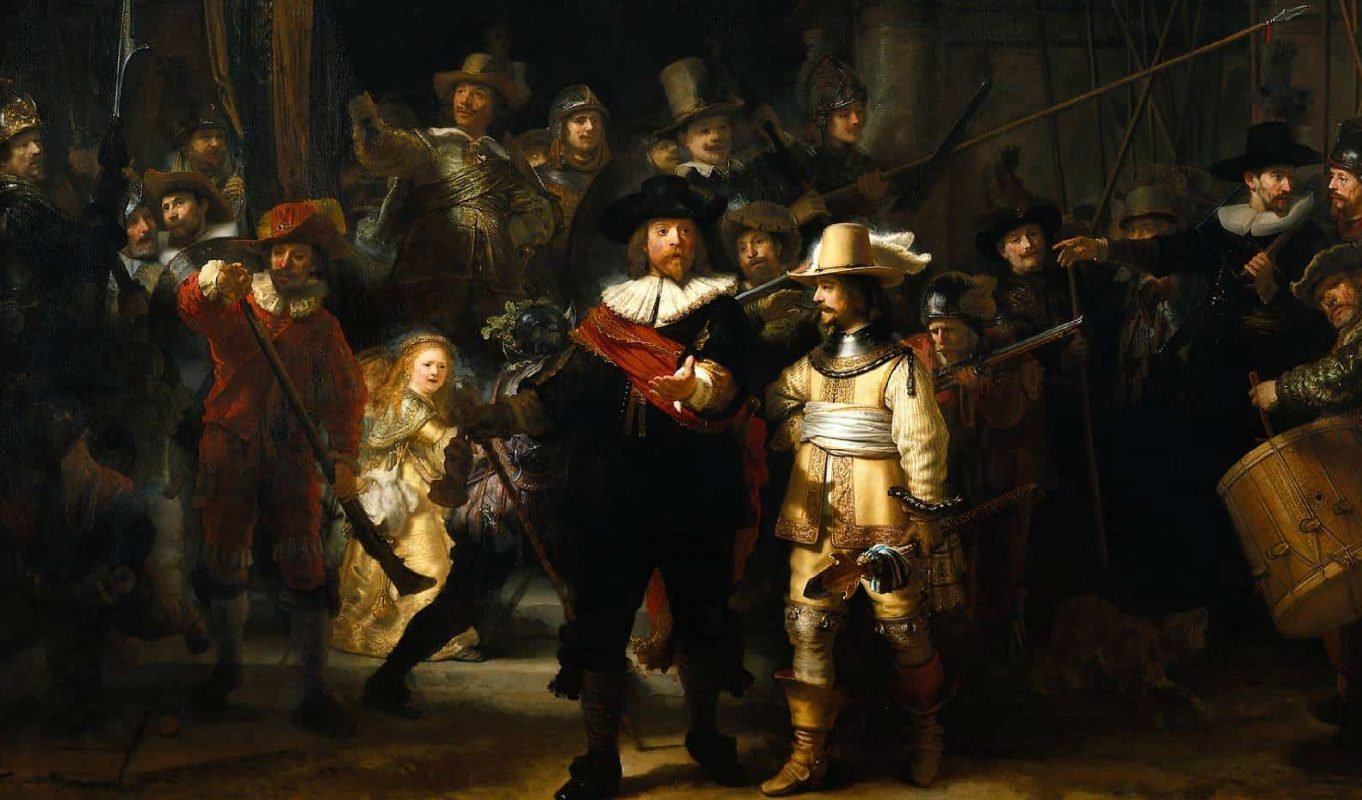
When we look at the famous Dutch artist Rembrandt van Rijn we notice quite dramatic light in his artwork and this is known as chiaroscuro lighting; when most of the painting is in the darkness and there are these extremely light areas to focus on. This is another interesting use of high contrast in art.
Claude Monet
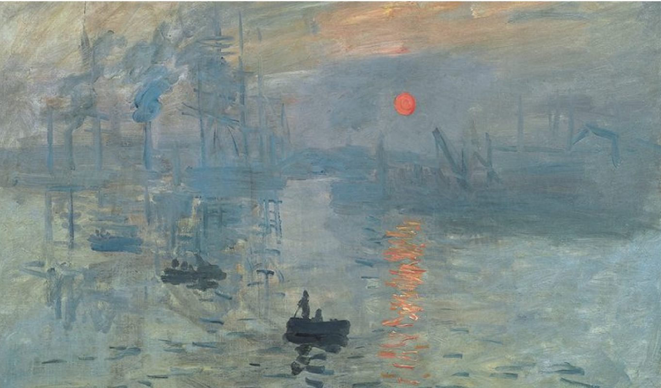
Sometimes we need to create a relaxed mood with a lot of subdued subtleties and then artists tend to use a low contrast: here we’ve got Monet’s scenes of London which use low contrast to depict the haziness in London air. When we need to depict a lot of detail we tend to opt for a wide range in the value scale as you can see here in this photo by Robert Mapplethorpe capturing the finest details on this Lily.
So, next time when you look at a famous artist’s artwork you need to ask yourself…
- What kind of values does it use?
- Mid-range? High range? Low range?
- Does it have high contrast or low contrast?
- How does the use of value make me feel?
Improve your own art
Now that you understand the value scale, you need to learn how to apply this to your own art.
Now that you understand the value scale, you need to learn how to apply this to your own art.
Before you start an artwork ask yourself:
- What emotion do you want to convey?
- Is it a soft subtle peacefulness?
- Is it a dramatic harsh dramatic emotion?
Then decide whether to include the entire value range or only a certain area of it.
Also, ask yourself:
- Do I want my artwork to look as realistic as possible or not?
If your goal is to make it look as natural and real as possible I would recommend using the entire value scale.
Common Mistakes
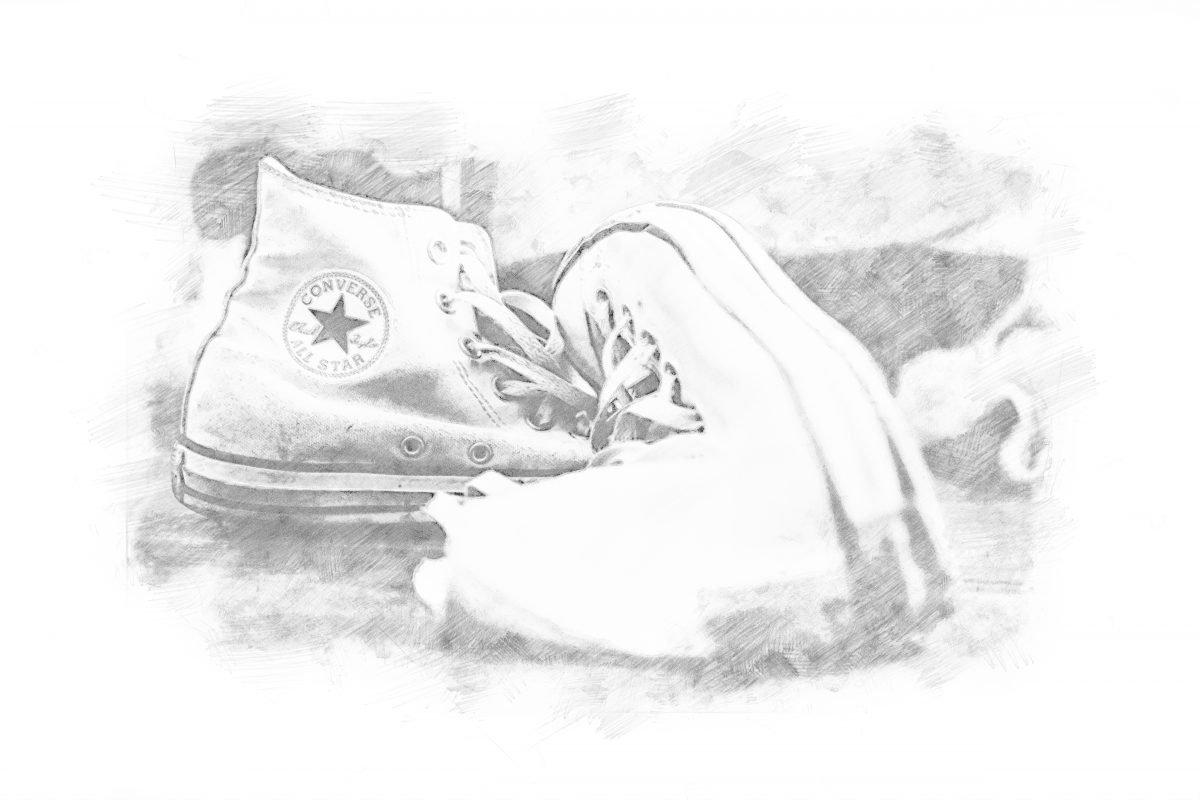
Most of the time my students are hesitant to go dark in their art so the art looks a bit bland and they tend to hover on the higher side of the value scale. If you can just push yourself a little bit harder to go darker and include the entire value scale, your art would look so much better, it makes a huge difference.Also think about what your art looks like from a distance when we zoom out on this big drawing of a sneaker with a low contrast it almost just merges into the background and disappears.
But when we are far away from an image using a good value range we can see it from a distance.

That’s it for our value lesson I hope you guys now have an awesome secret weapon to really make your art Wow and make it pop by using the entire value scale.

BUY THE 7 ELEMENTS OF ART WORKSHEETS
A 32 Page Worksheet Pack focused on teaching the 7 Elements of Art. Ideal for art students to learn how to apply the 7 Elements of Art and reinforce the principles.
FREE online videos available on our YouTube video for each worksheet.