Kids Art Projects
Tim Burton Inspired self-portrait in 9 steps
Nov
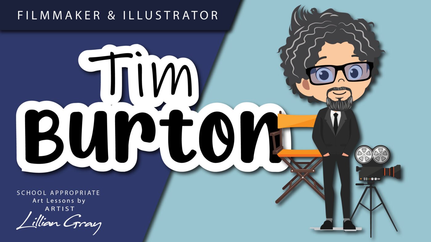
Tim Burton Inspired Art Project
Hello, I am Artist Lillian Gray. In today’s lesson, we are going to create a self-portrait inspired by Tim Burton’s art. Tim Burton is an American filmmaker, animator, producer and artist. He is mostly celebrated as a film director and illustrator. His accolades include nominations for several Academy Awards. He is the winner of three BAFTA Awards as well as an Emmy Award and a Golden Globe Award.
The start of Tim Burton’s art career
Tim Burton was born in California in 1958. As a young teenager, he would make short films in his backyard. He made his first stop-motion animation at the mere age of 13. Stop motion is an animated filmmaking technique where objects are moved in small increments. Each tiny movement is photographed. Once all the photographed frames are played rapidly, it creates the illusion of movement. Any kind of object can be animated using this style.
Burton wasn’t a particularly good student at school. He was introspective and struggled to communicate with other teenagers. He found joy in his art and movies. His future work would be heavily influenced by the works of such childhood heroes as Dr Seuss and Roald Dahl.

After he finished High School Tim Burton attended the California Institute of the Arts, known as CalArts in California. There he studied character animation and created his own independent short films. His short films attracted the attention of Walt Disney Productions. Disney offered Burton a job as animator, storyboard artist, graphic designer, art director and Concept Artist.
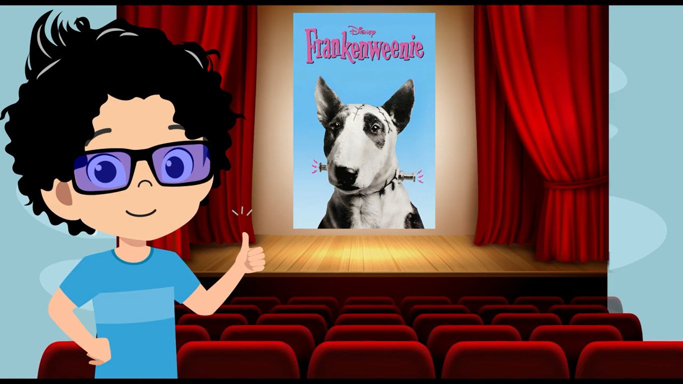
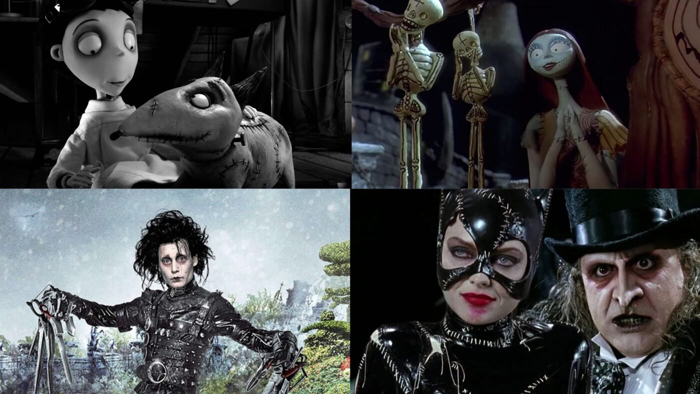
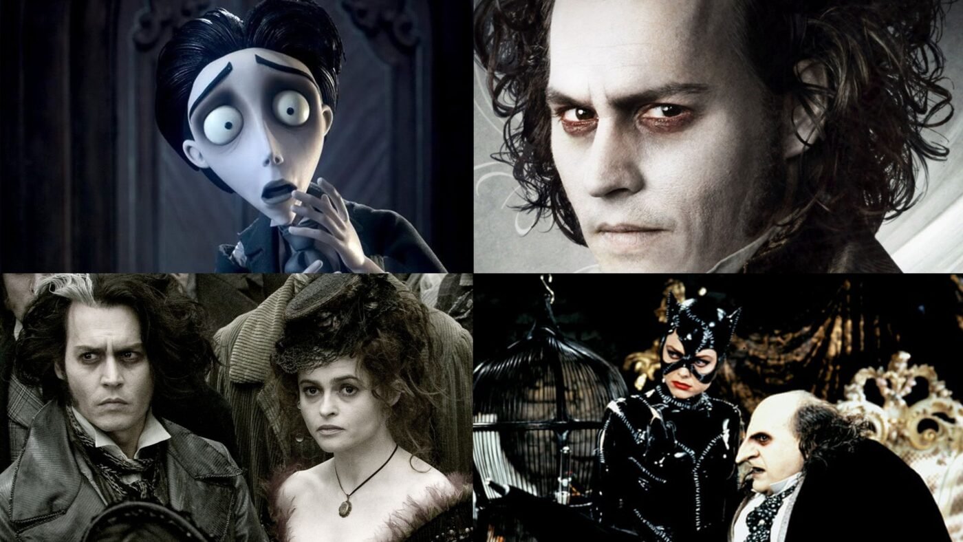
While working for Disney, Burton made a short film, Frankenweenie, that was released in 1984. It tells the story of a young boy who tries to revive his dog after it is run over by a car. Filmed in black-and-white. After Frankenweenie was completed, Disney fired Burton, under the pretext of him spending the company’s resources on a film that would be too dark and scary for children to see.
Filmography
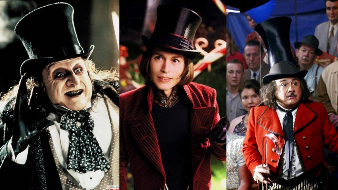
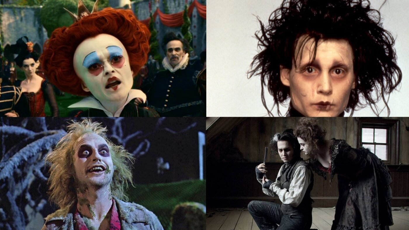
After leaving Disney he directed films and started to achieve success. He is known for his gothic fantasy films such as Beetlejuice, Edward Scissorhands, and Sweeny Todd. Burton also directed the superhero films such as Batman and Batman Returns, the sci-fi film Planet of the Apes, the fantasy-drama Big Fish, the musical adventure film Charlie and the Chocolate Factory, and the fantasy films Alice in Wonderland and Miss Peregrine’s Home for Peculiar Children. Burton also directed a live-action adaptation of Dumbo.
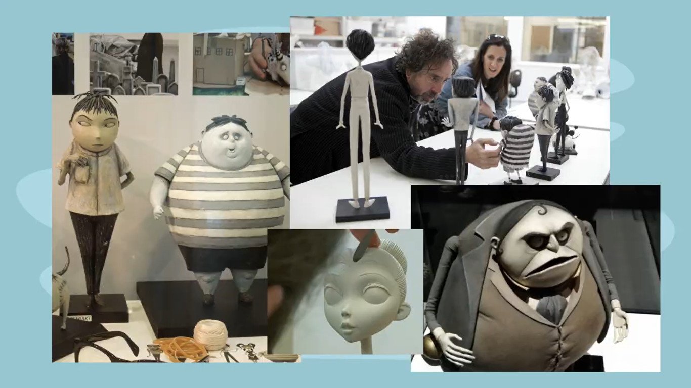
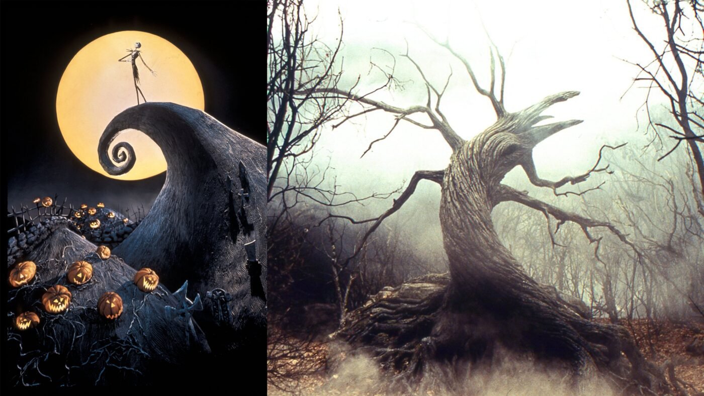
However, he is most known for his direction of stop-motion animations such as James and the Giant Peach, Corpse Bride, Frankenweenie and The Nightmare before Christmas.


Yes, in 2012 he decided to remake the short movie Disney originally fired him for. He created a feature-length stop motion film based on a memory he had as a child and his relationship with his dog. This time Tim Burton was a celebrated director and known for making box office hits, so Walt Disney Pictures funded and distributed the movie.
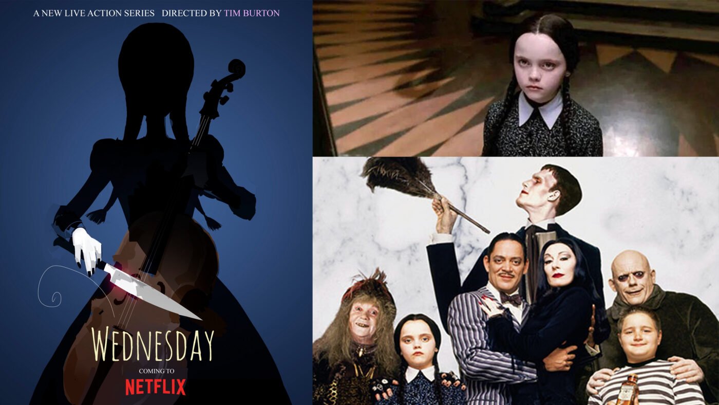
Current projects
Currently, Tim Burton is working on his first television series for Netflix. The series is called Wednesday and is based on the character from The Addams Family.
Books
Burton has also written and published various books and poems.
Exhibitions
Burton exhibits his artworks and illustrations in museums worldwide. In 2009 Burton had a retrospective exhibition at the MoMA in New York. A retrospective is when an accomplished artist is celebrated by a gallery for his or her accomplishment over a few decades spanning over their entire career. The exhibition consisted of over 700 drawings, paintings, photographs, storyboards, moving-image works, puppets, costumes and many items from the filmmaker’s personal collection.
The exhibition travelled to Melbourne Australia, Paris in France. He has also exhibited in Seoul in South Korea, in Prague, Czech Republic, in São Paulo, Brazil and in Hong Kong.

Let’s move on to analysing Tim Burton’s iconic illustration style.
Tim Burton’s Art Style
Character design
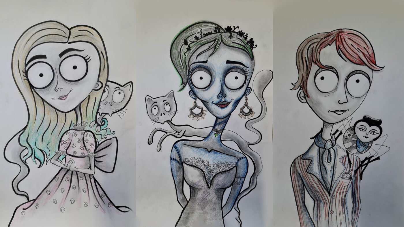
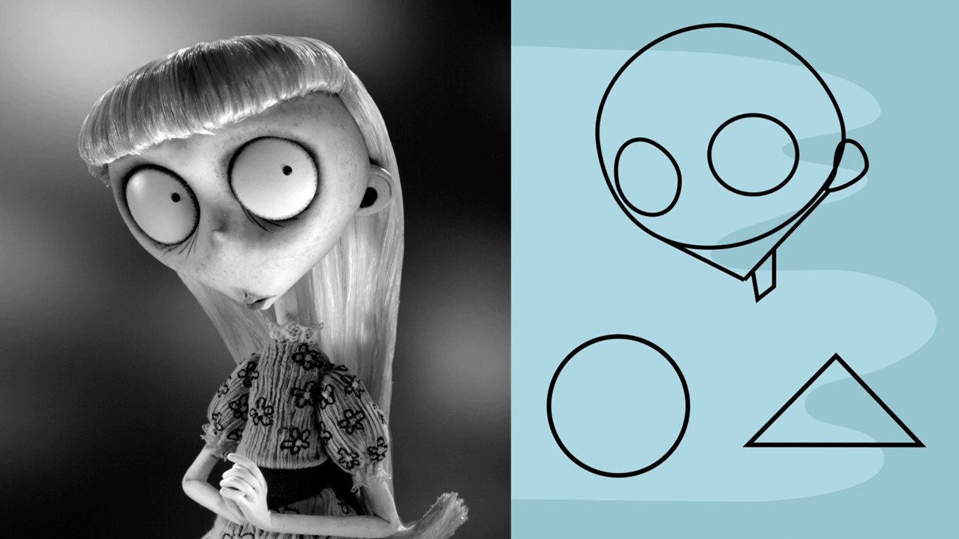
When you compare a Tim Burton character to a realistic portrait you will notice some major differences. Tim Burton’s art is not realistic but stylized. The eyes are exaggerated and are the main feature of the head. The iris lacks detail and simply consists of little black dots. The bodies are skinny and elongated. This contrast is exaggerated with large heads placed in thin long necks. Typically Tim Burton Characters have small noses and tiny mouths.

Use of colour
Tim Burton’s art shares an overall collective feeling. The consistency over all his projects is the way he uses colour. He favours a dark muted colour palette, known as desaturated colours. This colour scheme lends itself to his notorious gothic feeling. Overall he favours greys and blues. The colours Burton uses look pale in comparison to typical shades and may have a greyish tint.

Shape language
Shape Language is a concept used in art and animation to communicate meaning based on shapes we are familiar with. When used in character, object, and background design, shapes can tell a story, show personality, and elicit an emotional response in the viewer without using any words. When you look at these simple shapes, what do you feel?
Circles are usually seen as soft, squishy, harmless, approachable and changeable. Squares are seen as solid, sturdy, strong, supportive, reliable and inflexible. Triangles are sharp, directional, dynamic, dangerous, evil and unpredictable.
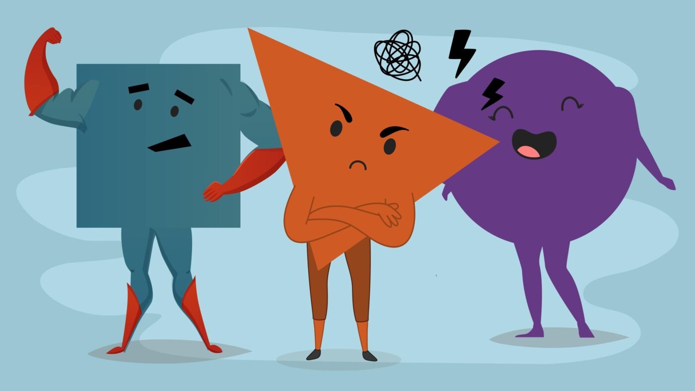
Tim Burton often combines two of these shape languages to create his characters, circles and triangles. The fine balance between these two shapes gives his characters that approachable yet scary appearance.

Line Quality
Burton also uses wonky lines and scratchy marks to add shading. This adds to the dramatic scary appearance of the worlds and characters he creates. You will also notice some curves are greatly exaggerated to add movement and dynamic compositions to the landscapes.
Great, now that you know more about Tim Burton’s biography and style let’s start working on our art projects. You can purchase an awesome Tim Burton inspired worksheet from our website or our Teacher’s Pay Teachers store.
Other characteristics
Other features that are quite noticeable in Tim Burton’s work are pale white skin with dark eyes. Crazy hairstyles, some messy and some overly styled, stitches, various characters have stitches and marks on their bodies and then the gothic clothing and costumes he is known for. Characters often wear top hats and Victorian-inspired dresses and suites. Tim Burton is also fond of cursing stripes in his costume designs.

How to draw a self-portrait Tim Burton Style.
Step 1: Setup your station and art supplies
- worksheets
- pencil
- eraser
- fine liner
- coloured pencils (optional)
- photo of yourself
For this project, you will need our awesome worksheets, pencil, eraser, fine liner, black koki and coloured pencils, if you would like to add colour. It will also be helpful to have a photo of yourself or to be seated close to a mirror. Optional extras would be coloured toned paper and a white pencil.
Find a nice comfortable place to work with good lighting. For this video, I will be drawing myself and some of my close family members. I will be using this image of myself. I will be wearing the same hair and clothes while adding some Tim Burton inspired characteristics and style elements.
Pro Tip: Don’t press too hard in the beginning.
A pro tip before you start drawing. Press lightly with your pencil in the beginning. Glide over the page like an ice skater and do not stomp around like an elephant. If you press lightly it is easy to erase mistakes and change your drawing.
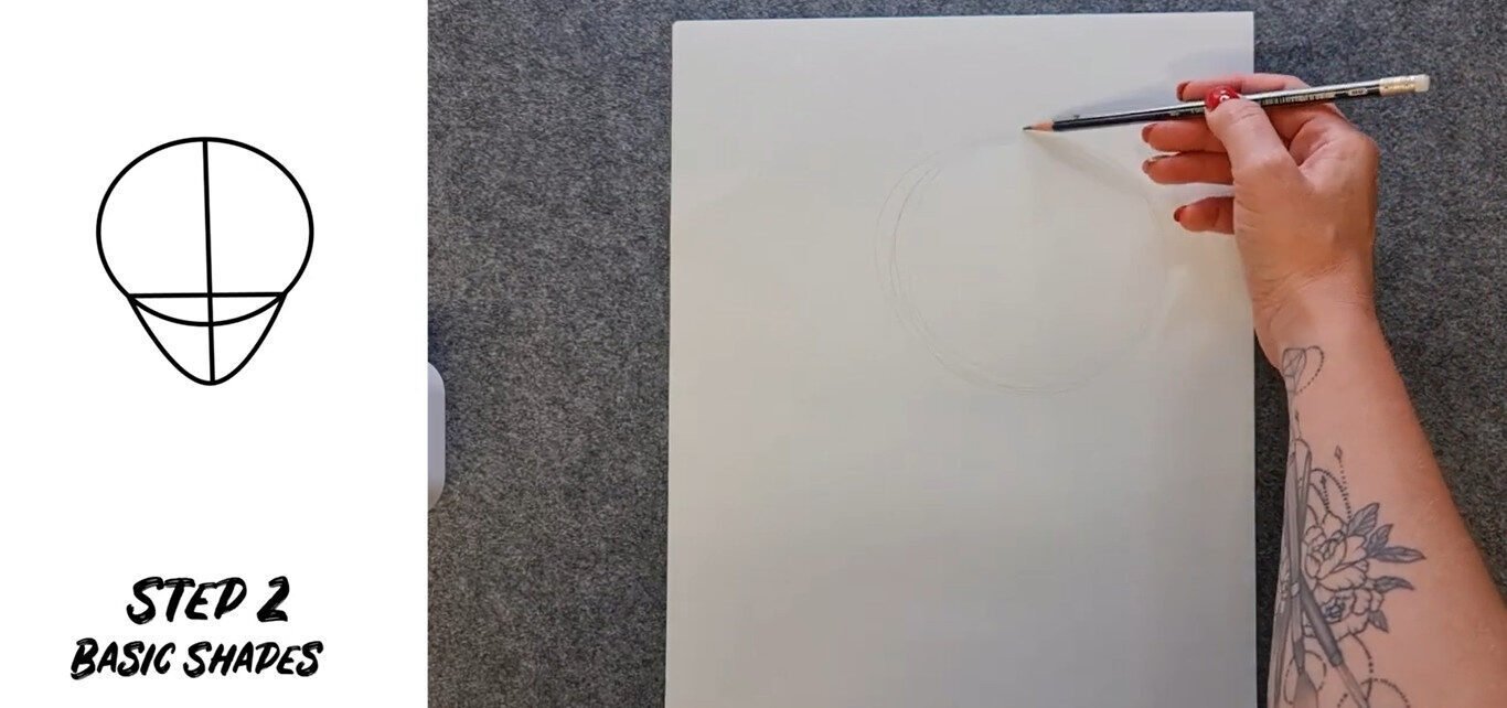
Step 2: Start with Basic Shapes
Start with the basic shapes and the median line. The Median line is the line that runs down the face in the middle. It helps you to place all the elements of the face. Start with a big circle. Notice that I am not drawing with one continuous line, I am building my circle with small quick lines. I am also working with the natural curve in my hand and not against it.
Now add the median line. Keep going until you reach the point where you would like the chin. Now we are going to add a triangle for the chin. Erase the circle line that you no longer need.
Moving on to the body we can add a thin elongated neck and shoulders. The shoulders are rounded to match the circle shape language. Now you are done with the overall placement of your character.
Step 3: Add the facial features
Erase the bottom part of the circle you no longer need. Lightly place the eyes in the head. The eyes are huge and remind me of ping pong balls. Make sure your eyes are symmetrical and the same size.
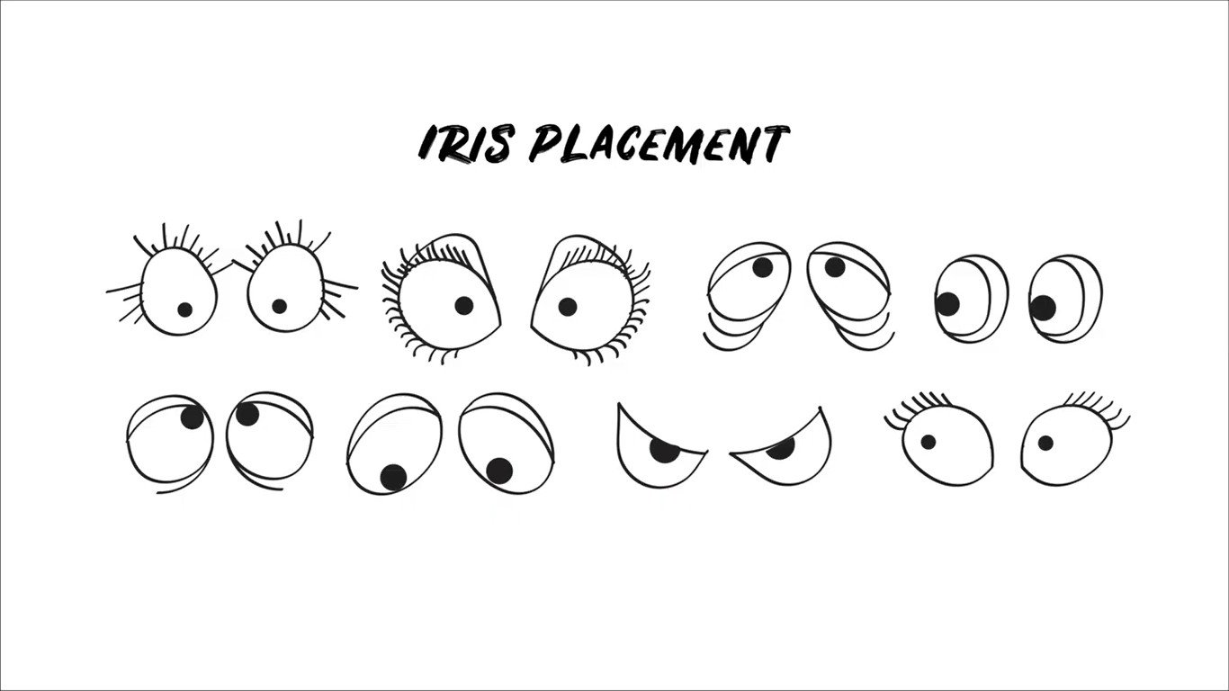
The pupils lack details and are simply a tiny black dot. If you would like your character to look straight at you, place the pupil in the middle. If you would like their gaze to go off into the distance, place it slightly to the left or right. If you would like them to look up, place the iris to the top of the eyeball.
Add guidelines for the nose and mouth placement. Remember these proportions are not realistic, they are stylised. If you would like to learn how to draw realistic portraits you can watch my videos about drawing faces. Click the link on the screen. Tim Burton’s character’s features are exaggerated which ends up looking like a combination between fun and spooky.
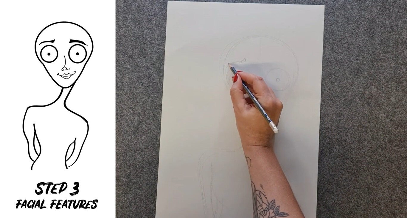
Now let’s add the nose. Remember Tim Burton’s noses are mostly small and understated especially for his main characters. There are some exceptions such as the Penguin in Batman and other supporting characters where the noses are massive. In the worksheets, I have included different features you can use in your portrait but for this portrait, I’m just going to draw a tiny simple nose.
Now let’s place the mouth. I am not going to add a massive mouth that covers the face. It will be a tiny mouth. Most of Tim Burton’s male characters have very slim upper lips and you can only see the bottom lip. When creating a female character you can make the top lip a little bit bigger to emphasise the lipstick and femininity. Add a little heart on the top lip to help you achieve the desired shape.

Great, we have placed most of the facial features by now. To add more emotion and facial expression to your character add eyebrows. You can make these as thin or as thick as you want or you could give your character really bushy brows. Draw a curved line above each eye for the eyebrow. Now add some line quality by making them thinner and thicker at places or add texture if needed.
Now let’s add the ears. The ears are tiny and simplified. In my lesson on how to draw realistic ears, I teach the 9Y-method. This is always helpful for getting the structure of the ear. Draw the 9 of the ears on both sides of the face. Ensure they are placed at the exact same height and are the same size. Now add the inner y. And wa la! You have ears.

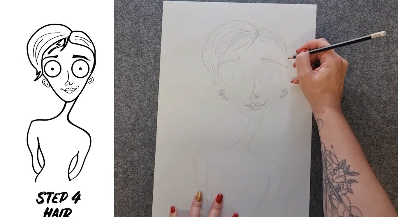
Step 4: Add hair
Time for your character’s hair. First, break your hair down into basic organic shapes. Now analyse the direction of your hair. In which direction is each section flowing. Avoid helmet hair where the hairs sit flat on the skull. The hair sits on and around the skull and has volume. Hair is dynamic and has a life of its own. Sometimes it can be unruly. For extra character add lots of strands standing up or flowing over the forehead. If your character is shocked the hair might be crazy and standing in all directions.
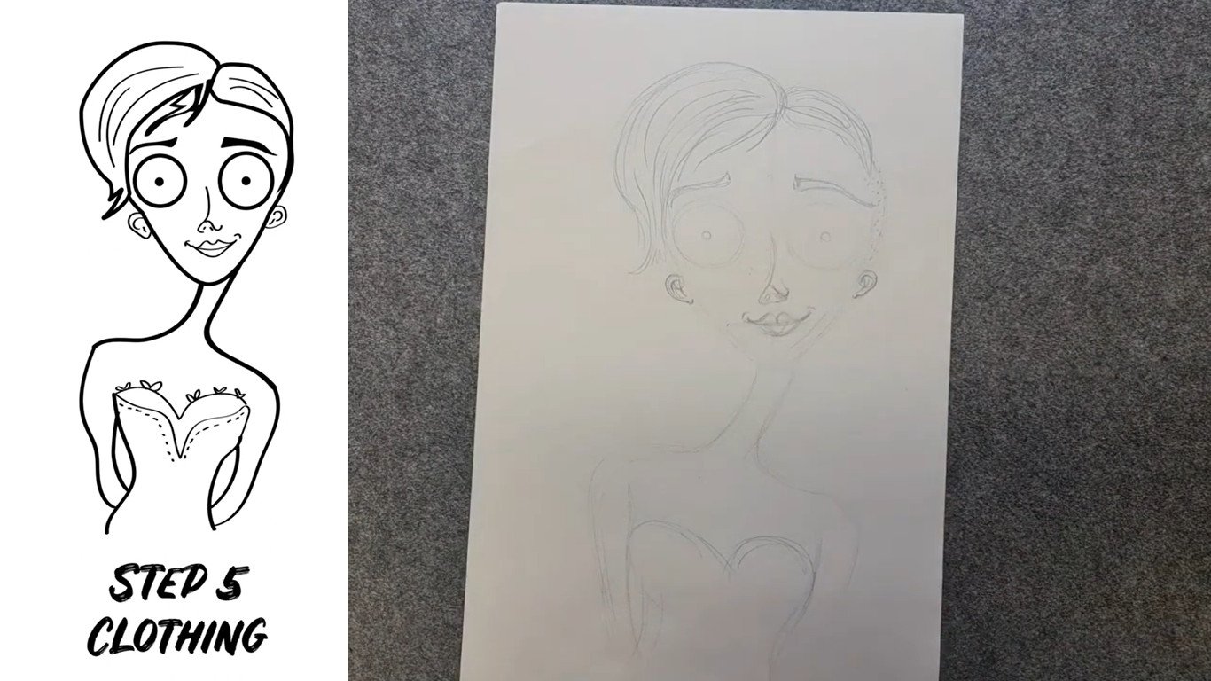
Step 5: Add clothing & accessories
Now let’s add clothing. You can be inspired by the clothes you are wearing in your self-portrait photo or the clothes you are drawing today. I am going to add a typical Tim Burton style off the shoulder dress to my character. Now we can add some fun accessories. On the worksheet, I have illustrated a few accessories to inspire you. You can add earrings, a hat, lace patterns, a collar, tie, choker, bracelets, necklaces, glasses or a monocle.
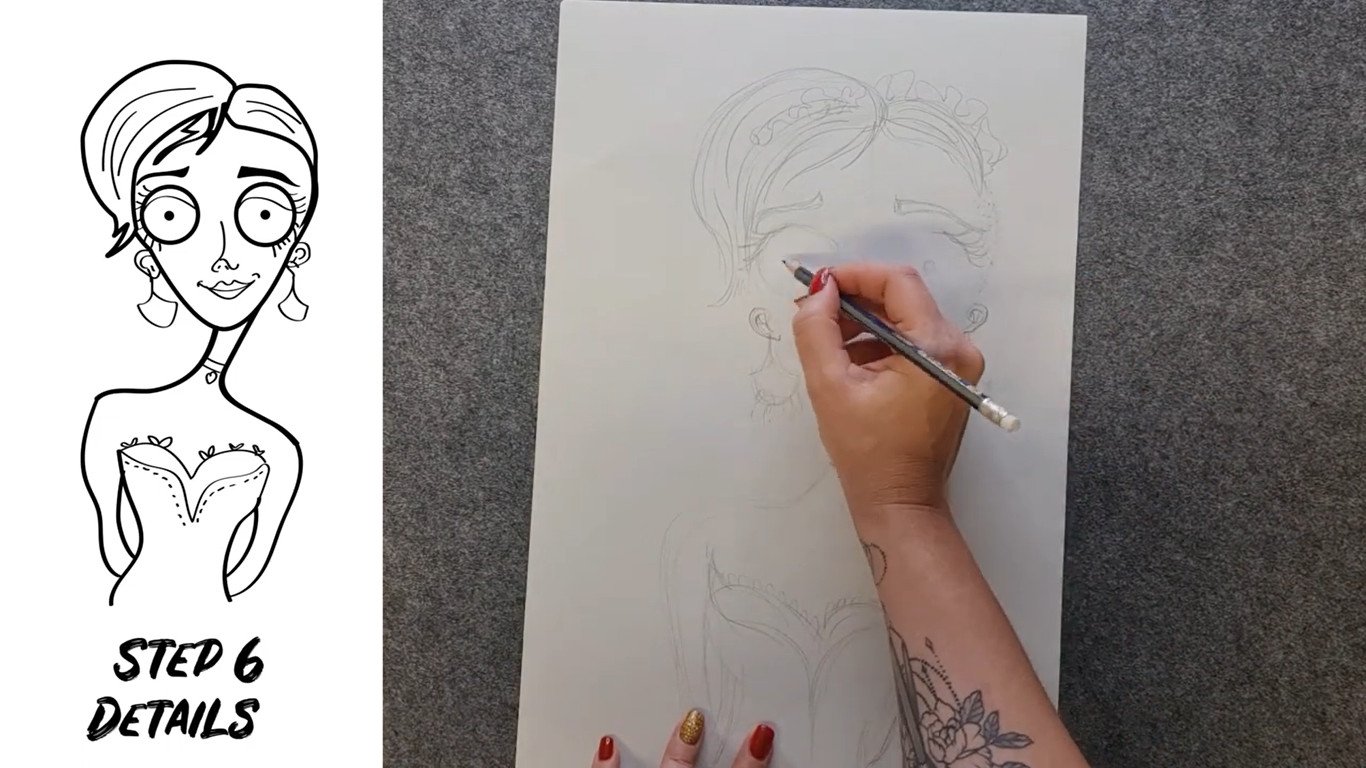
Step 6: Add details
Now we can add all the tiny details. You can make your character more feminine by adding eyelashes. You can add make up such as adding eyeliner. If you have an off the shoulder dress you can add the collar bone. You can even add stitching to make your character a bit scarier.
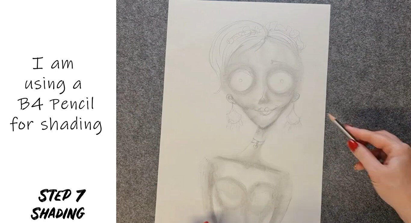
Step 7: Add shading
You can make your character look more 3D by adding shading. This adds to the stop motion puppet look that Tim Burton is known for. It is important to add shadows below the chin and below the nose. Tim Burton characters also typically have shading under their eyes. With shading, you can also make the cheekbones a little more pronounced. Lastly, shade the clothing.
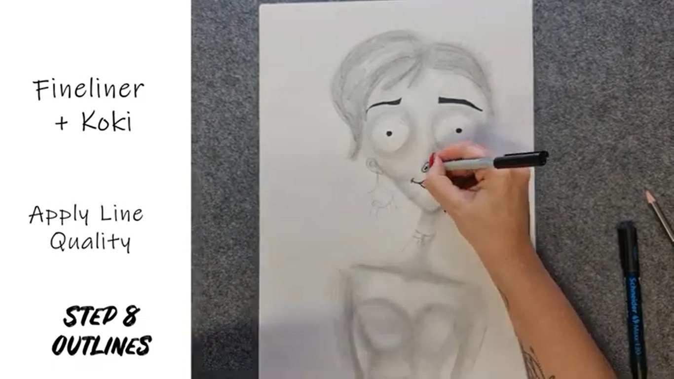
Step 8: Outlines
Use your fineliner, sharpie or koki’s to add outlines and details.
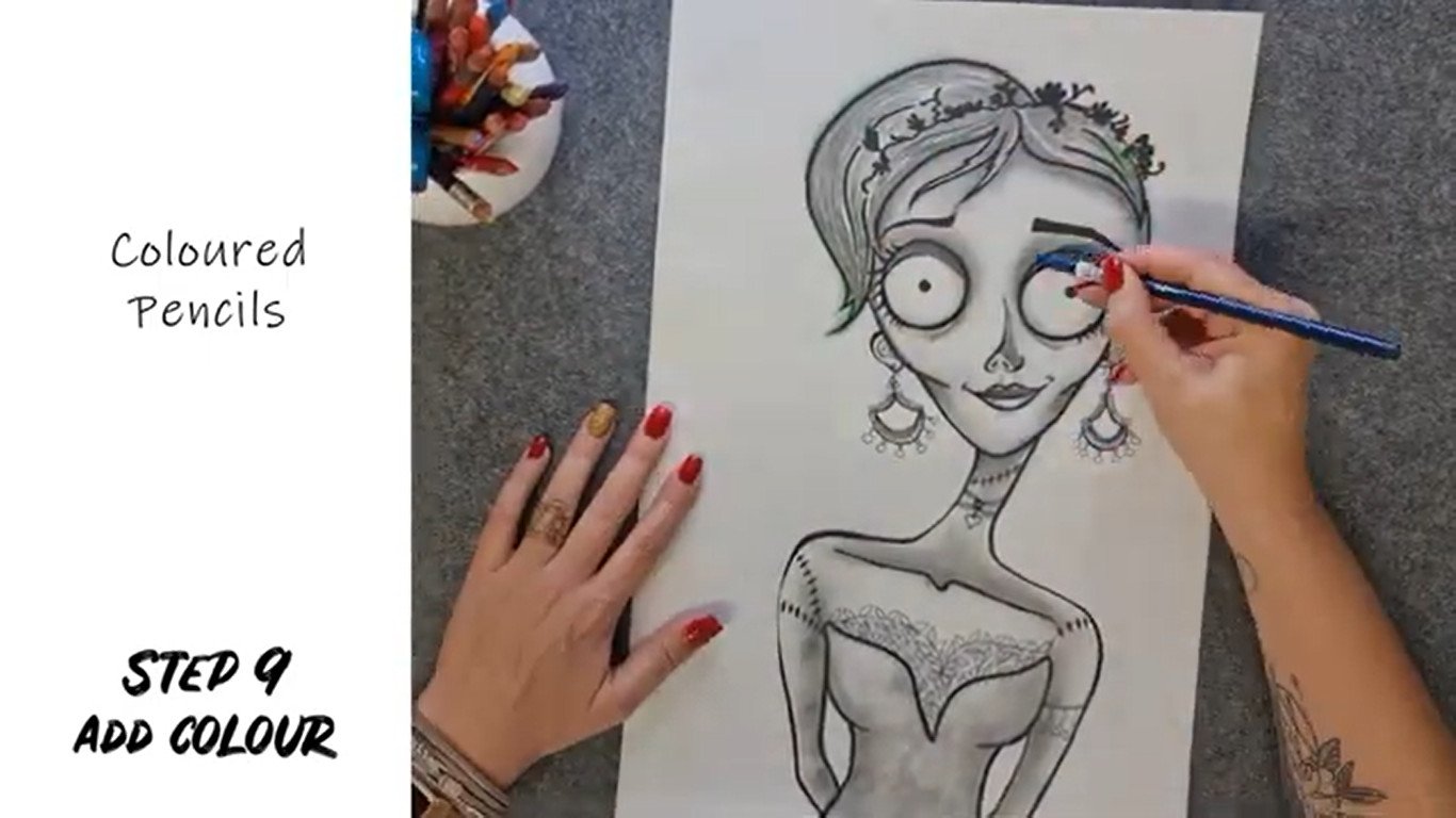
Step 9: Optional to add colour.
You can now add a bit of colour to your portrait. This is completely optional. So if you love the monochrome look why not keep it. If you want to add colour remember to use the muted colour pallet that Tim Burton uses. Do not overwork the colour so all the beautiful shading you have created disappears. You can also blend the colours together for an added 3D effect.
Well done your Tim Burton inspired self-portrait is now complete! Stay tuned for a bonus time lapse at the end of the video where I draw my other family members in the same style.
We’re done!
And that’s it for our Tim Burton inspired art lesson. I hope you enjoyed this lesson and learnt more about Tim Burton’s specific style.
If you’re new to our channel please click subscribe so you can be notified whenever we have a new video.

BUY OUR TIM BURTON WORKSHEETS
Worksheet pack that includes notes and fun activities. Ideal for art students and history students to learn more about Tim Burton
I am artist Lillian Gray, until next time.

Please visit our blog for many more fun art projects.