Kids Art Projects
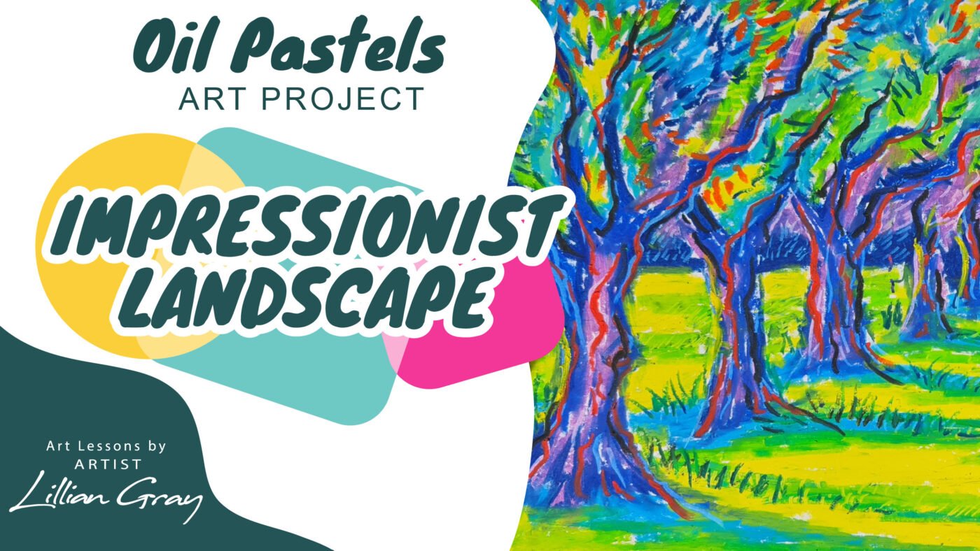
Draw an oil pastels landscape inspired by Impressionism with 6 oil pastel techniques
Jul
Hi, I’m artist Lillian Gray and I’m super excited about today’s lesson.
I’m going to teach you some awesome tips and tricks on how to use oil pastels. We’ll be making a landscape honouring the Impressionists.
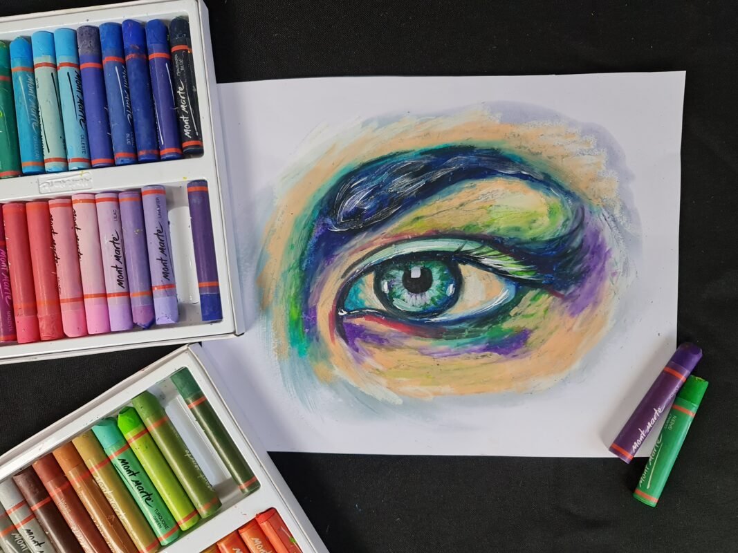
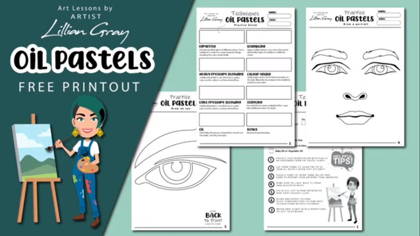
There’s a free oil pastel printout on our blog for you to practice the various tips and tricks in this lesson.
For today’s lesson you will need:
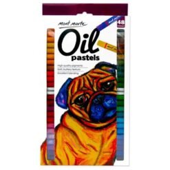
- oil pastels
- A3 white paper
- paper towel
- earbuds
- scraping tool
A quick note on buying oil pastels, there are various size packs that you can buy. A cute little 12 set is great to work with. However, if you can afford a bigger pack with 48 pastels, you will have a lot more colour options which really helps with the blending. If you would like to buy any of these art supplies, you can shop online with us.
Today I am going to be working on an easel. You don’t have to work on an easel, you can work flat if you like to. The easel just really aids with no smudging and getting your proportions right. What happens when we work flat is our eye first sees the closest part of the page then the middle then top, and when we flip it up usually our drawings are out of proportion, an easel prevents us from creating a parallax mistake with our eyes.

What is the difference between oil pastels and crayons?
Have you ever wondered what is the difference between oil pastels and crayons? The biggest difference is that with oil pastels the pigments are held together using oil. With crayons, the pigment is held together using wax. By using oil and oil pastels it gives it this buttery texture, a really smooth texture that is wonderful to blend with. It’s much harder blending with crayons.
However, you need to be cautious when working with oil pastels because they can smudge too much, dirtying the colours. first lightly sketch out your drawing, and then only start
Helpful tips and tricks with oil pastels
- lightly sketch out your drawing
- start pressing harder
- Make sure ou have the correct grip, almost like holding a knife
- Have paper towel close by to clean points of your pastel
Blending colours
A very helpful tip for me is to know which colours to blend together. Colours next to each other on the colour wheel are called analogous colours. They blend really well. Colours that are opposite each other on the colour wheel tend to create mud. They are high contrasting, complementary colours and should be placed next to each other and not mixed together.
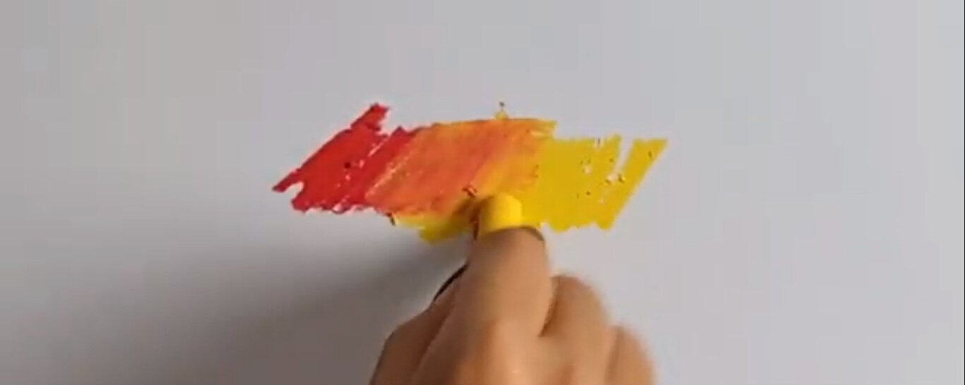
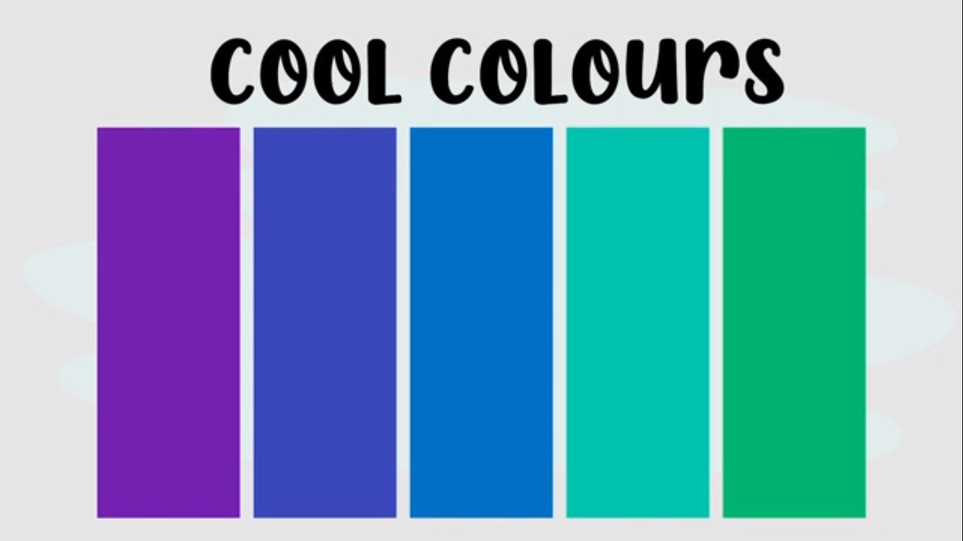
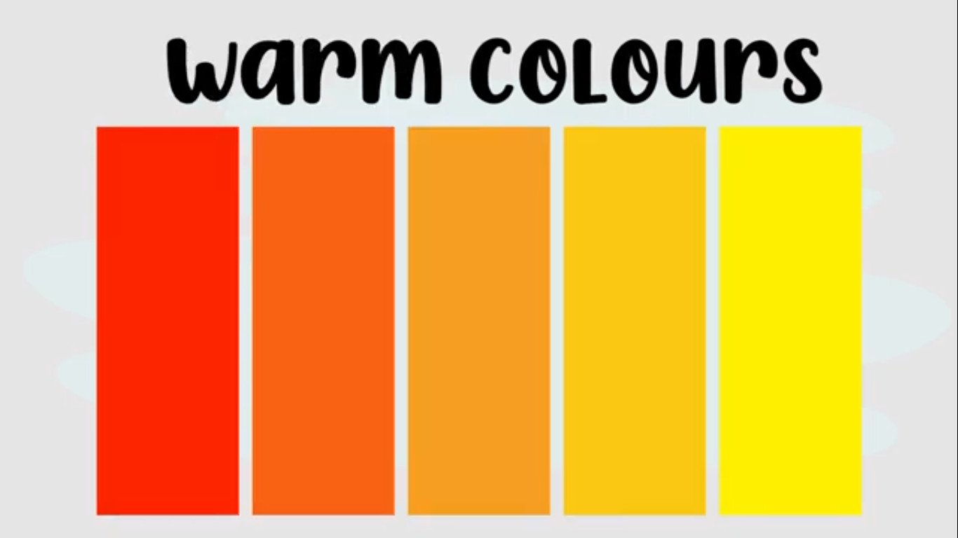
Examples of colours that can be blended well together are usually your cool colours which are your blues, and your greens, and your purples. And then your warm colours which are your reds, your oranges, and your yellows.
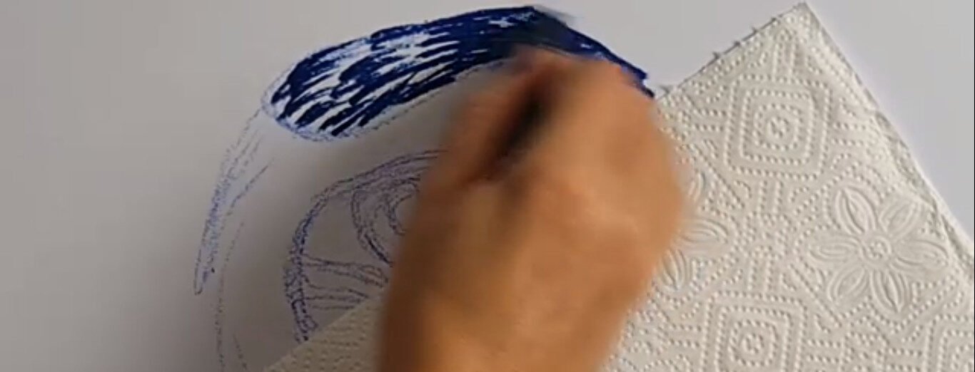
To prevent smudging and dirtying your hand is to put a paper towel underneath your hand while working on oil pastels. It is totally normal for your oil pastels to snap and break as you work with them. The set is definitely not going to stay in some pristine condition.
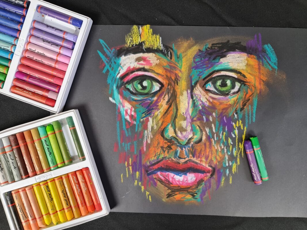
You are not colouring in
What’s important to note when using oil pastels, is you don’t actually colour in. You can leave a bit of space in between your pastel marks because you can save some oil pastel by smudging and rubbing it over the page.
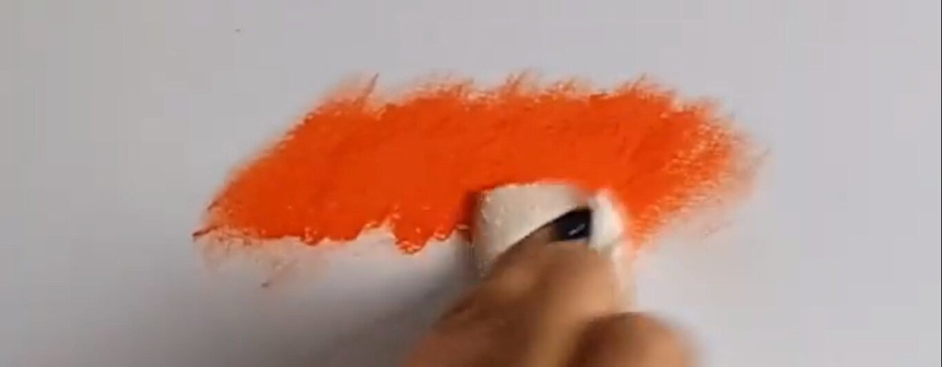
Use short quick strokes overlapping each other to avoid white spaces. Press firmly when colouring with oil pastels and applying them to the paper, think of it as squashing the oil pastel onto the page. Always use black last. Avoid using black in the beginning. It will dirty all your other colours.
When blending, a helpful tip is to always start with a darker colour and then blend with the white, so we work from dark to light, back to front. However, the exception is black. Black you would like to add last.
A helpful tip is to brush your artwork clean with a clean synthetic brush, just a smooth brush that can gently brush away all the oil pastel flakes. Use hairspray or a fixative to prevent the artwork from smudging afterwards.
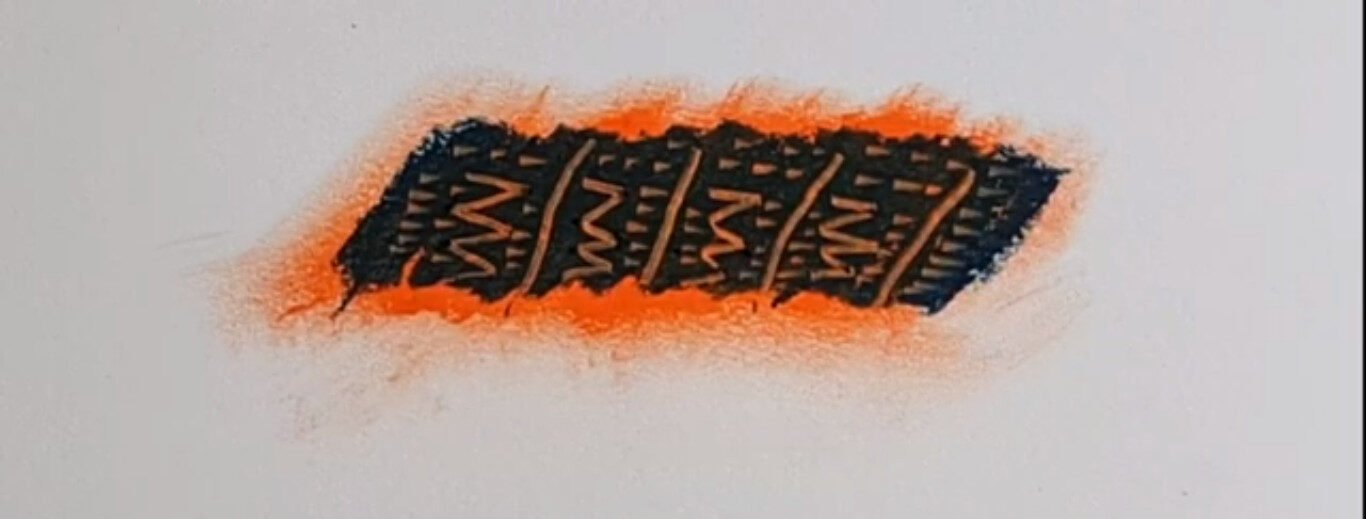
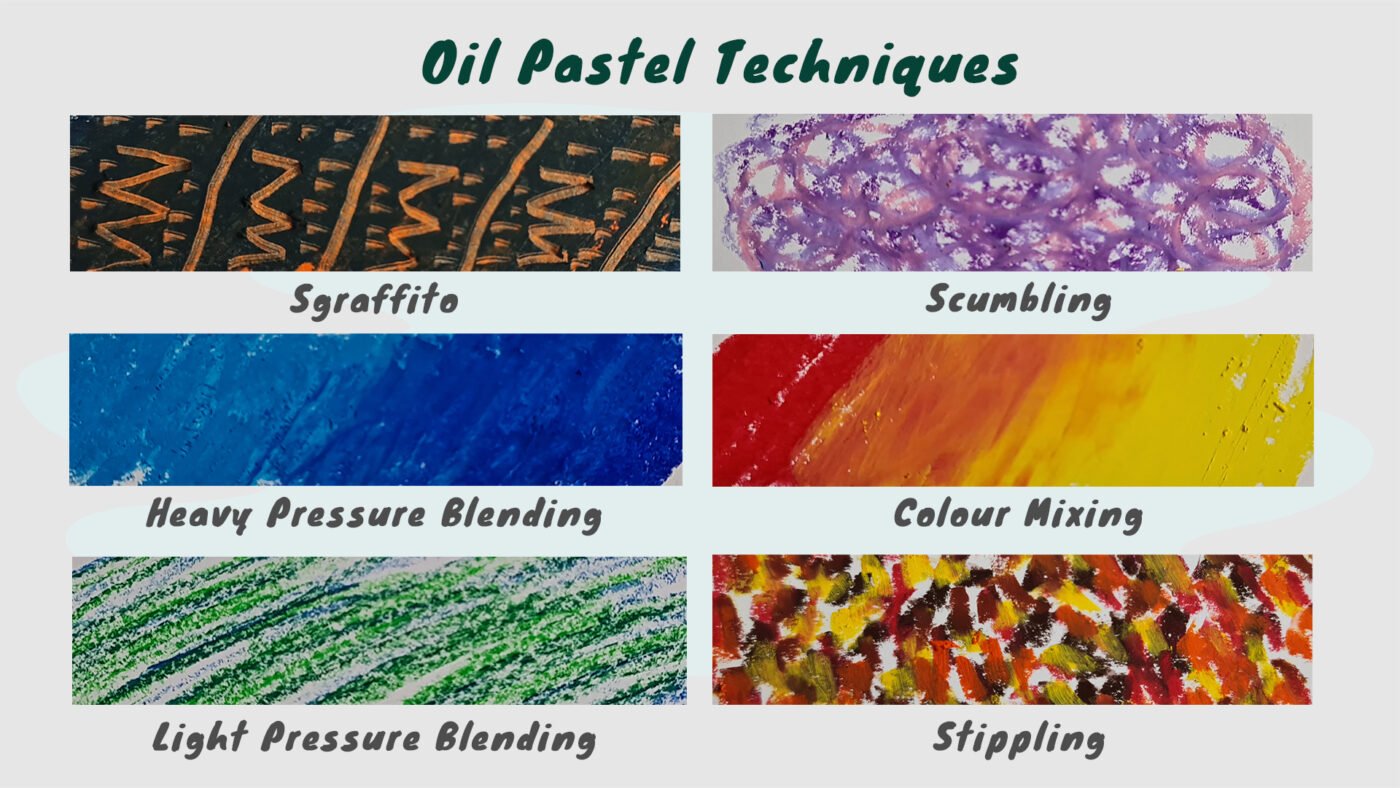
Using sgraffito
I will now be doing some expert techniques. Sgraffito is an Italian word that means to scrape, to scrape away. What we are doing is, we are applying our oil pastels quite thick, then we’re using a tool like a toothpick, a pen, or a scraper to remove areas of the oil pastel, and this reveals the colour underneath or the background colour. You can create various line quality, textures, and patterns by using Sgraffito.
Using baby oil or vegetable oil
An interesting technique to try is, once your oil pastel artwork is completely done you can paint over it using vegetable oil or baby oil. This dissolves the oil pastels and turns them into a painting. Just remember it will take a long time to dry, so you’ll need to leave it for about two days.
Different oil pastel techniques
Heavy pressure bleeding: generously add pastels in one direction on the paper, layer colours to achieve a blended, rich, thick look. Light pressure breathing leaves a lot of white space. Lightly add pastels in one direction on the paper, layer colours to achieve various hues. Scumbling is when we do like a doodle quick, scribble mark over each other using various colours to build up various values and texture.
Colour mixing: you can mix pastels on your page by adding two colours over each other to create a completely new colour. Stippling: use small, choppy, quick strokes to create a stippled effect on paper and layer with additional colours for extra depth. This is great when you try to mimic the Impressionist artists
Which paper should you use?
You get various pastel papers that were made for oil pastels and soft pastels. The hexagonal design holds the pigment to ensure that it doesn’t rub off the page. It’s very important to use texture paper, especially when working with soft pastels. With oil pastels, you can get away with working on various kinds of paper. Today I am working on a smooth paper. It’s also important to note that you can use various colours and then use the background colour of the paper as an extra colour, when you create your artwork let it shine through, incorporate it into your design and your artwork.
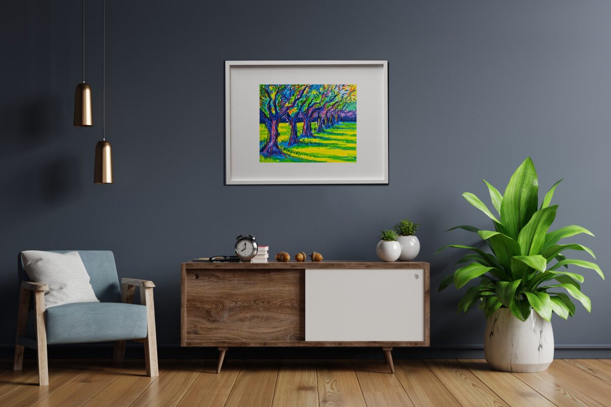
Creating your Impressionism landscape
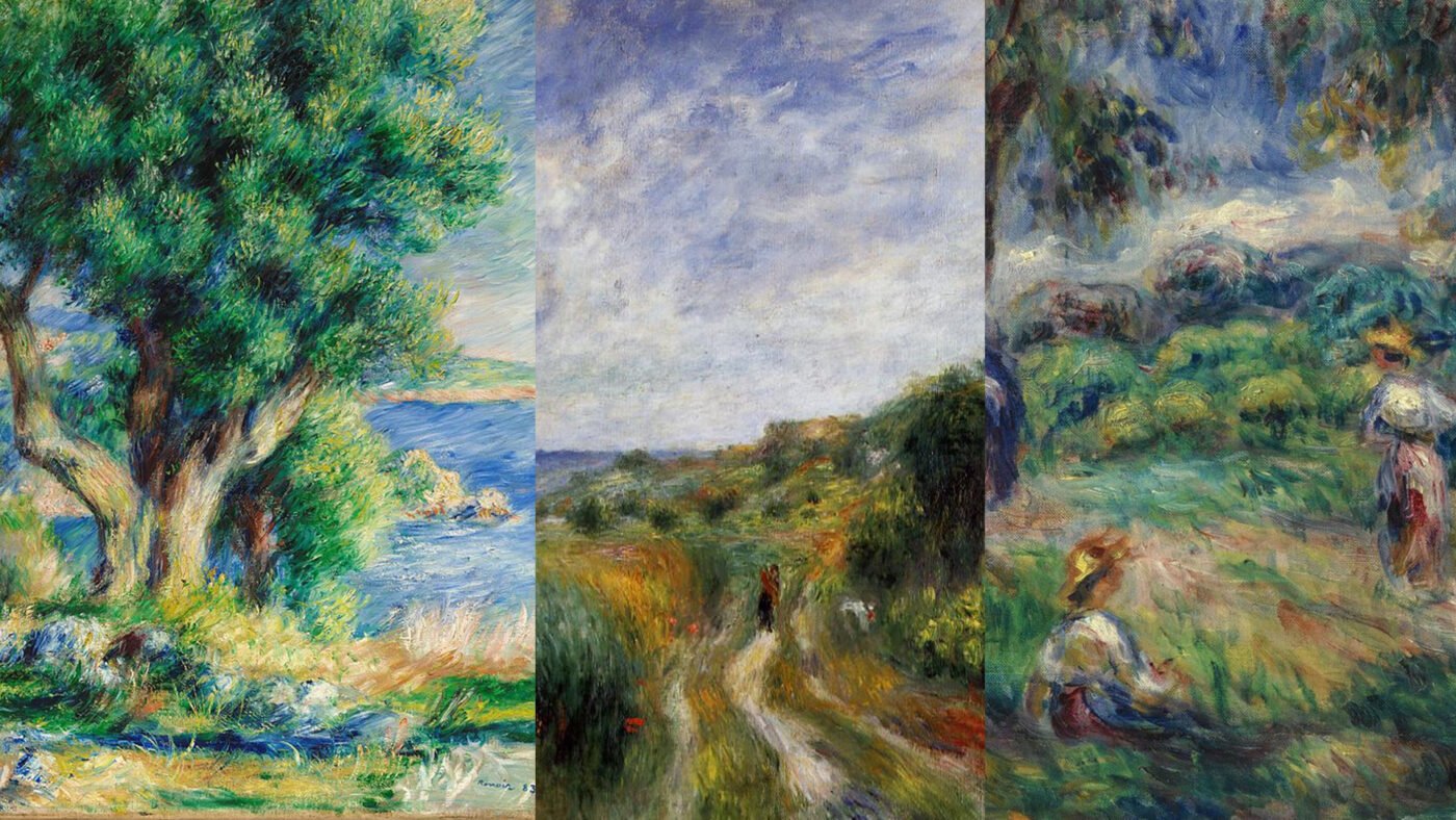
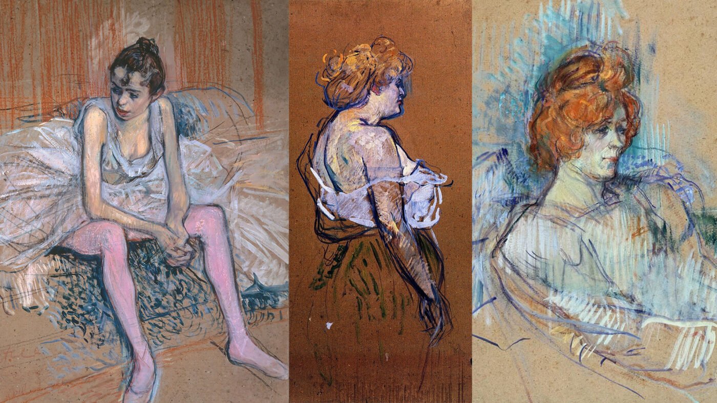
Now that you know various oil pastel techniques, let’s create an amazing artwork. I am going to create a landscape, inspired by the Impressionists and the Post-impressionists. You will see I’m going to add some fuzzy edges that are inspired by Renoir, some stippling that’s inspired by Van Gogh, and some interesting marks that are inspired by Toulouse-Lautrec.
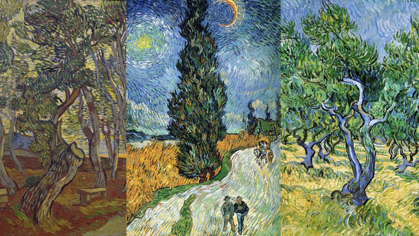
It is important to choose a good reference for your artwork. Ensure your image has a good value range. My reference today is from Unsplash. It’s an awesome website with photos that do not have copyright on them. All they ask is that you link directly back to them, crediting the photographer. Today I am going to do an olive grove.
Setting up your station
Here are some tips and tricks for setting up your station. Use sheets of paper towel or newspaper or a table cover to protect your desk. Your pastels will create a lot of flecks. Tape off the area with masking tape that you plan to draw in. This leaves a nice crisp clean line once you are done.
Work from dark to light
My general approach here is to move from dark to light. I’m starting with my cool colours, the colours that will blend easily together like my blues and my purples. Now I’m just going to add my complementary colours as highlights. Notice that I’m not blending them.
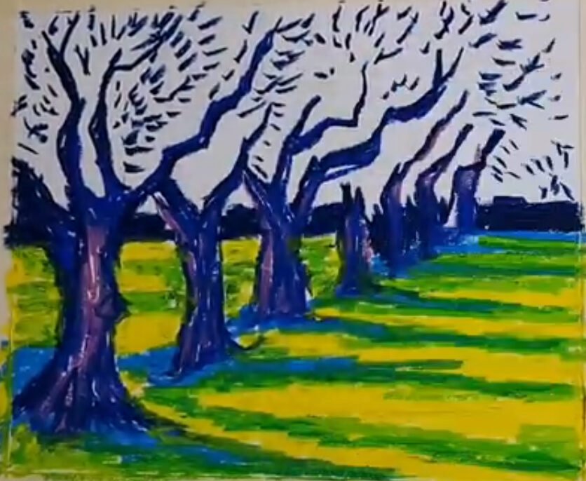
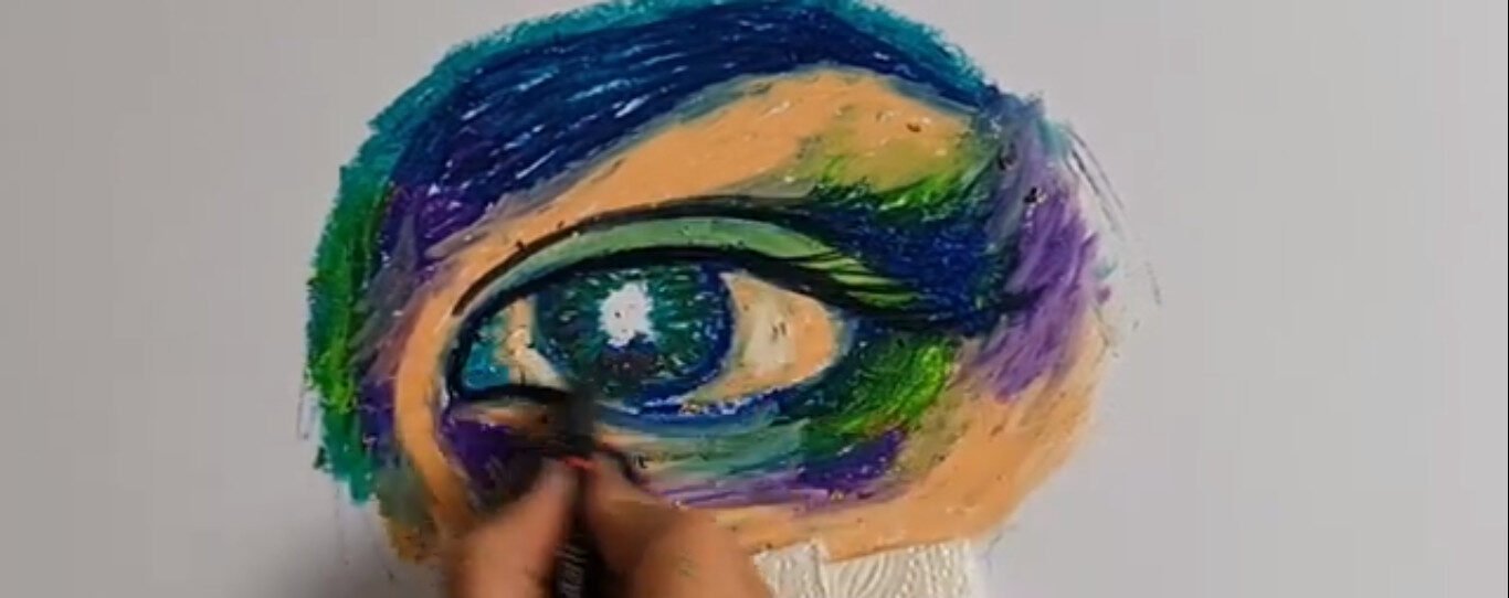
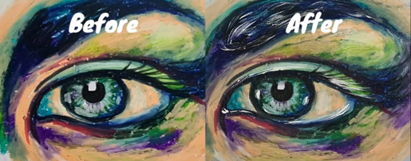
Here I’m using sgraffito to create extra foliage on the grass, and extra leaves in the trees. As you can see here I’m adding the black last, to create the drama and the higher contrast.
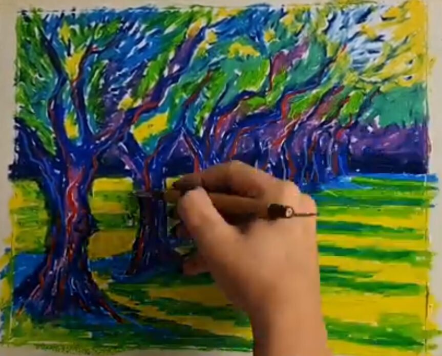
The final artwork
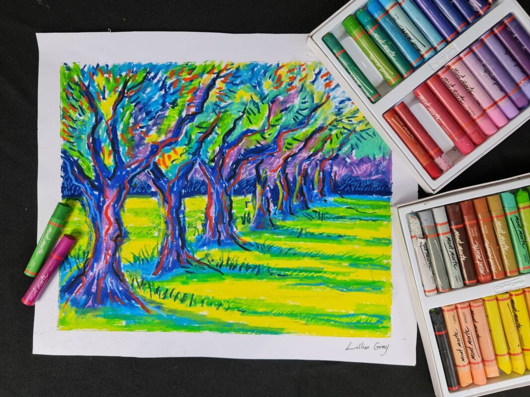
And that’s it for our beautiful oil pastel landscape. I hope all of you enjoyed this lesson. Please feel free to share an image of the artworks you are creating at home with us on our various social media platforms.
Check out our blog for amazing art history lessons and some more art projects
I’m artist Lillian Gray and see you next time!